
Sporkbytes Website
Impact
Reimagined Sporkbytes’ catering platform with a lively, user-friendly design that simplifies requests and infuses every click with personality and ease.
Role & Responsibilities
Art Director: Creative Direction, UX Strategy, Interface Design, Visual Systems, Developer Collaboration
Brief
Sporkbytes struggled to provide customers with an easy, intuitive way to request catering. The process needed to be streamlined through a robust digital platform—while also preserving brand consistency and elevating the experience to feel more engaging and inspiring.
Solution
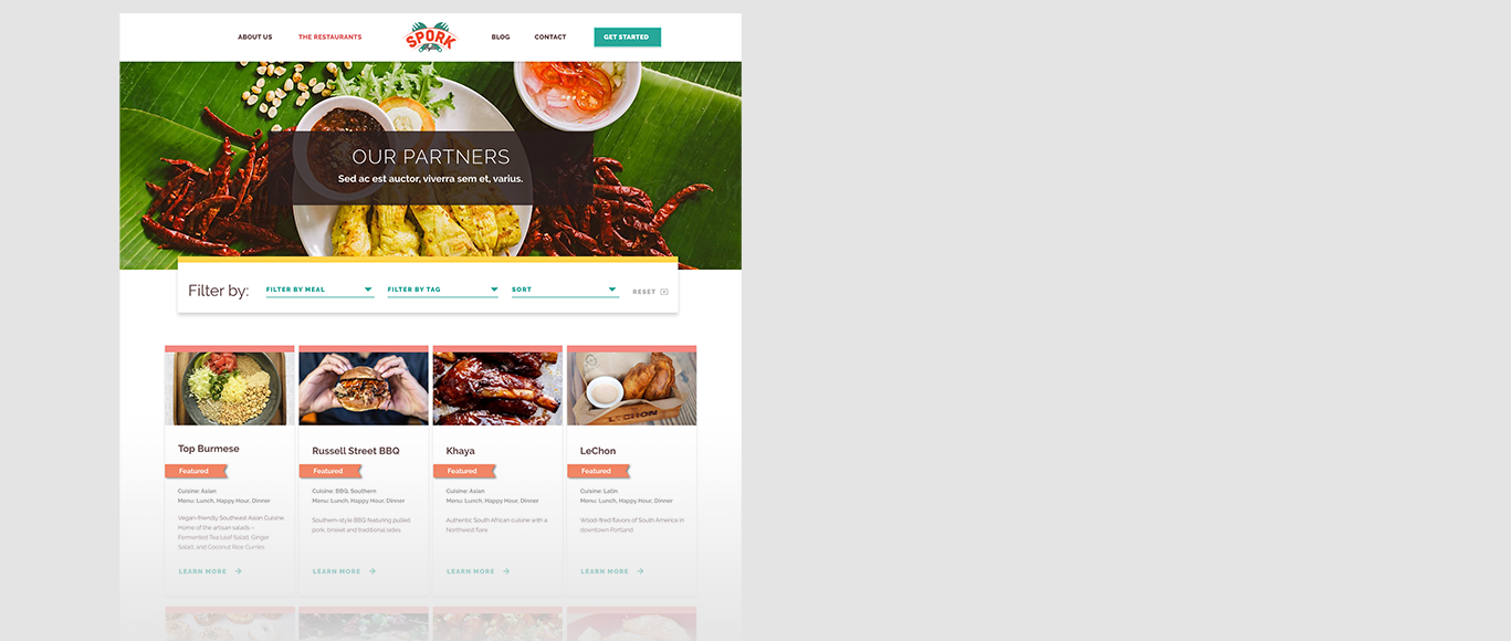
I carefully integrated elements of the existing brand to maintain a cohesive identity, while introducing a vibrant, playful color palette to infuse the platform with energy and creativity. To improve usability, I added a search-by-cuisine function that made browsing more intuitive and enjoyable. Together, these updates enhanced the user experience, aligning with Sporkbytes’ brand identity while creating an inviting, interactive environment for customers.
Inspiration
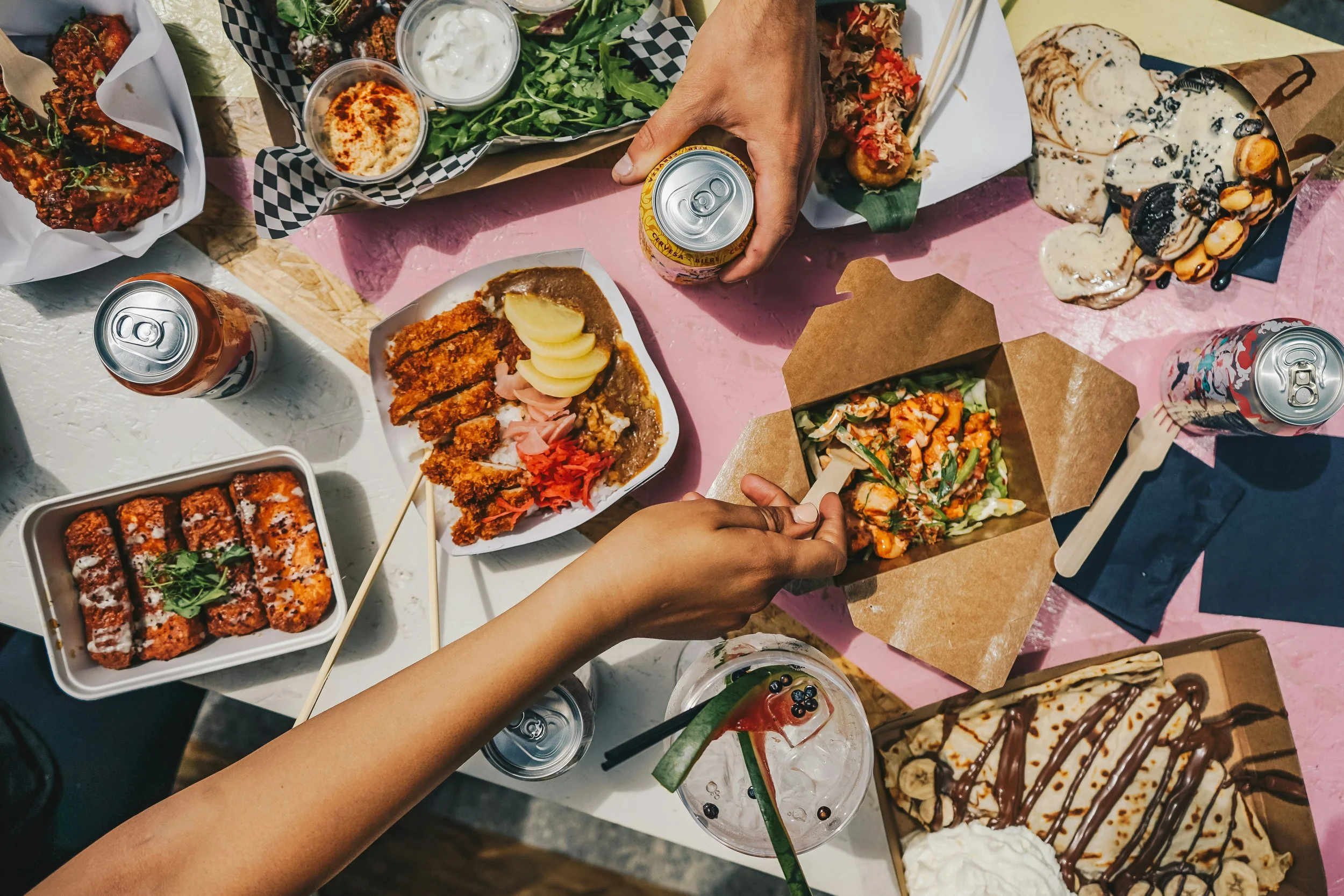
Inspired by the joy of gathering around food, the bright palette and lively visuals capture the warmth and spontaneity of a shared lunch, translating that feeling into a seamless digital experience.

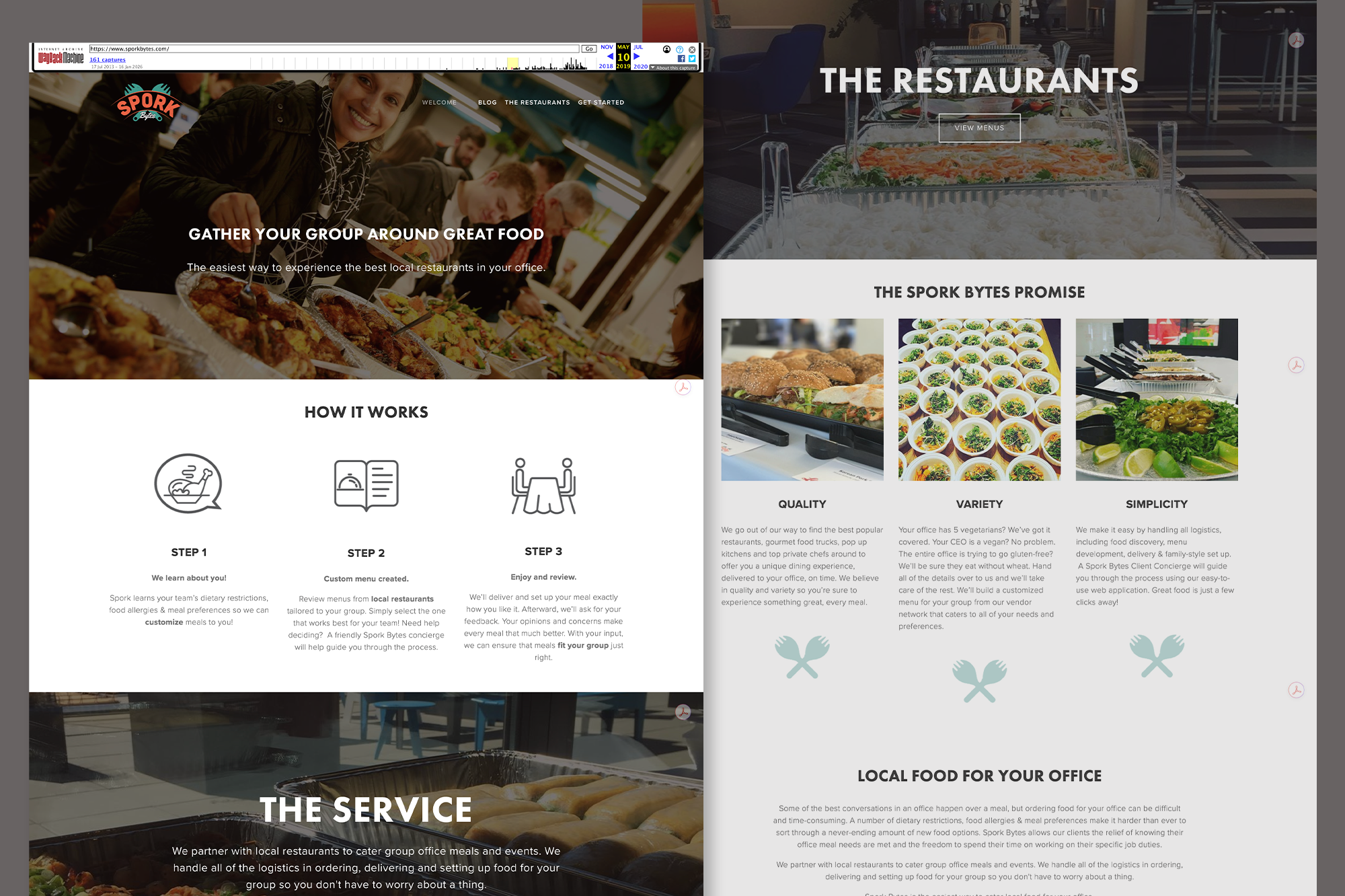
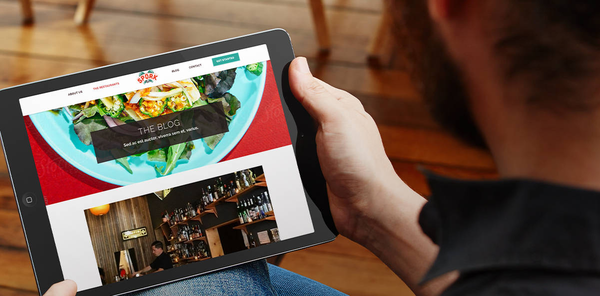
Previous Site
The old Sporkbytes website felt dark and visually inconsistent, with little brand presence or personality. Its layout also made it hard for busy office planners to quickly understand services or submit a catering request, slowing conversion.
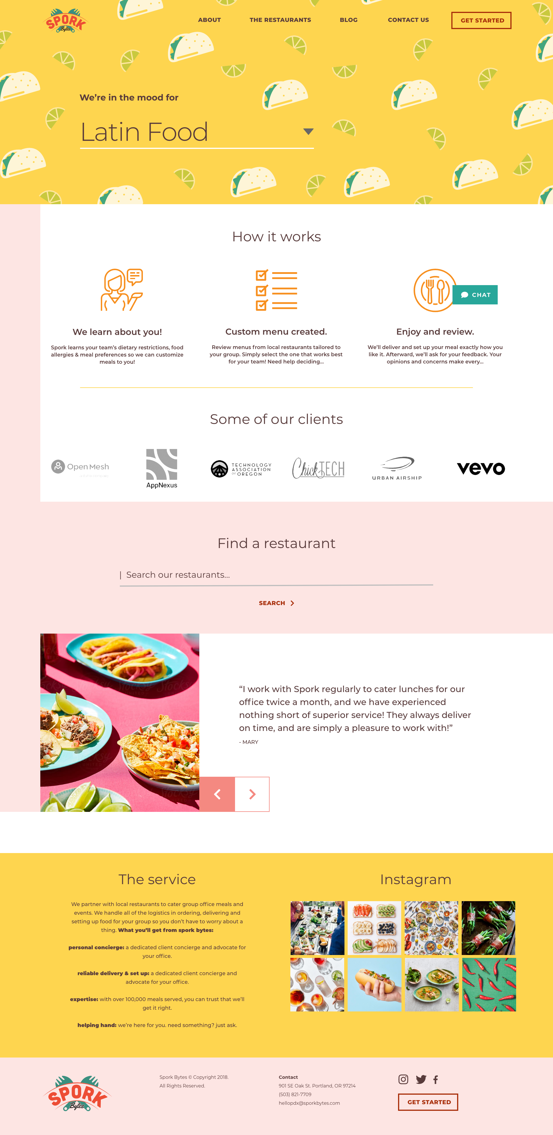
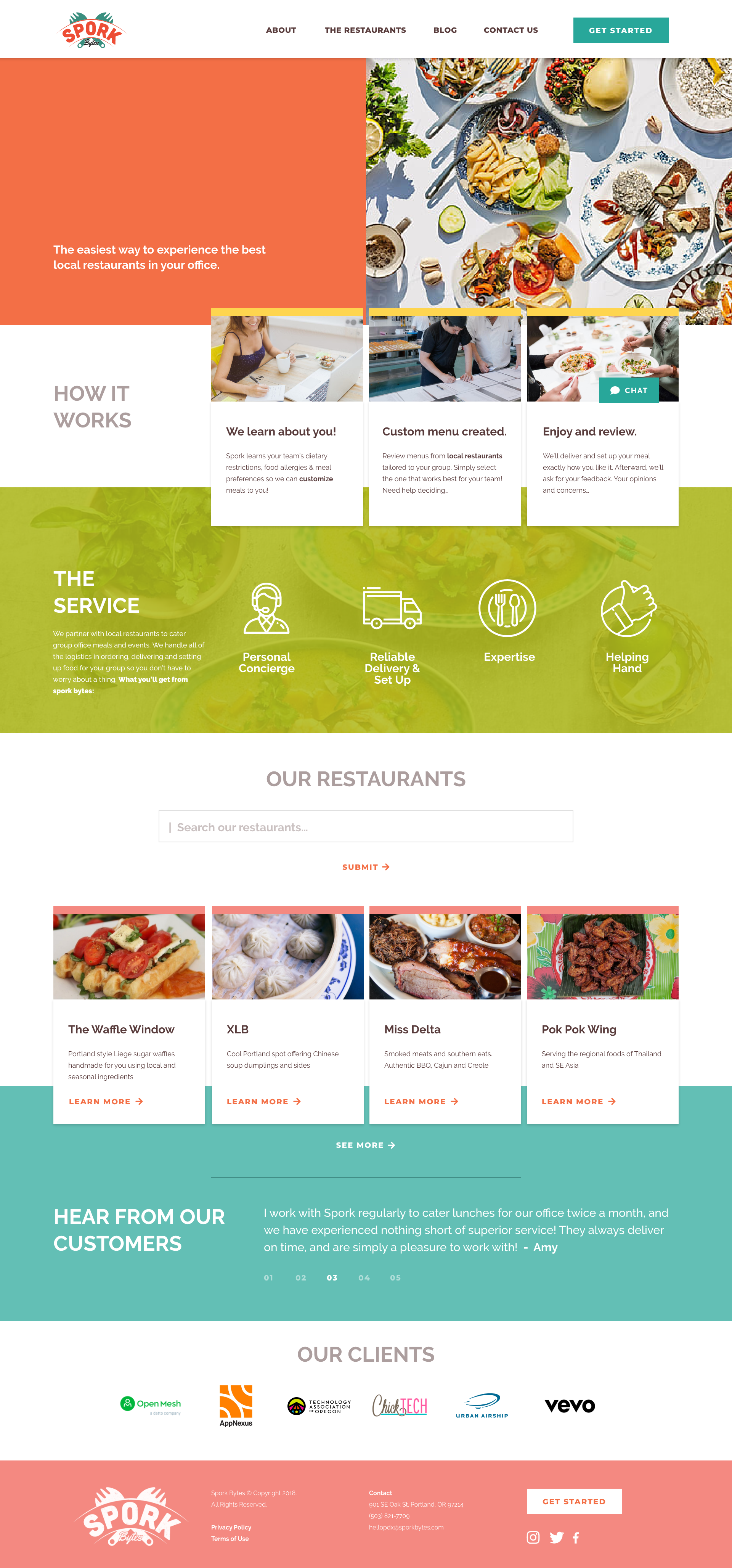
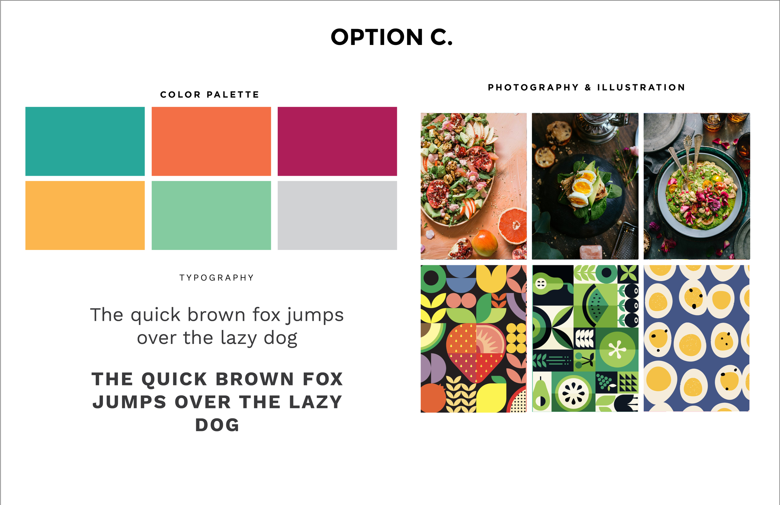
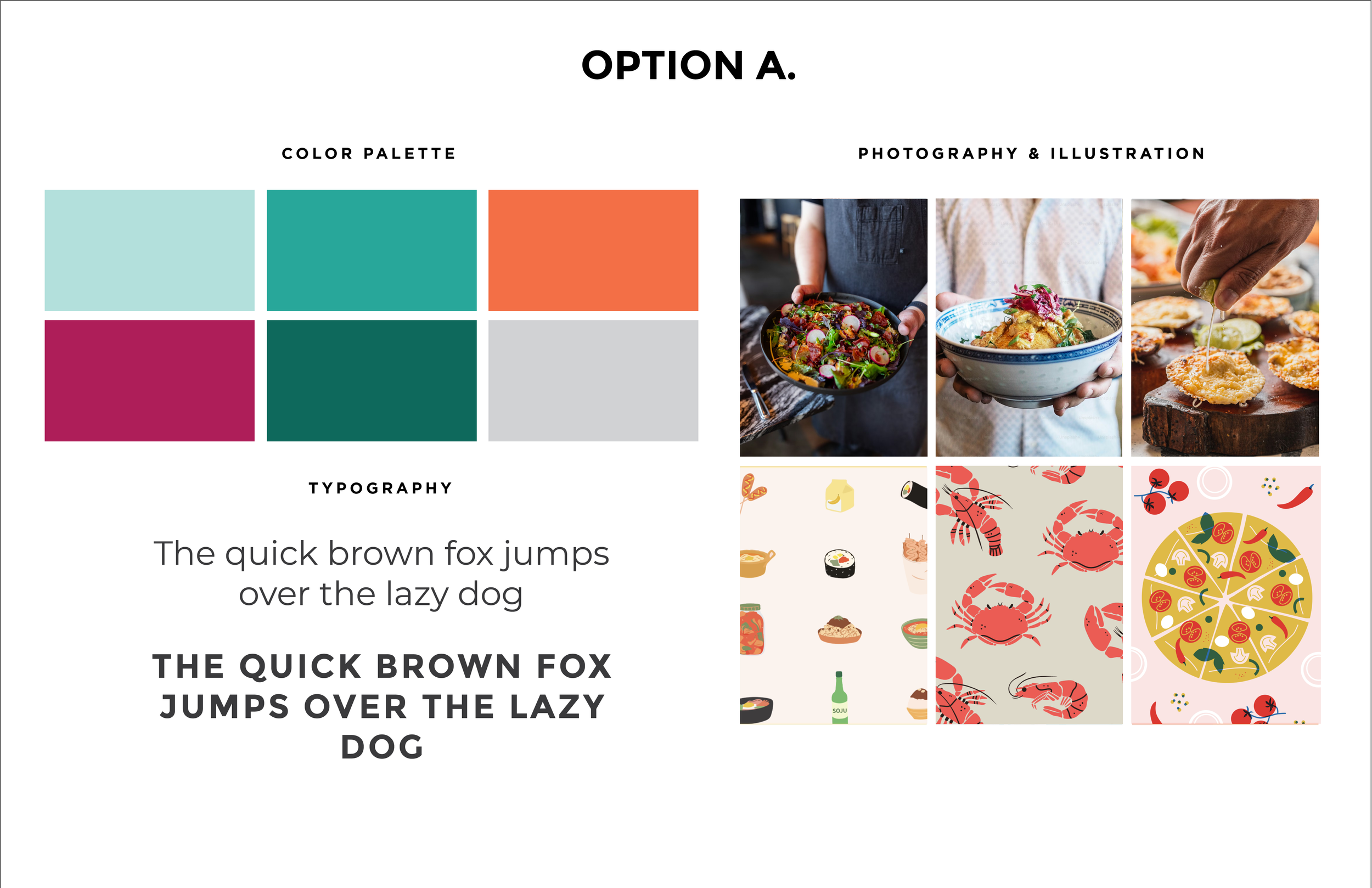
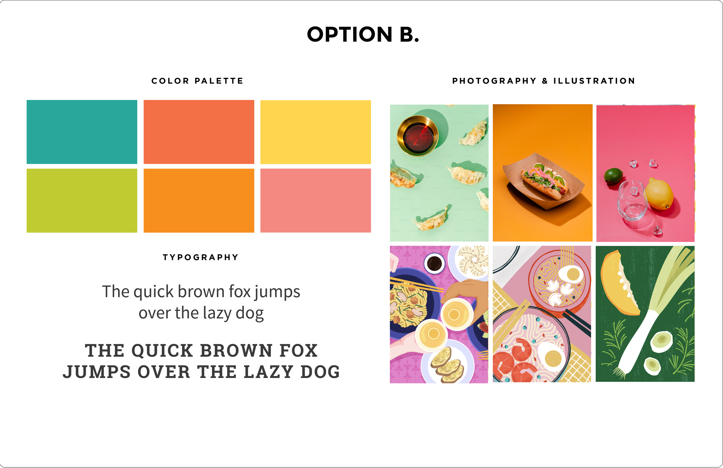
Moodboard Concepts
Moodboards were used to explore and align on the site’s visual direction, helping facilitate conversation and establish a shared understanding of the design approach early in the process.
Art Direction
Three concepts were developed to help the Sporkbytes team choose a visual direction for the site, each explored through the lens of their brand. Different photography, illustration, and UI approaches were applied to the homepage, allowing them to compare styles within the area undergoing the most significant change.
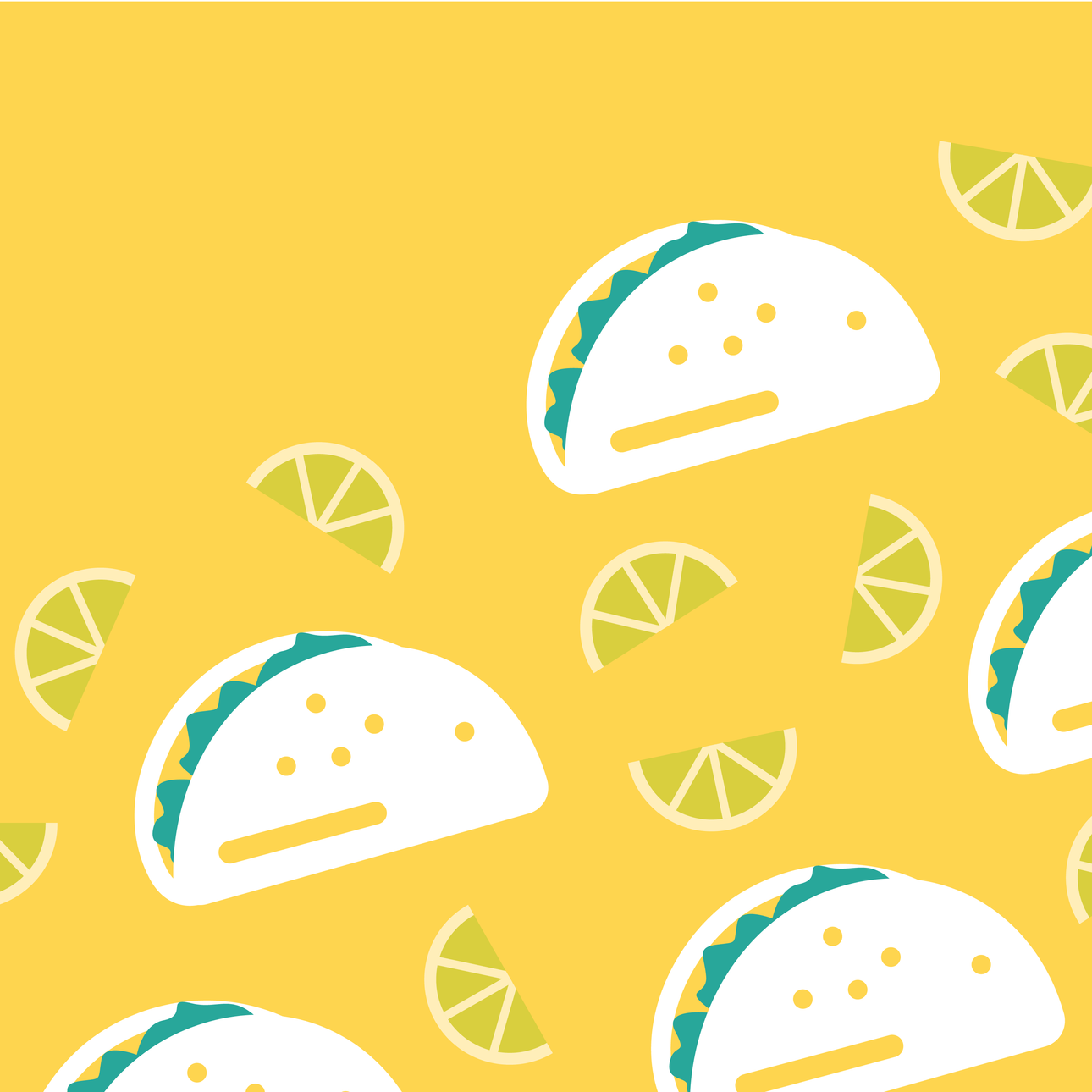
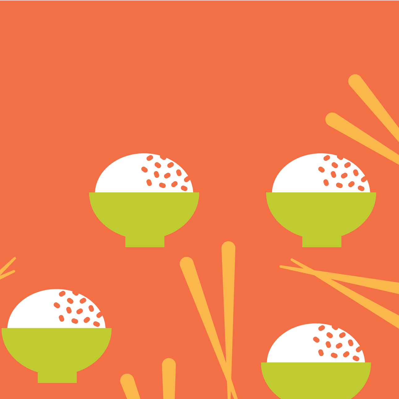
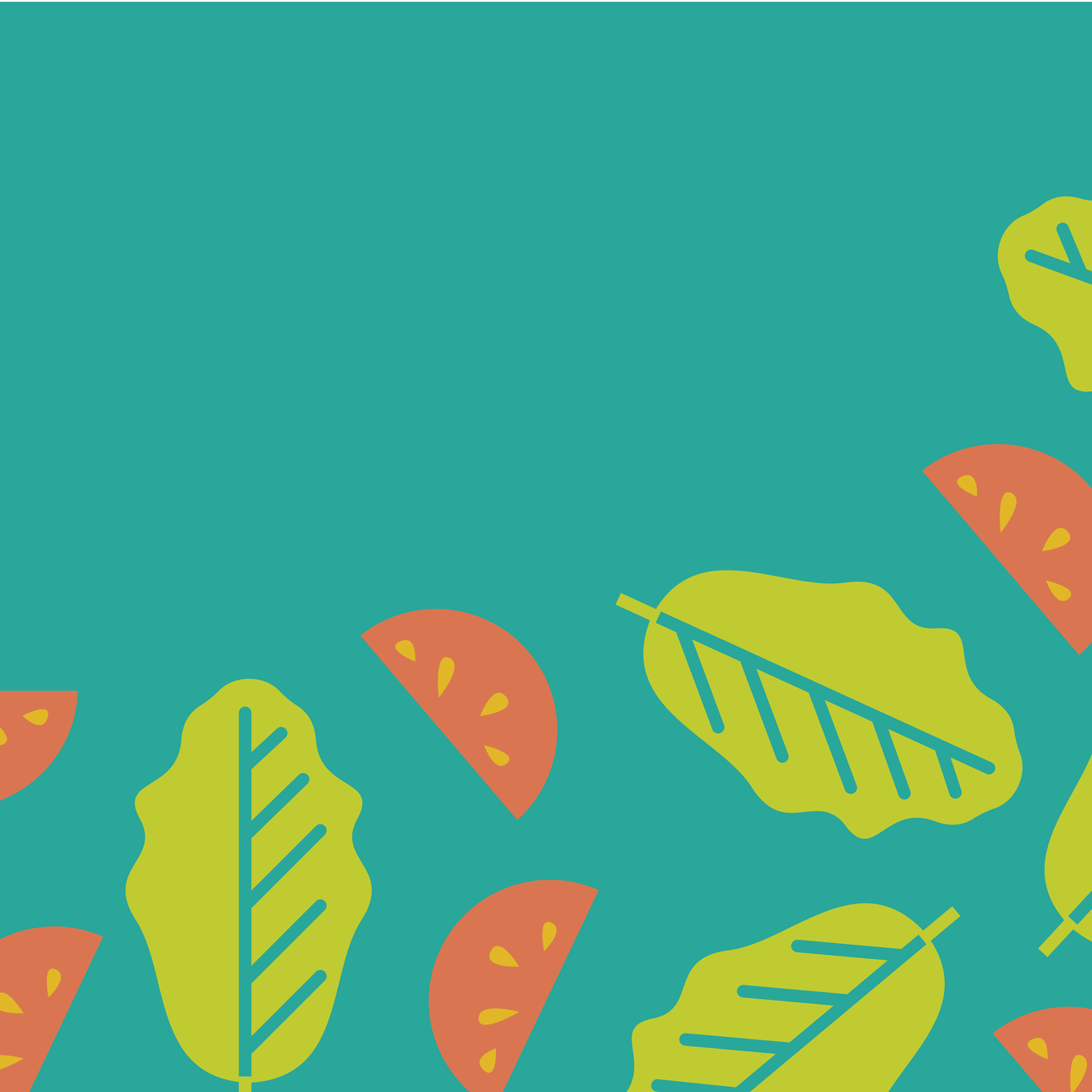
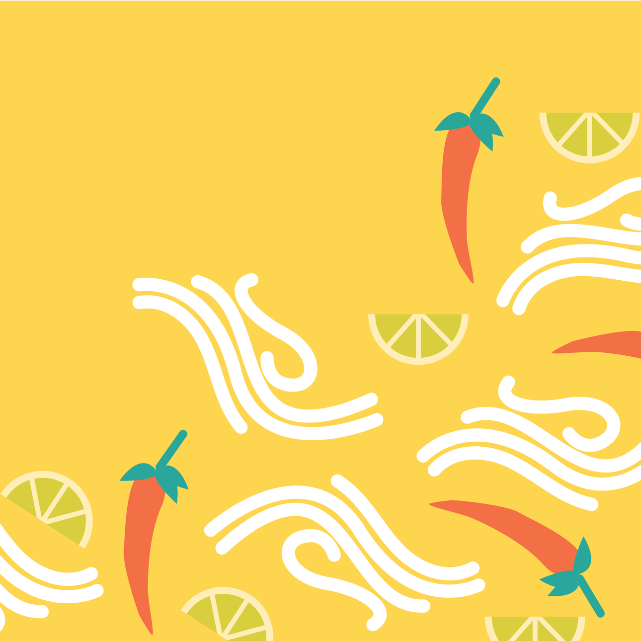
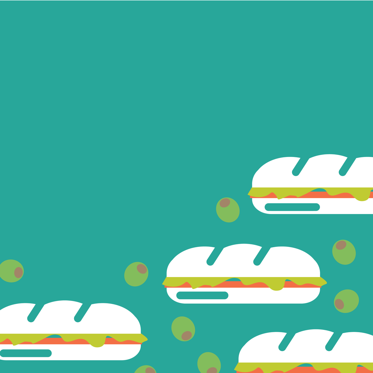
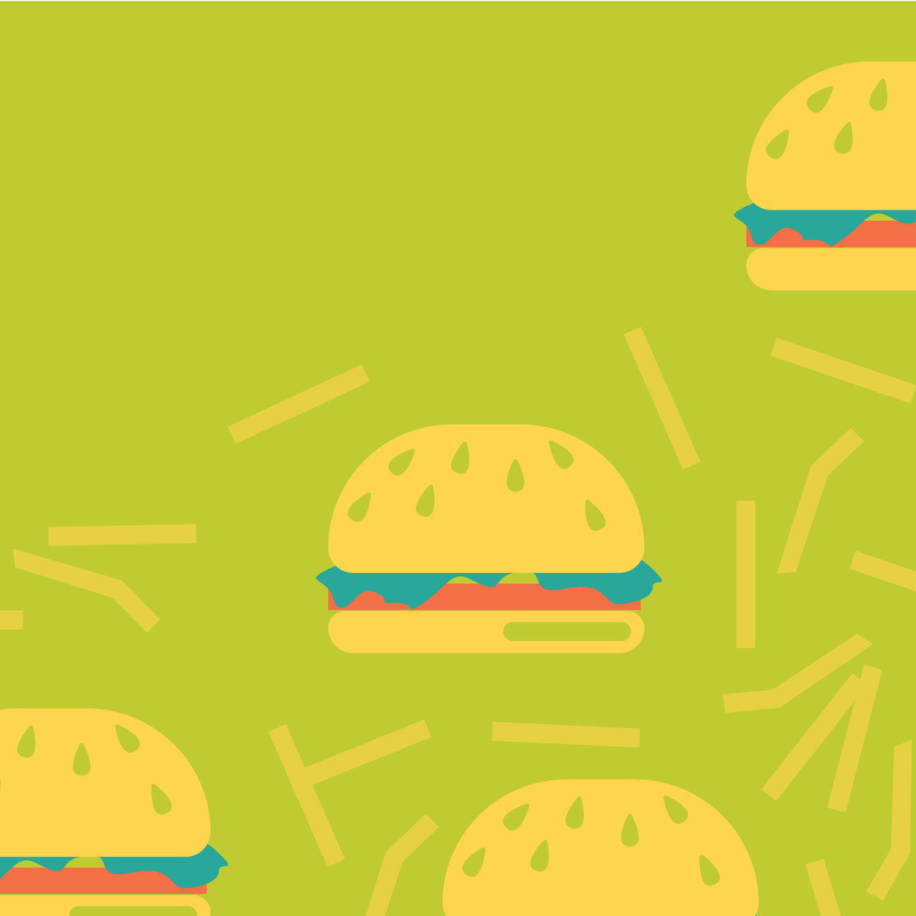
Patterns
As part of the site redesign, a set of graphic food patterns was created to represent each cuisine Sporkbytes offers. Rooted in the brand’s visual language, the patterns add a fun, vibrant layer of personality while helping differentiate menu categories.


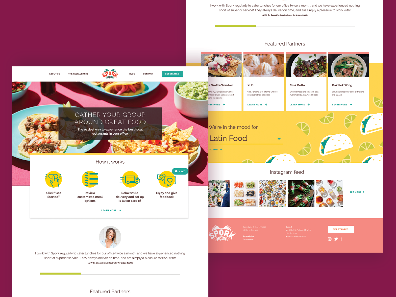
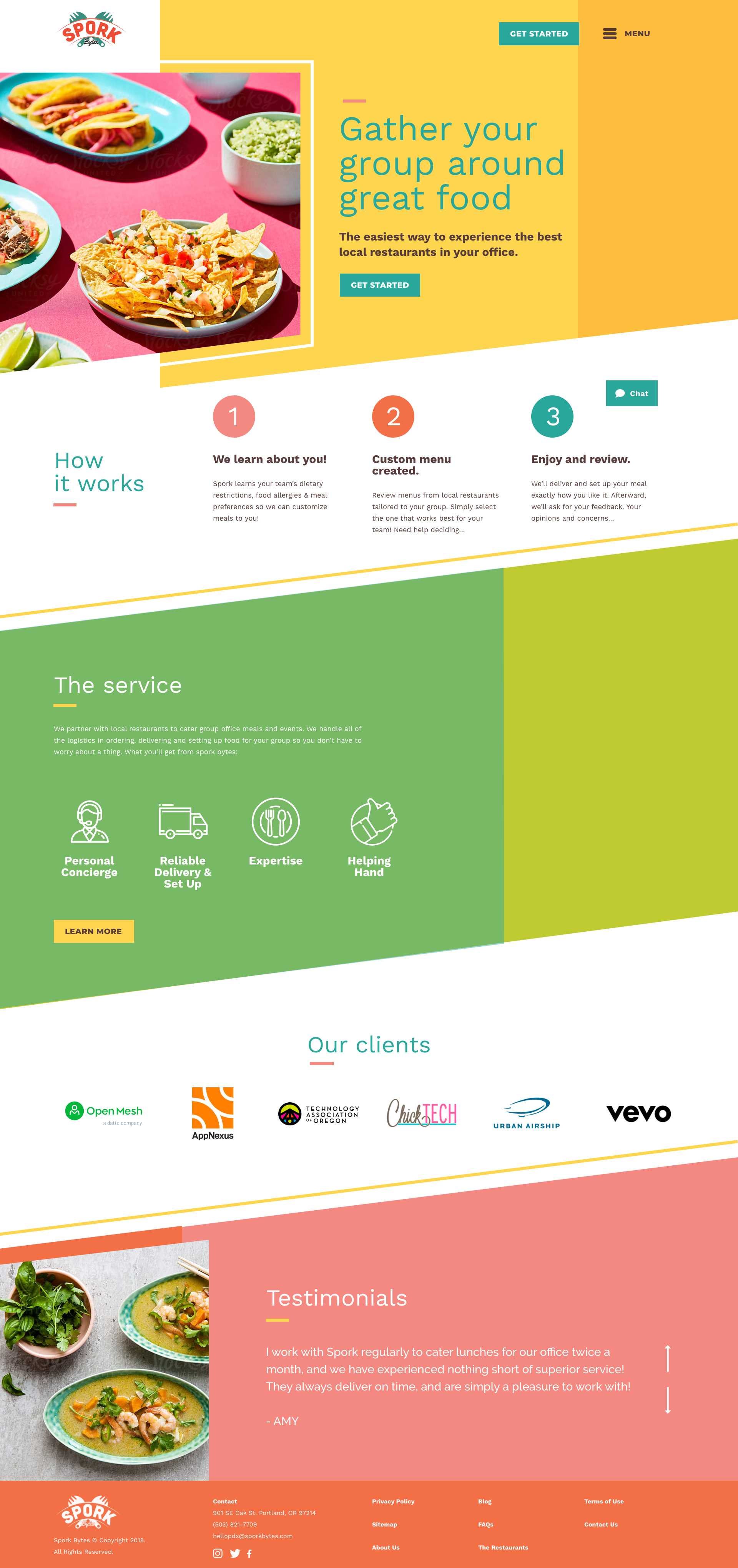
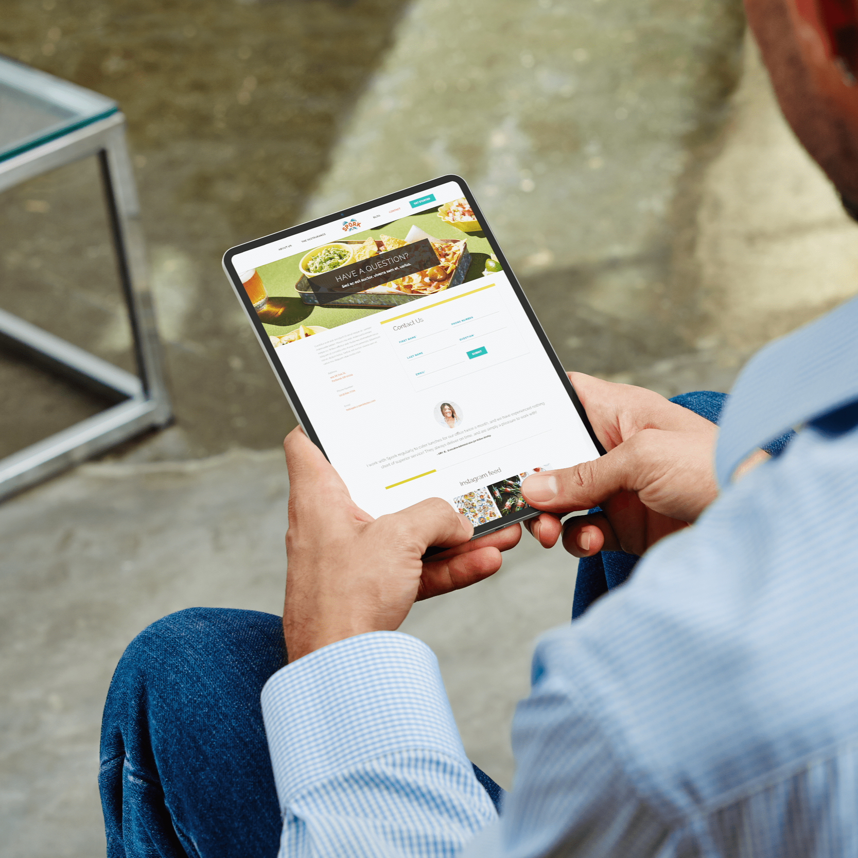
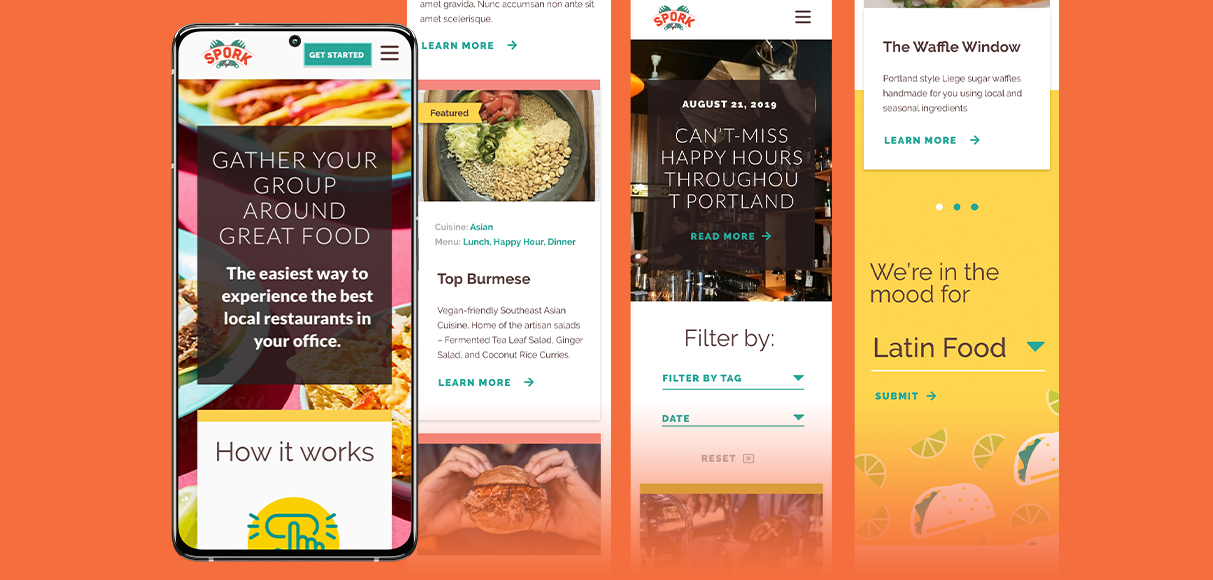
Design System

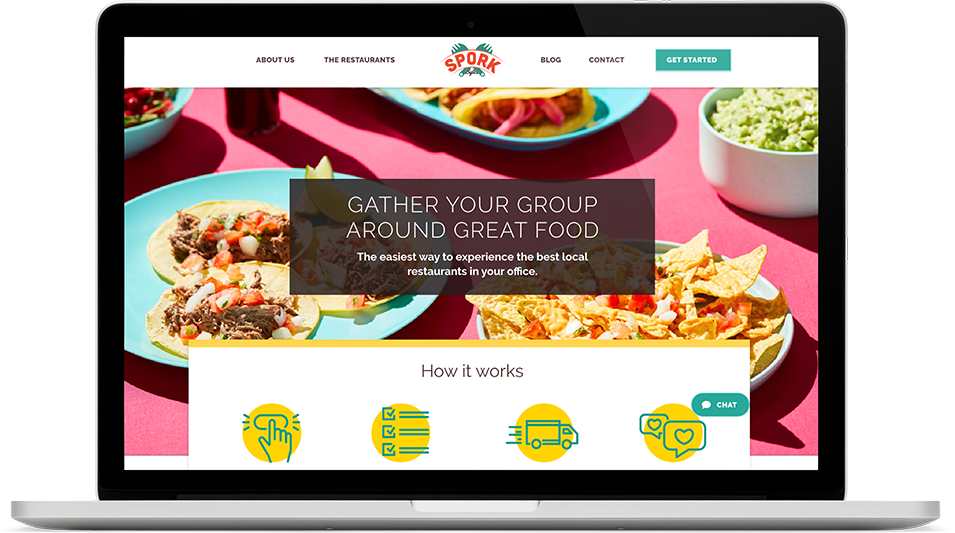
Final Design
The final site design brings the Sporkbytes brand to the forefront through bold color, energetic food photography, and clear, friendly interactions. The result balances personality with usability, helping the platform feel both fun to explore and efficient to use.
Alex Mueller
Former CTO
Sporkbytes