
Tank the Tanks Branding and Website Redesign
Impact
Rebranded Tank the Tanks and designed a new website that transformed discoverability and awareness, increasing site visits by 713% year over year and generating over 1.6K pageviews within the first year.
Role & Responsibilities
Art Director: Creative Direction, Brand Identity, Web & Social Strategy
Brief
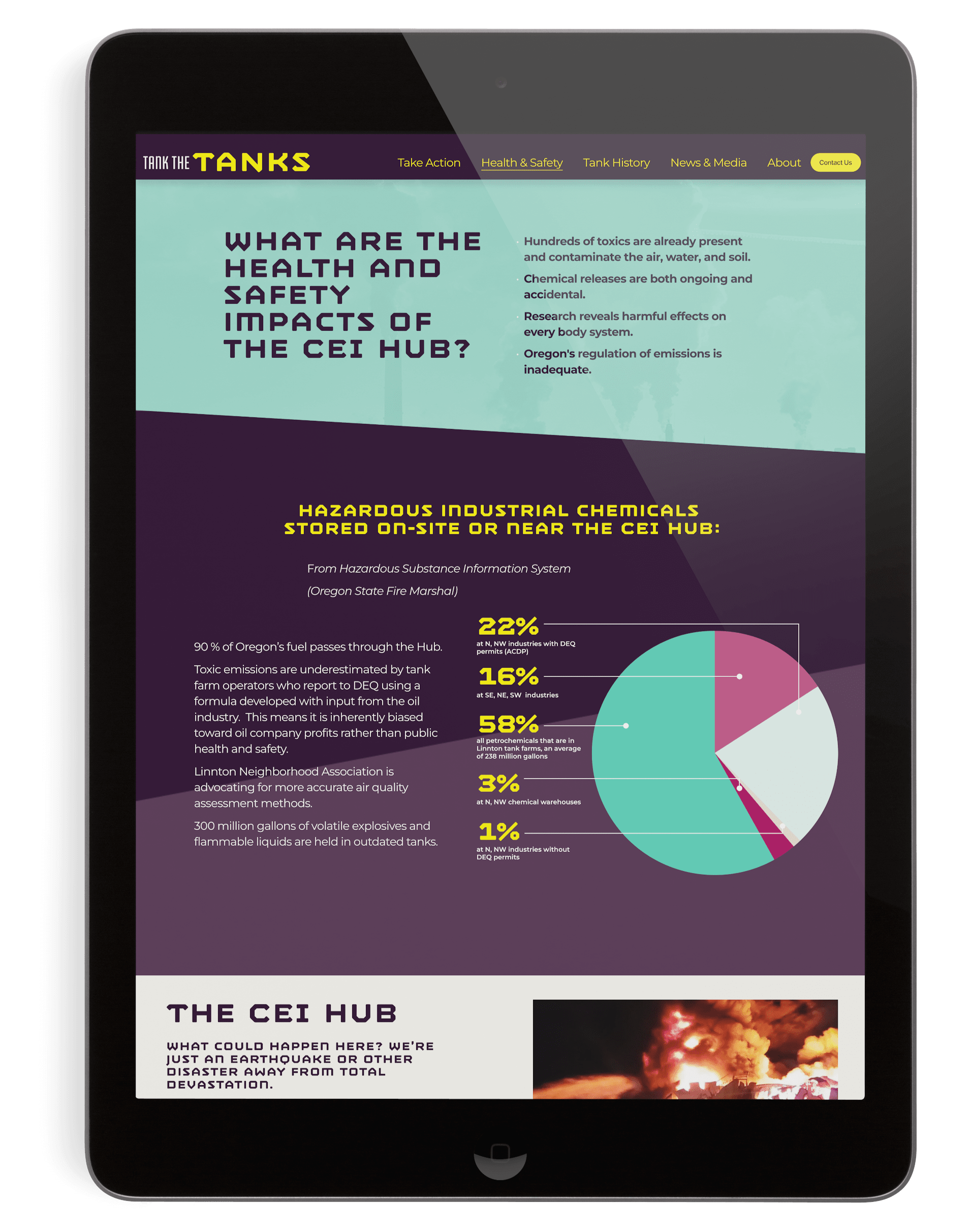
Tank the Tanks lacked a formal visual identity, making it difficult to communicate the seriousness of its mission and maintain consistency across digital channels.
Solution
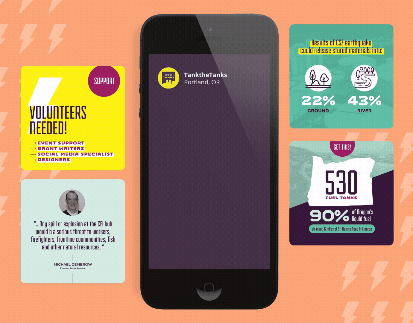
Established a cohesive brand system spanning a new logo, website, and social presence, balancing clarity with urgency while fostering a community-oriented voice. The platform helped transform awareness and engagement, increasing annual traffic by 713% and growing unique visitors by 931%, creating a shared visual language that supports connection and action around the organization’s mission.


Inspiration
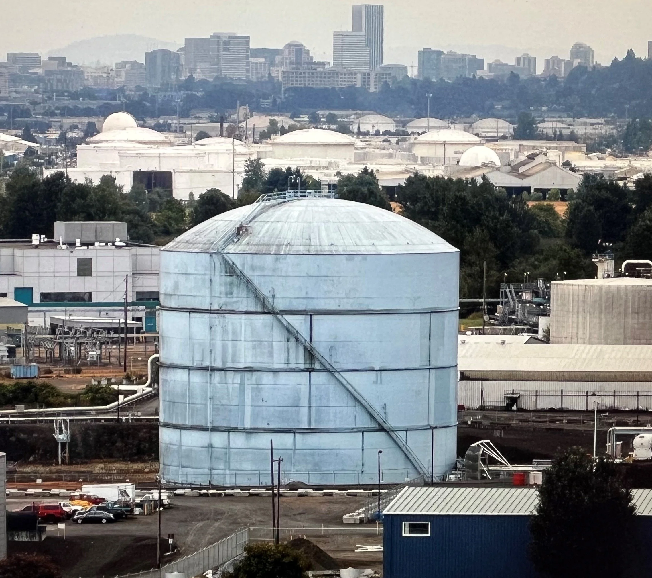
Bold signage and the distinct colors and landscapes of the Pacific Northwest informed a brand language rooted in place, urgency, and collective action.
Initial concepts

Final brand
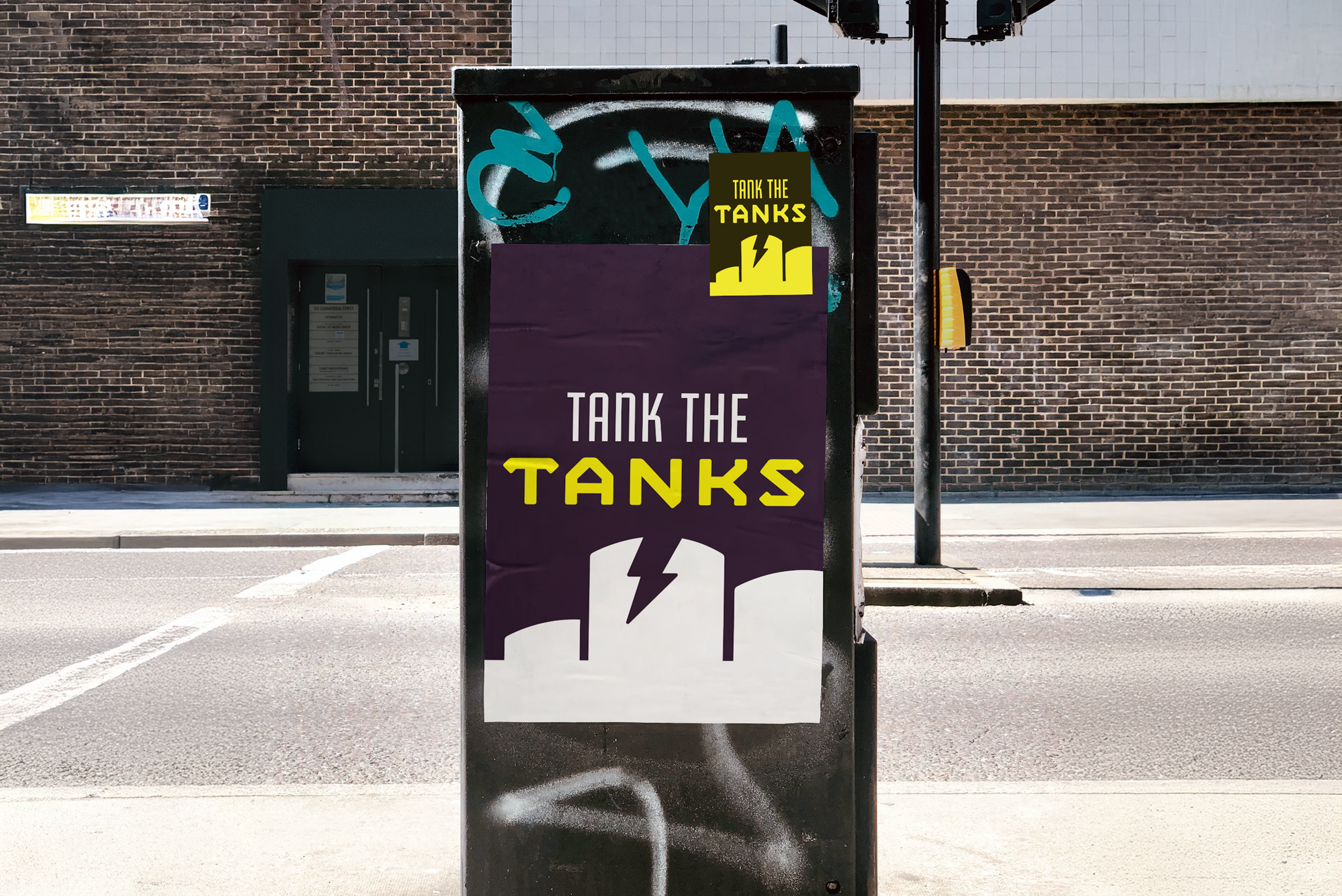
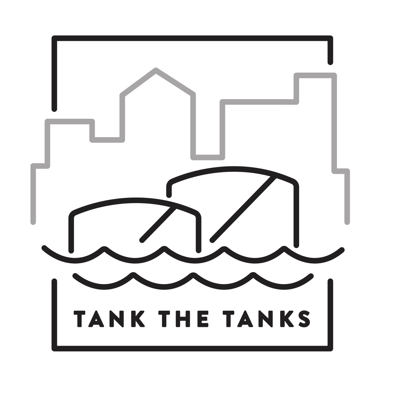
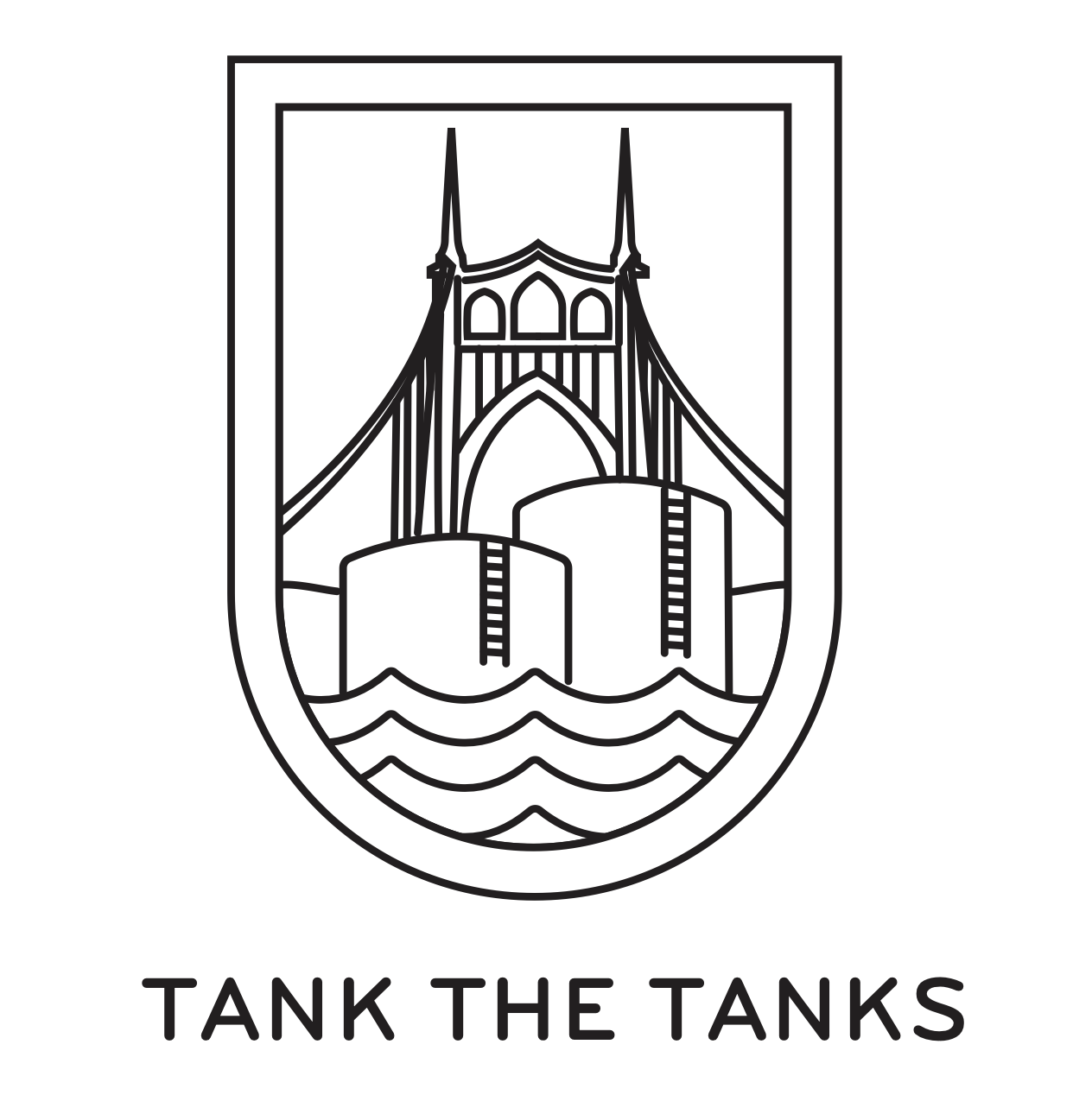
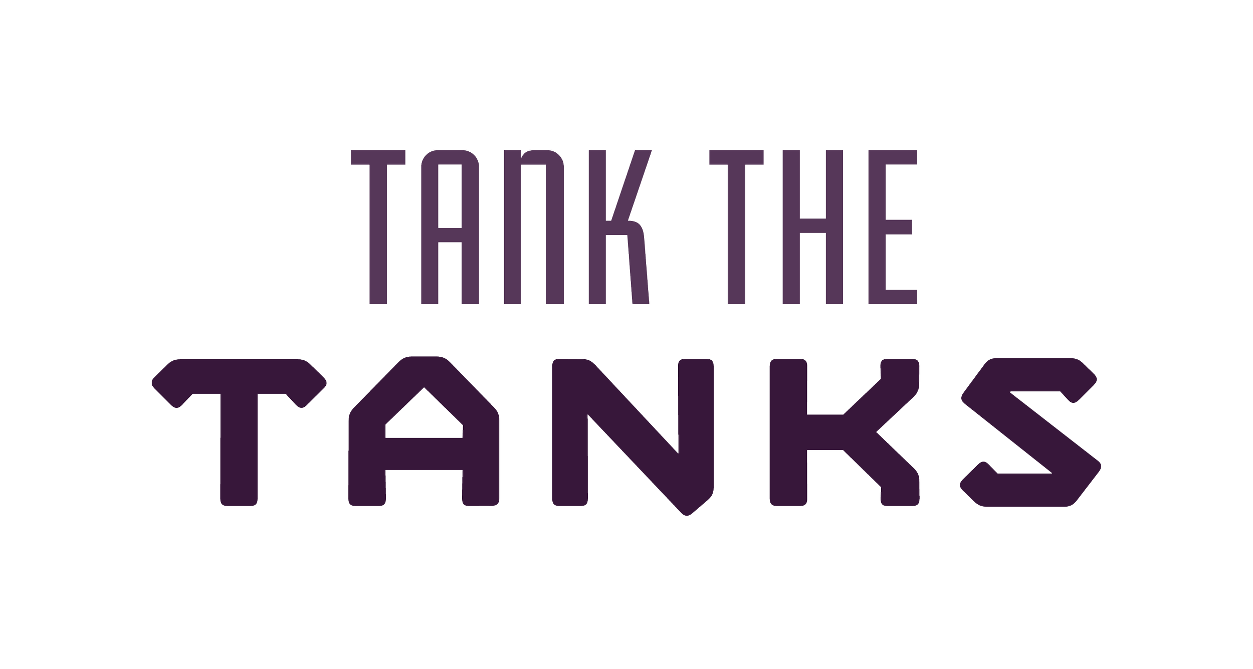
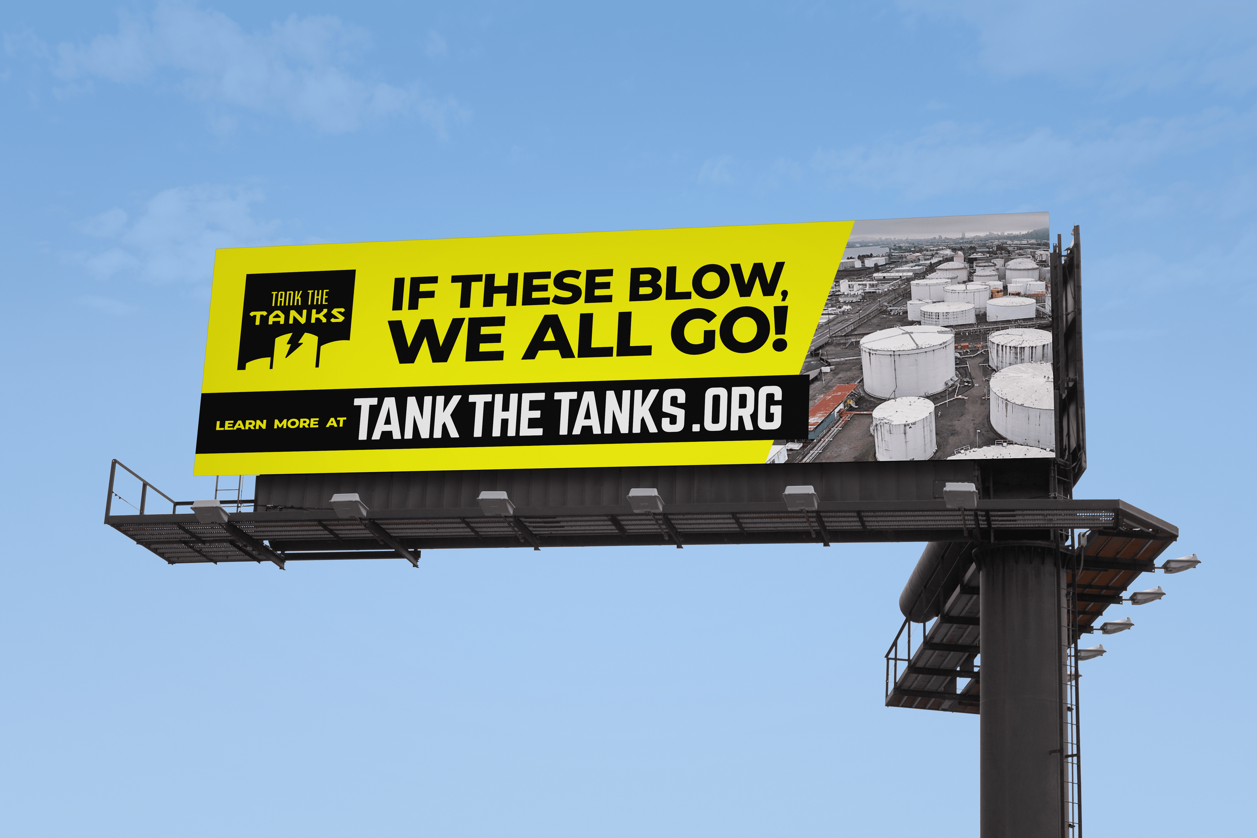
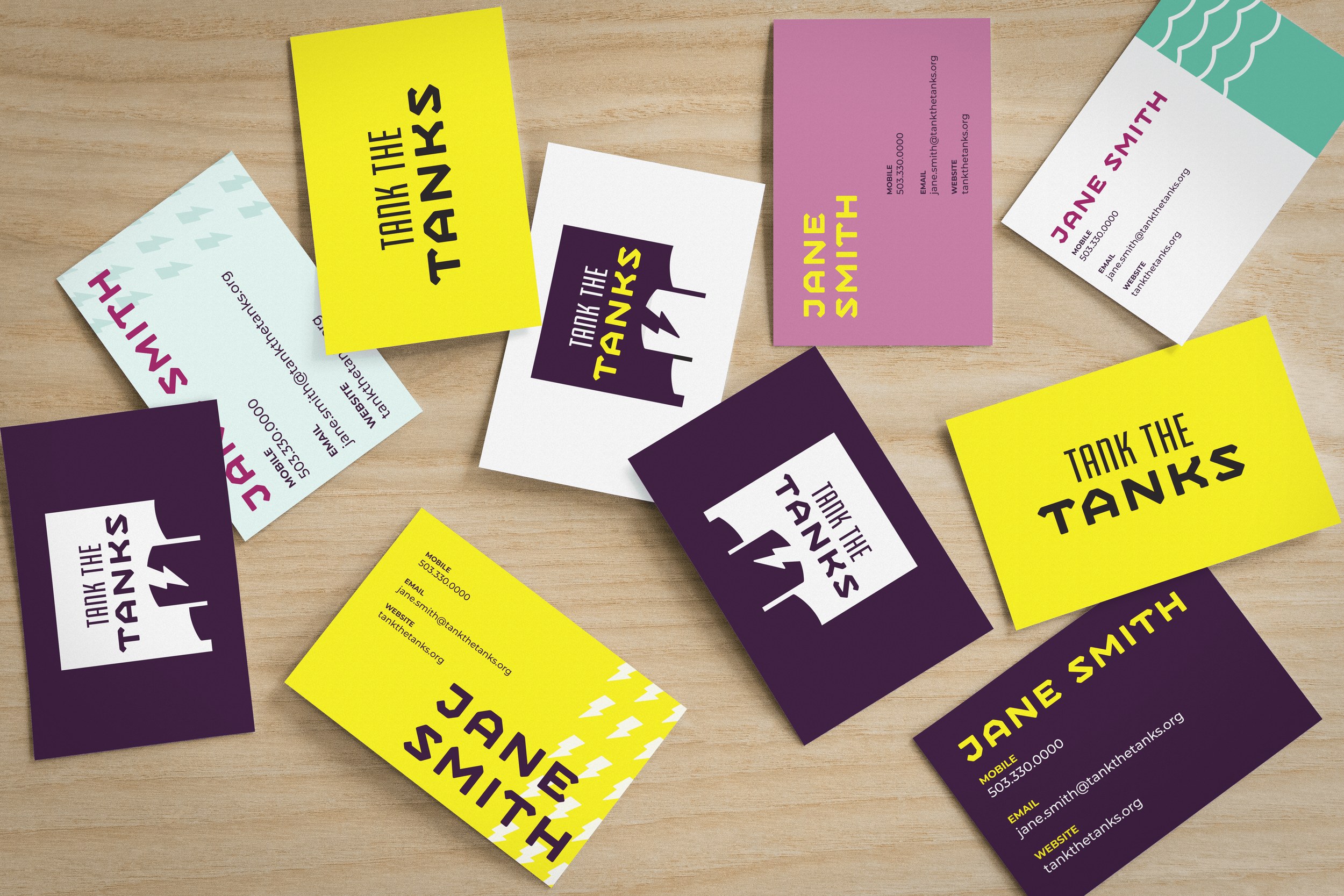
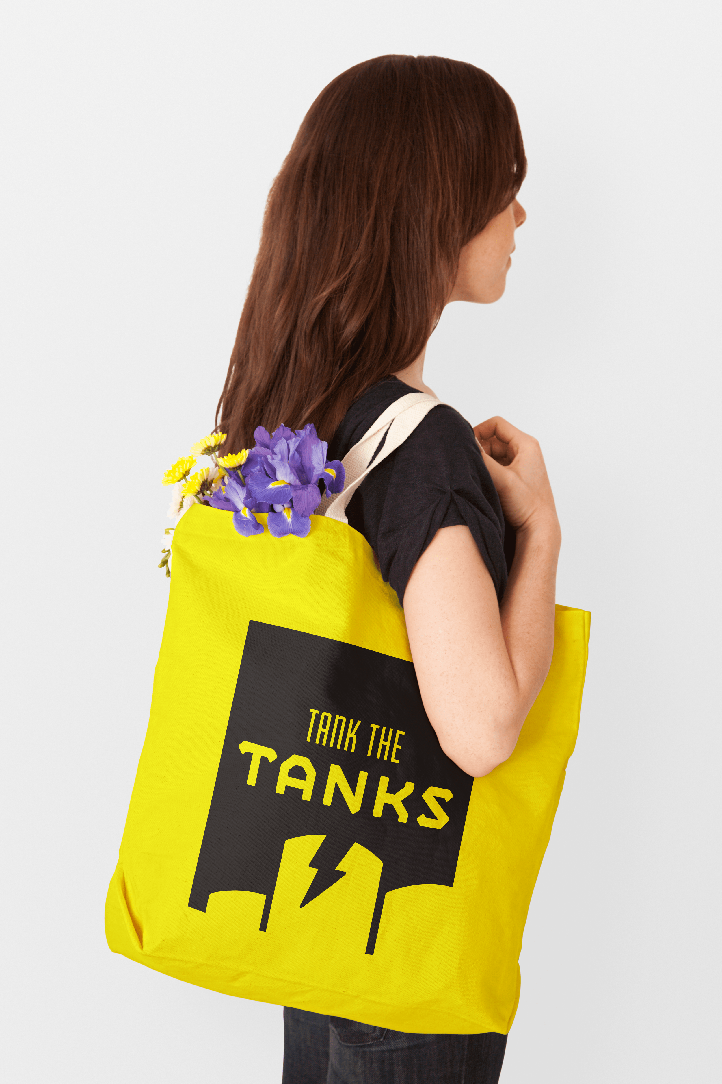
The Tank the Tanks identity centers on a clear, purposeful mark: a minimal tank farm illustration paired with a lightning bolt, signaling both danger and a call to action for awareness and change. A supporting wordmark provides a flexible alternative in spaces where simplicity or readability is needed, ensuring the organization remains recognizable across varied applications. Both marks are designed to work in full color, black, or white, allowing them to adapt across varied applications and photography while maintaining strong contrast and legibility.
Minimum Size:
To maintain legibility and consistent brand representation, it is essential that the logo maintains a minimum height of 50px, while the wordmark should not be reduced to a height below 30px.

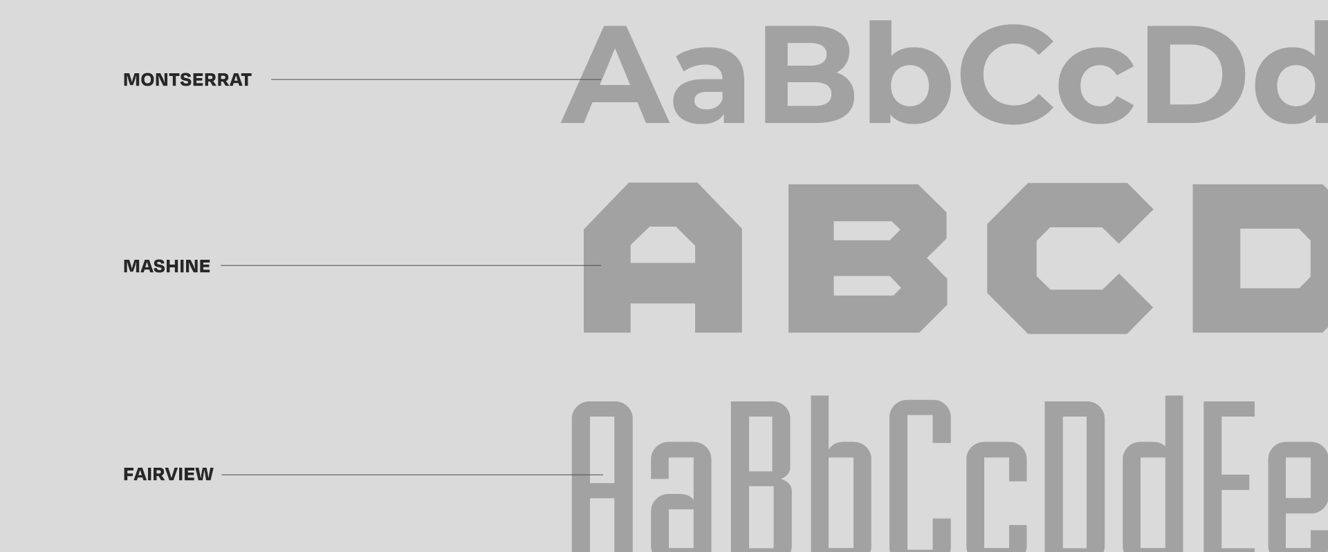
Color Palette & Typography
Driftwood
Driftwood 50%
Driftwood 25%
Caution Yellow
Caution Yellow 50%
Caution Yellow 25%
Amethyst
Amethyst 50%
Amethyst 25%
Berry
Berry 50%
Berry 25%
St. Johns Green
St. Johns Green 50%
St. Johns Green 25%
Accessibility
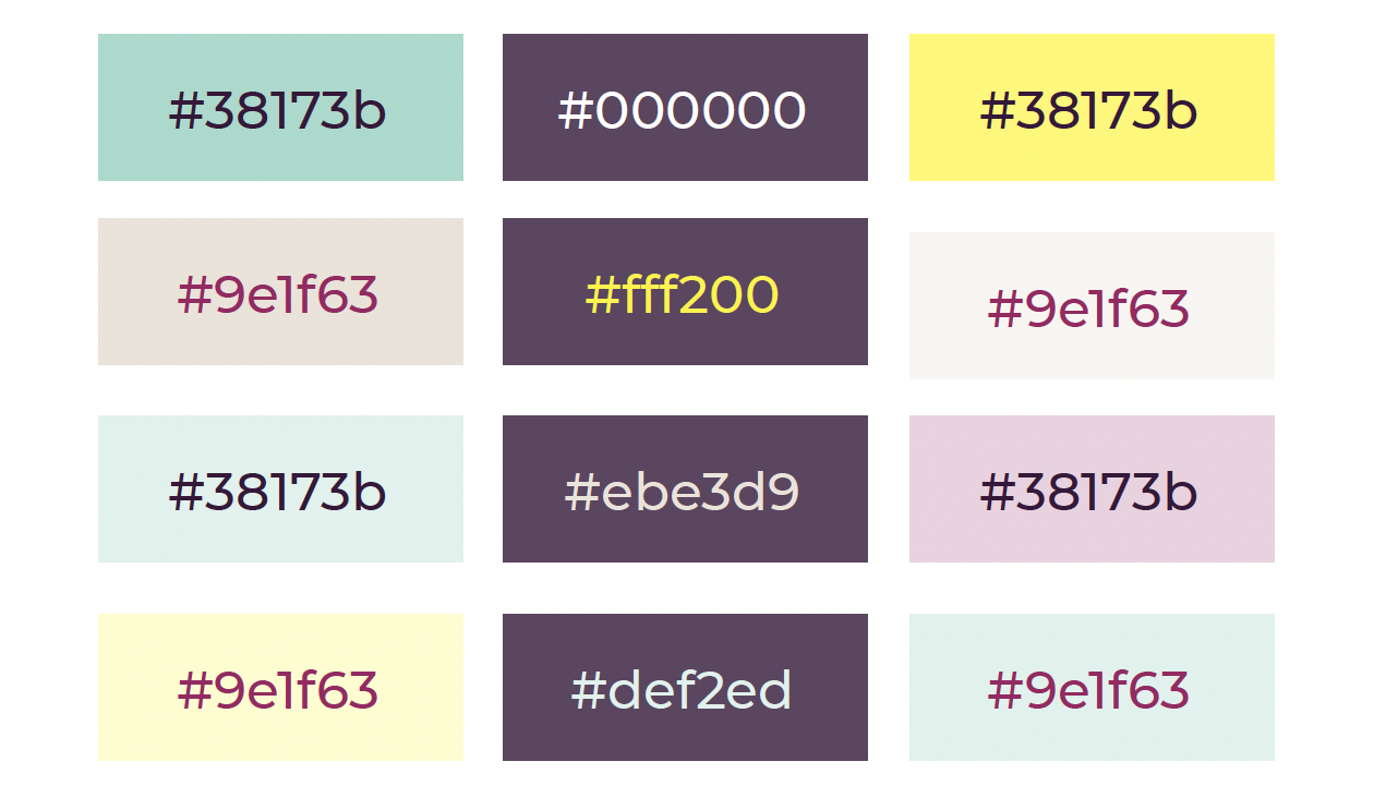
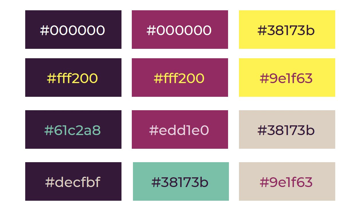
AA: Graphical Elements and UI
Color plays an important role in Tank the Tanks’ commitment to accessibility and inclusivity. Approved color combinations meet WCAG AA standards for text and interface elements, helping ensure the brand is both visually engaging and easy to read. Across web, print, and digital communications, these choices reduce barriers to understanding and participation.
Graphic Elements & Photo Treatments
Photography is treated in duotone using the core palette to create cohesion across materials. Layered wave and lightning patterns add energy and symbolism, and angular compositions with high-contrast color pairings convey both disruption and action.


Application
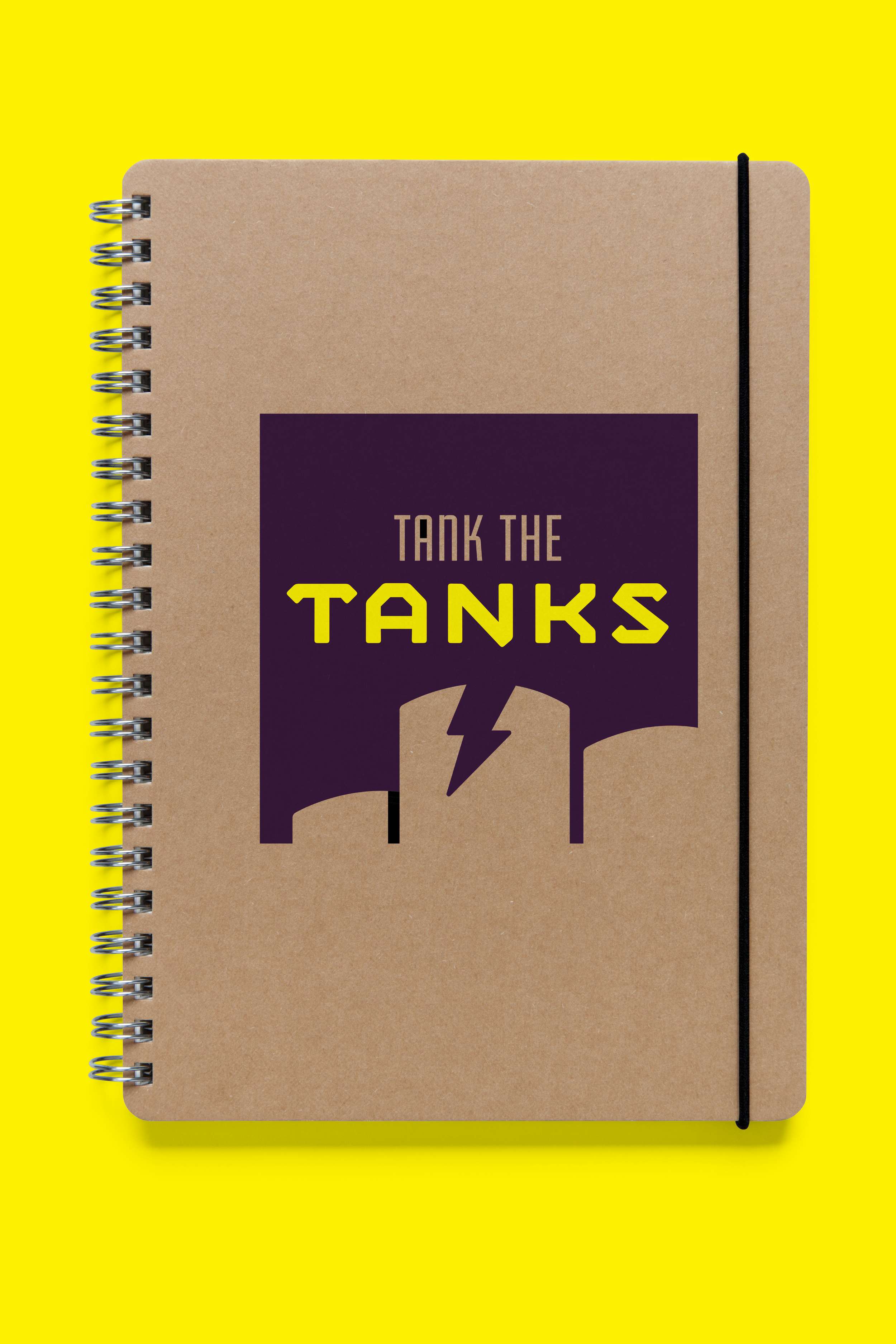
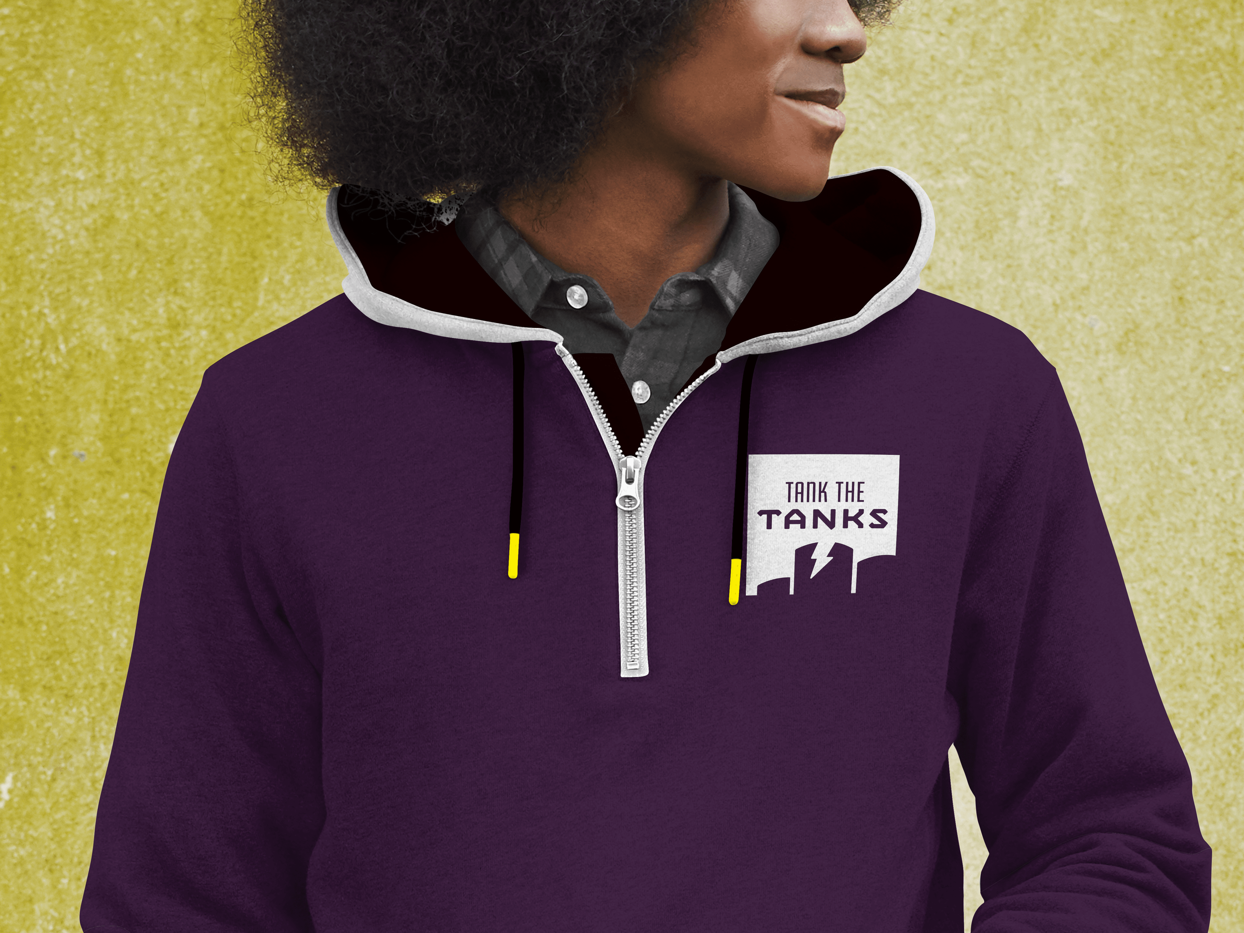
I directed the creation of the Tank the Tanks identity in close collaboration with the organization, grounding decisions in real-world applications rather than designing in isolation. At the end of the branding process came the fun part: developing grassroots-friendly swag ideas to help the community share and spread the message.
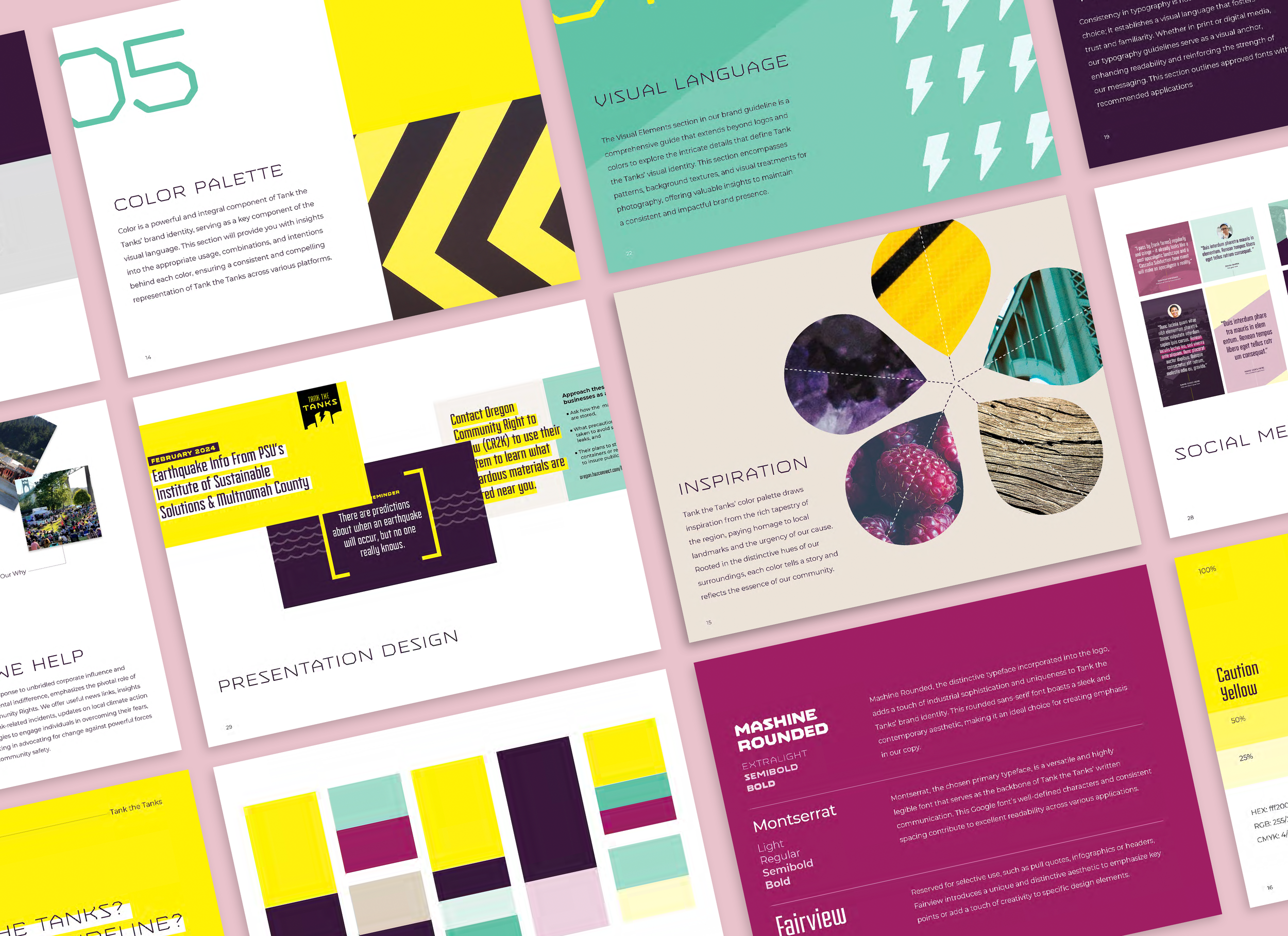
Brand guidelines
The Tank the Tanks brand guidelines are designed as a practical tool the organization can actively use, not just reference. Built to work seamlessly within Canva, the system enables the team to quickly create materials across everyday touchpoints while staying on brand. It also gives partners a clear framework they can easily follow, helping the organization communicate consistently and confidently wherever its message appears.
Laurel Viles
Team Member
Tank the Tanks