
NWEA Visual Language
Impact
Transformed NWEA’s visual identity across platforms—supporting brand cohesion and contributing to over $26 million in marketing revenue.


Brief
NWEA needed to be seen as one unified organization—partnering across the system to support educators and leaders at every level. This was an opportunity to harness its core strengths and create a cohesive brand experience, bringing products and services together under a single, powerful visual language.
Solution
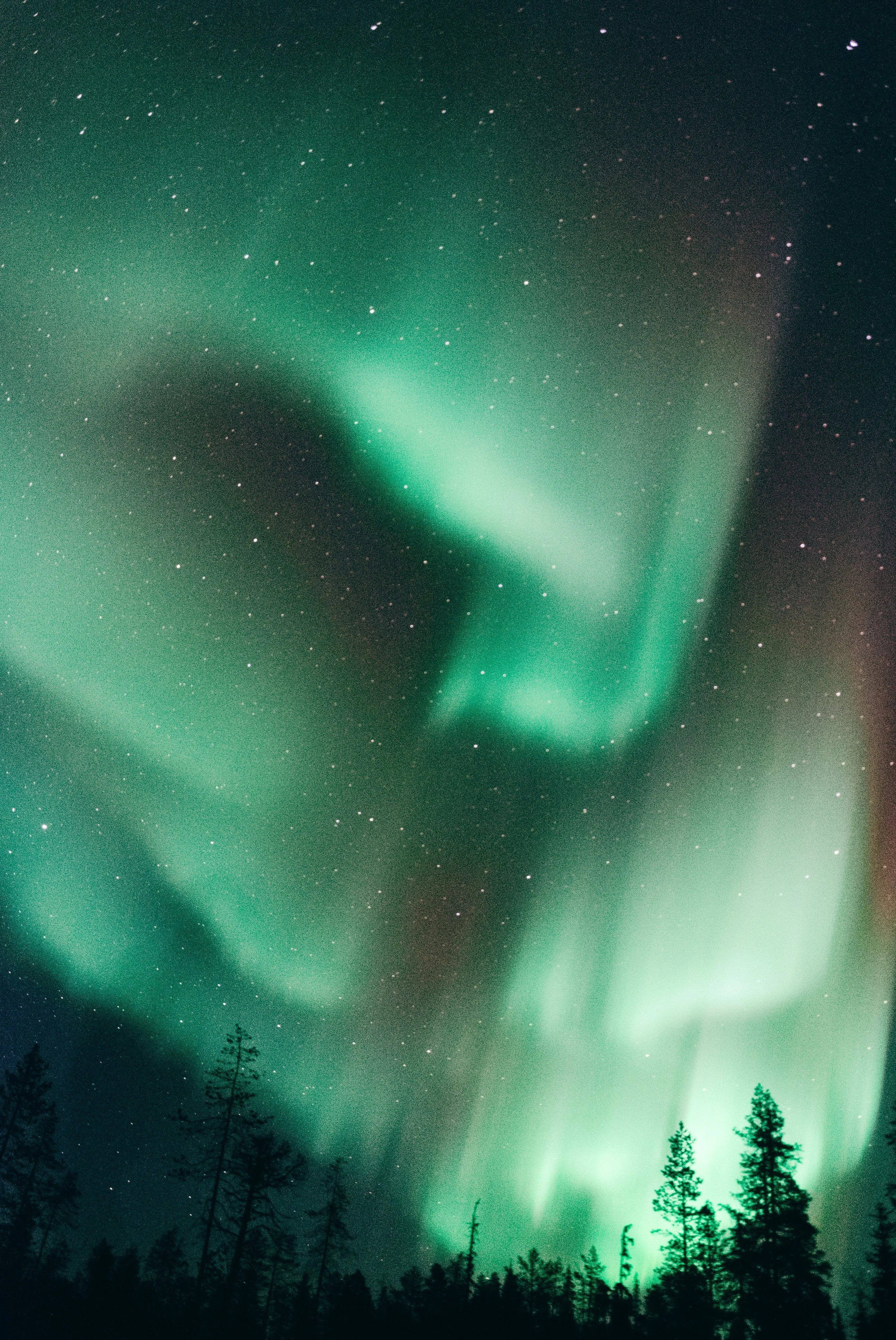
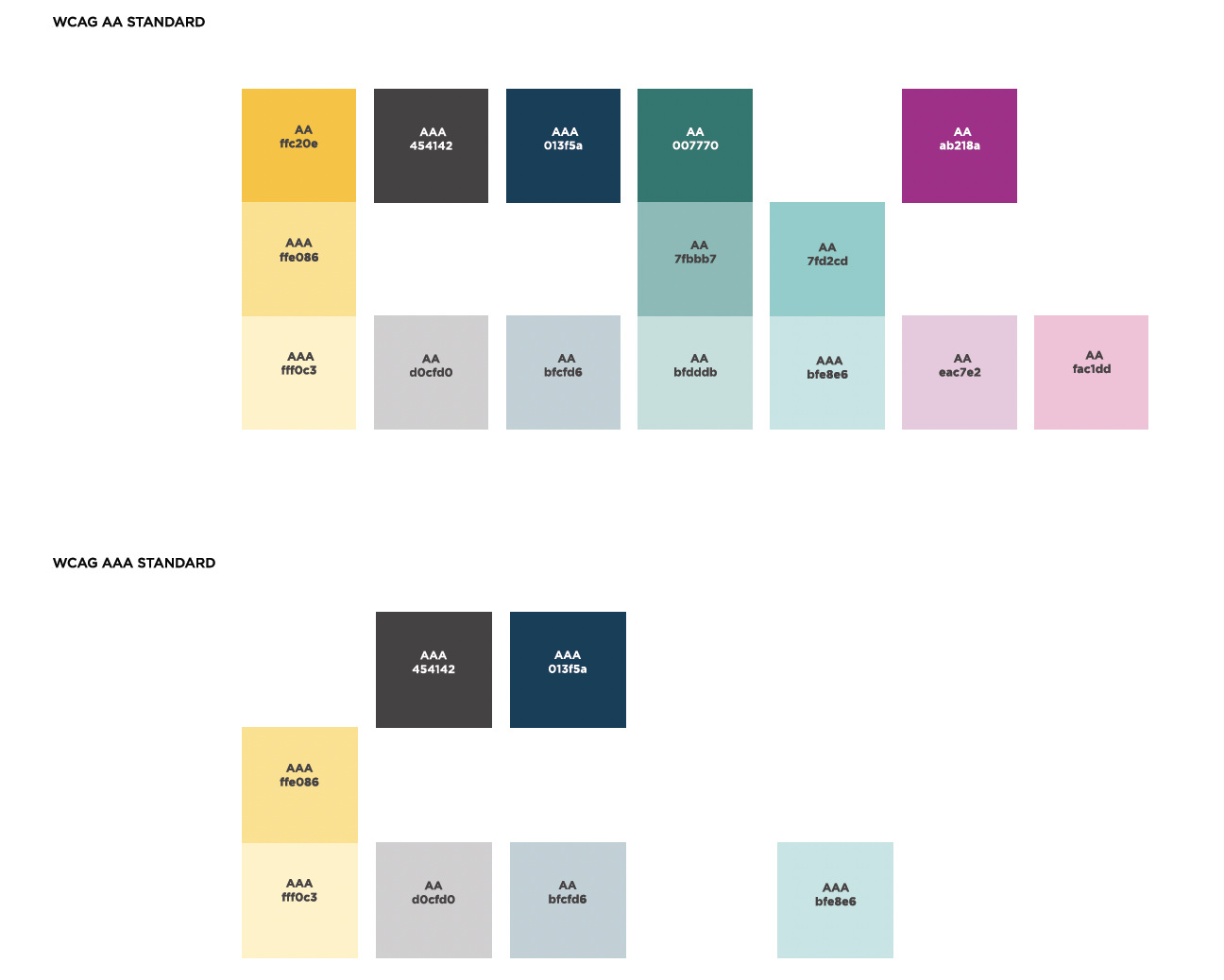
As we shifted to solutions-based storytelling with tailored partner experiences, we needed a visual language that celebrated individuality. Inspired by the Aurora Borealis—its vivid, ever-changing gradients—we expanded NWEA’s palette with richer primary tones, a flexible secondary palette, and accessible color variations. This system empowered teams across the organization to create dynamic, inclusive visuals at both AA and AAA accessibility standards.

Inspiration
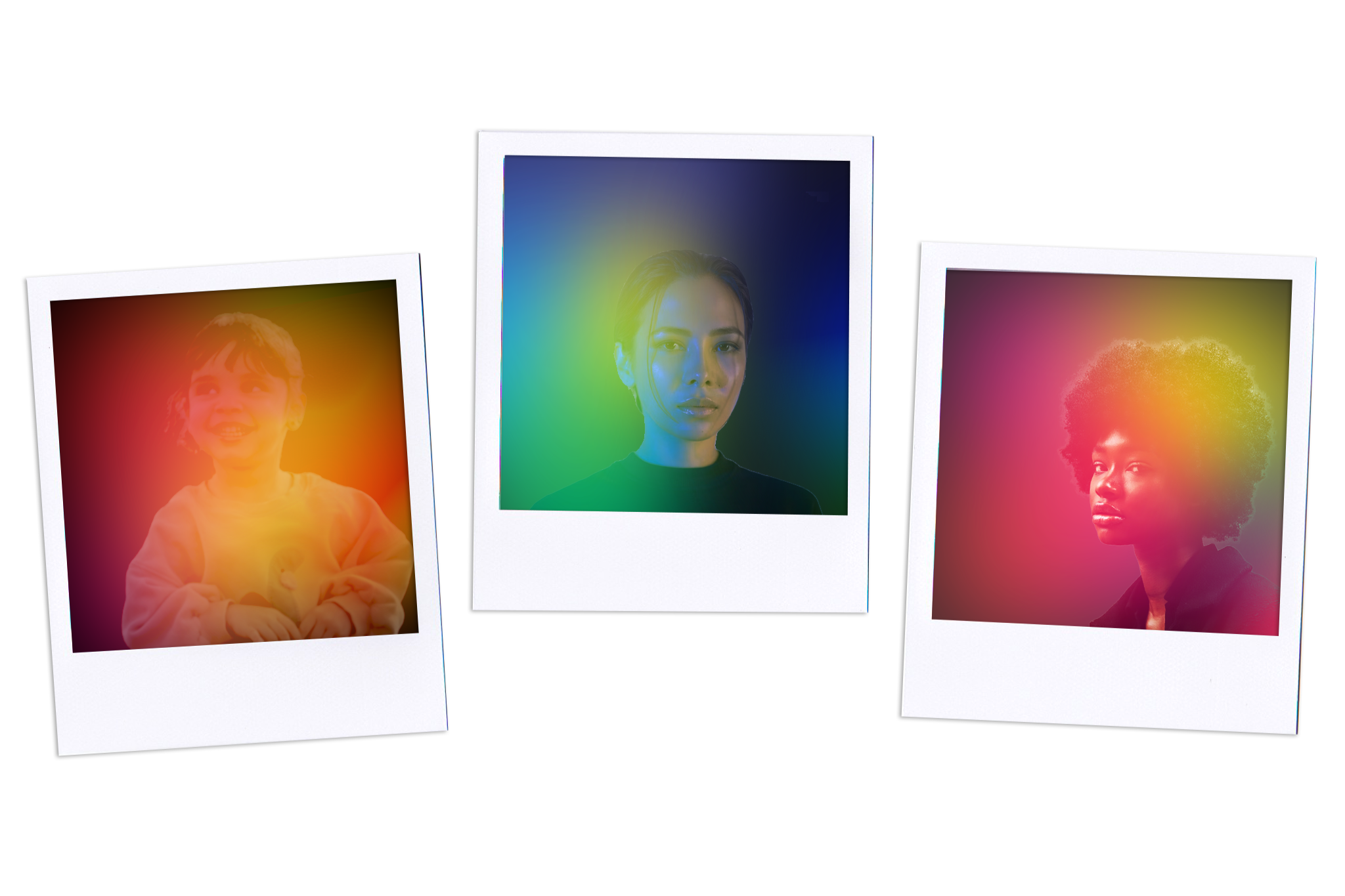
Inspired by the Aurora Borealis and aura portrait photography, the refreshed system reflects NWEA’s services—dynamic, responsive, and adaptable to each user’s unique needs.
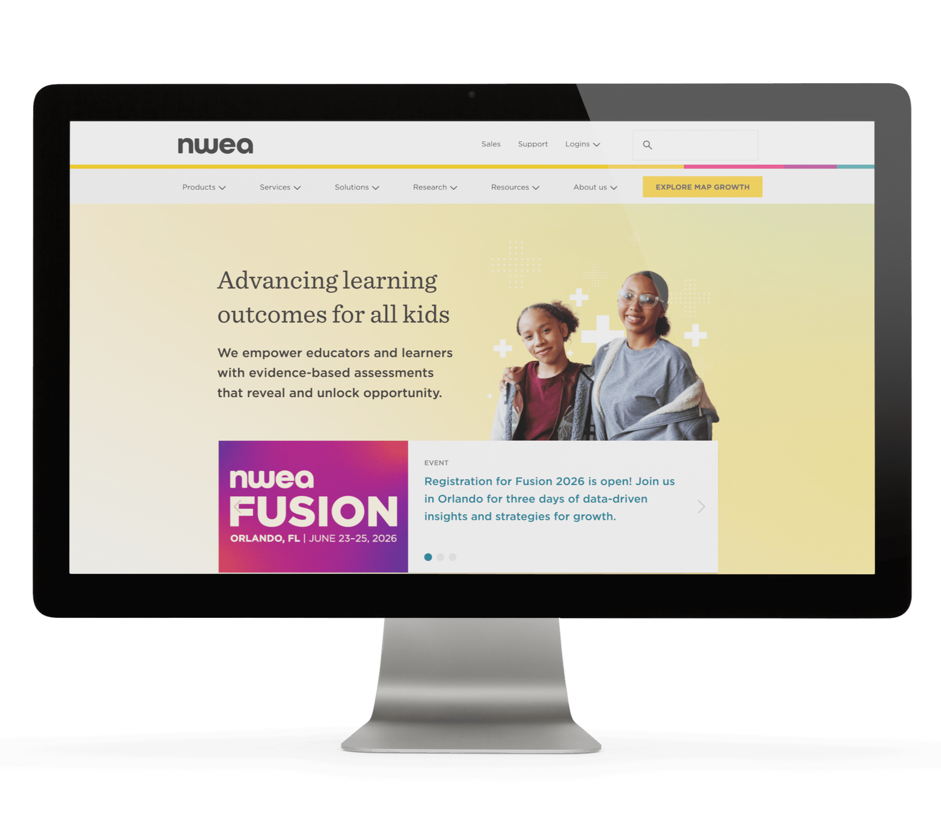
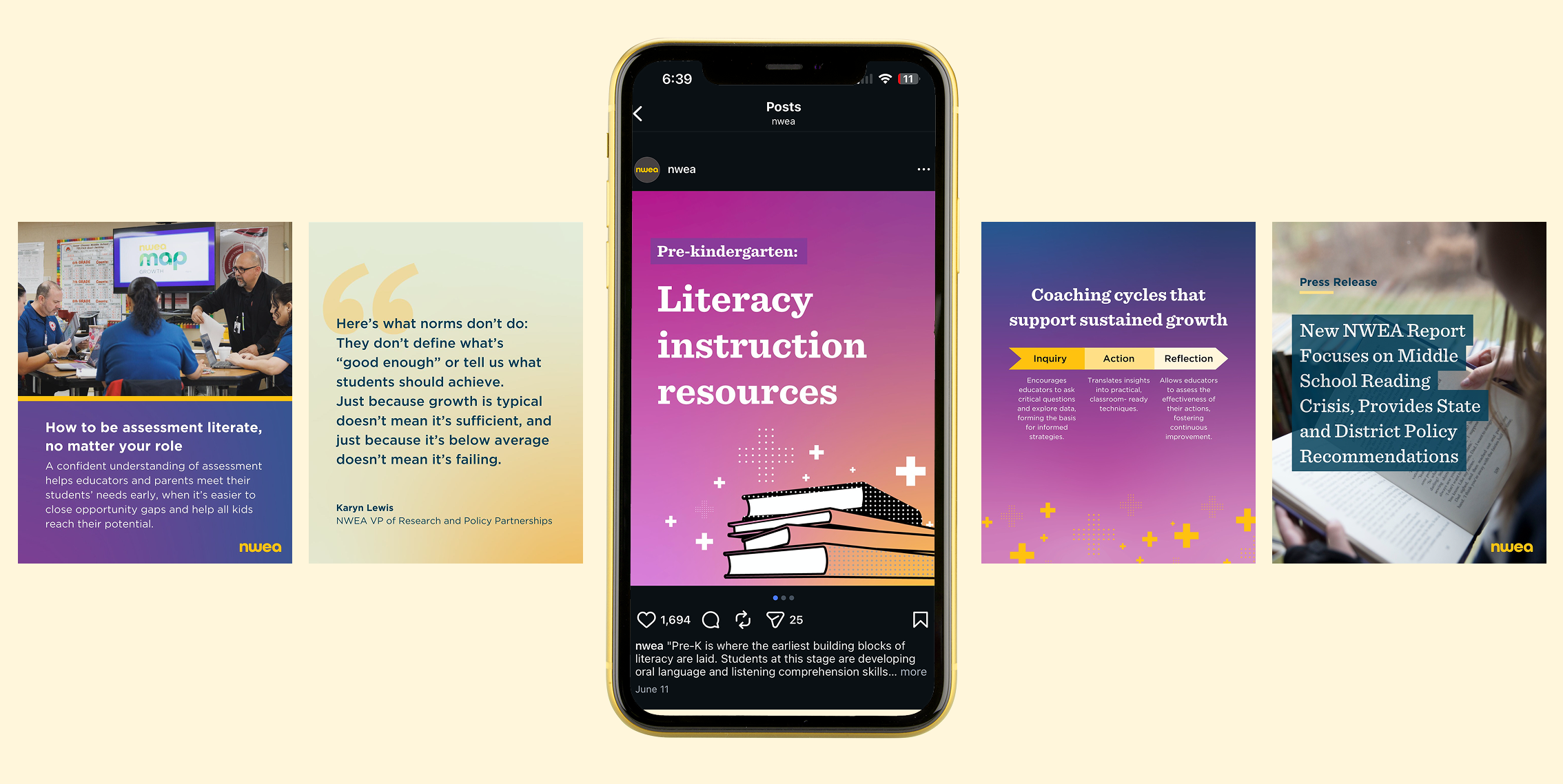
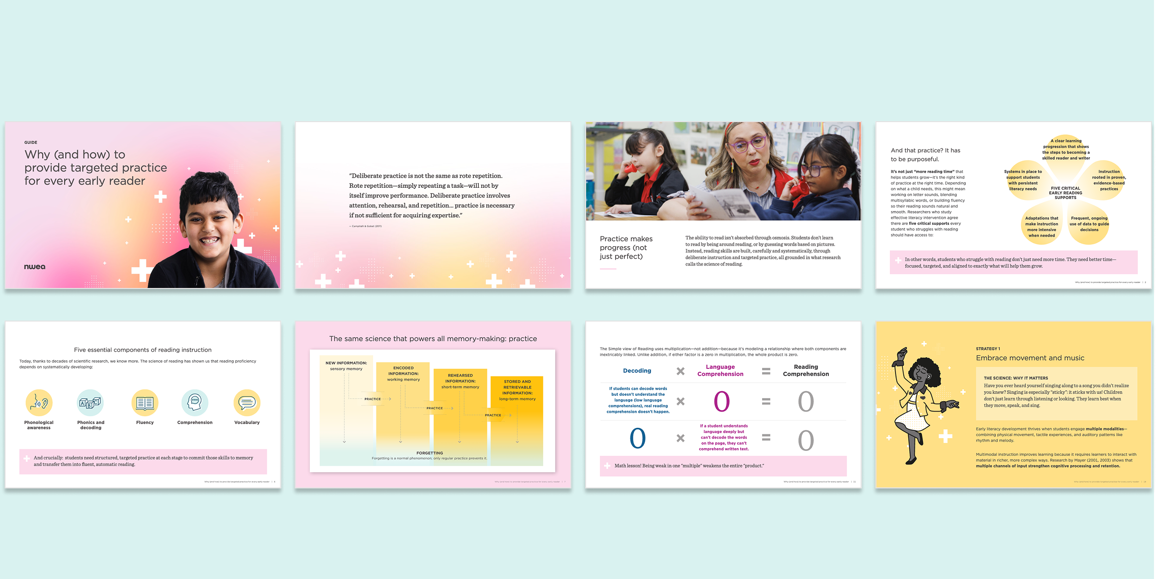
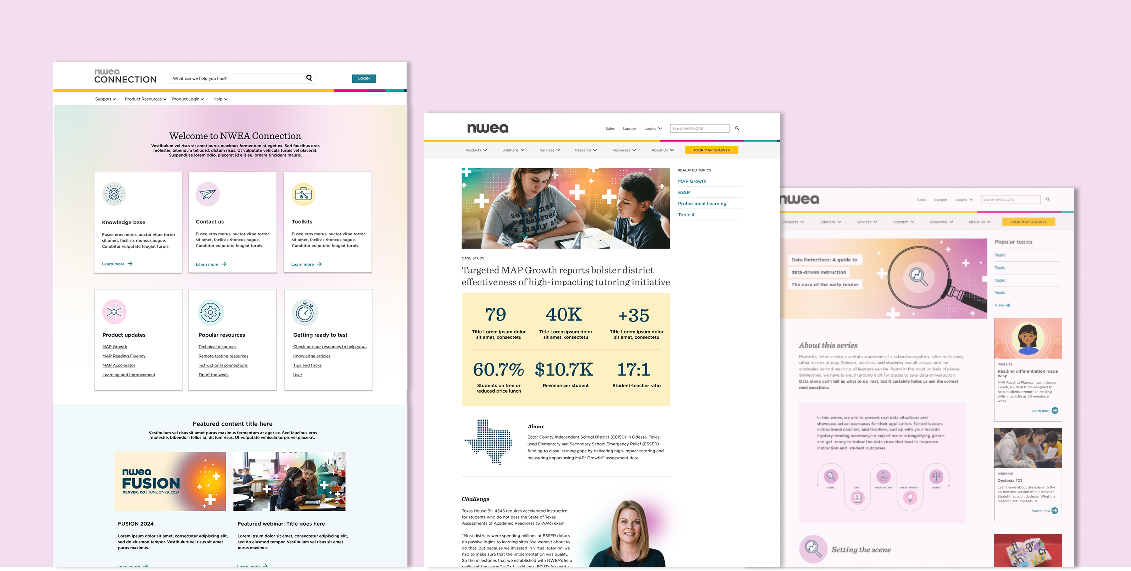
Visual Language
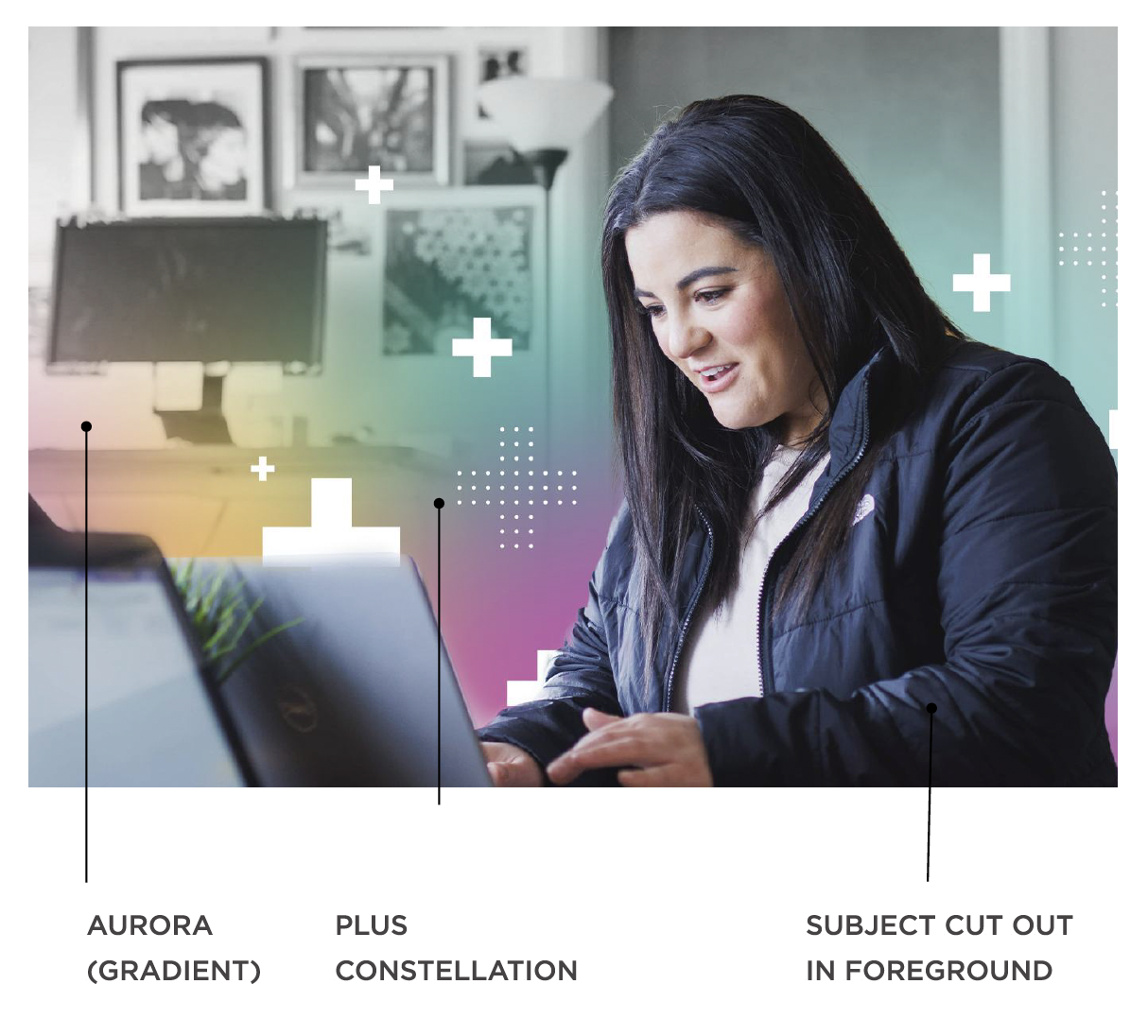
The visual style puts individuals front and center. The Aurora color from the NWEA palette separates people from the background, while the Aurora gradient and plus constellation highlight each person’s unique data story.
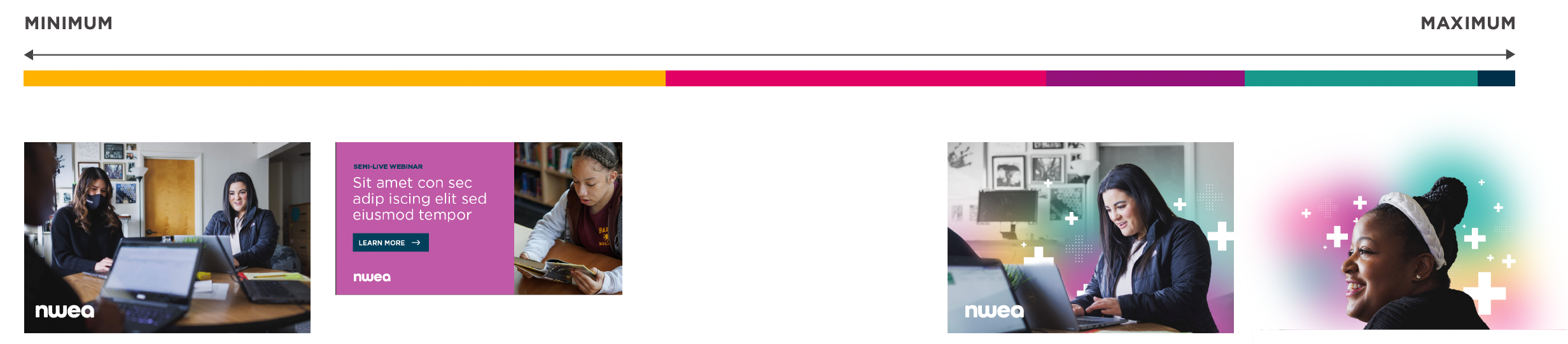
Brand Continuum
Brand elements live on a continuum of use, from minimum to maximum amounts of application. The graphic represents a high-level overview of how to use the brand in different formats. Evergreen content will have minimal branding, whereas changing content, like social media, will use the most expressive form of the brand.
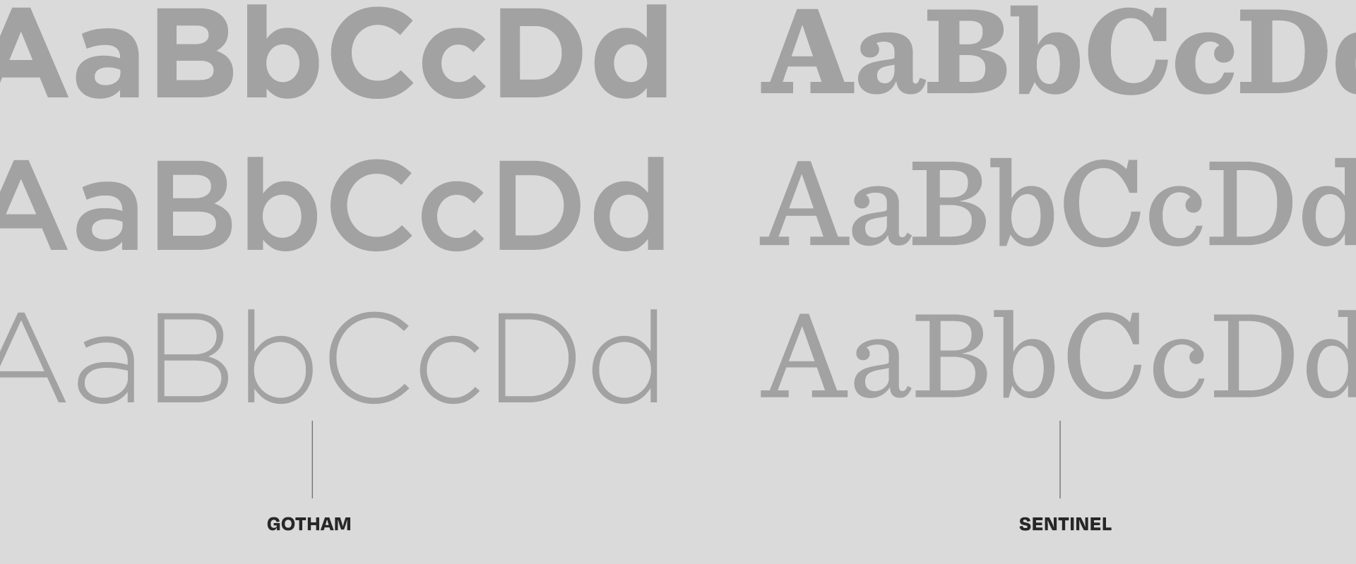
Color Palette & Typography
Yellow
Yellow 50%
Yellow 25%
Graphite
Graphite 50%
Graphite 25%
Midnight
Midnight 50%
Midnight 25%
Pine
Pine 50%
Pine 25%
Teal
Teal 50%
Teal 25%
Marionberry
Marionberry 50%
Marionberry 25%
Magenta
Magenta 50%
Magenta 25%
Accessibility
AA: Graphical Elements and UI
Accessibility is at the center of NWEA, so naturally it was a core consideration when developing the palette and the UI. The work aligns to WCAG 2.0 AA principles, with guidance and best practices documented so teams could consistently create clear, readable, and inclusive materials across touchpoints.
Application
The brand comes to life through intentional application across every touchpoint. From digital and print to presentations and social, each piece reinforces clarity, accessibility, and impact. Using a defined system of color, typography, imagery, and components creates a cohesive visual language that builds recognition and trust.
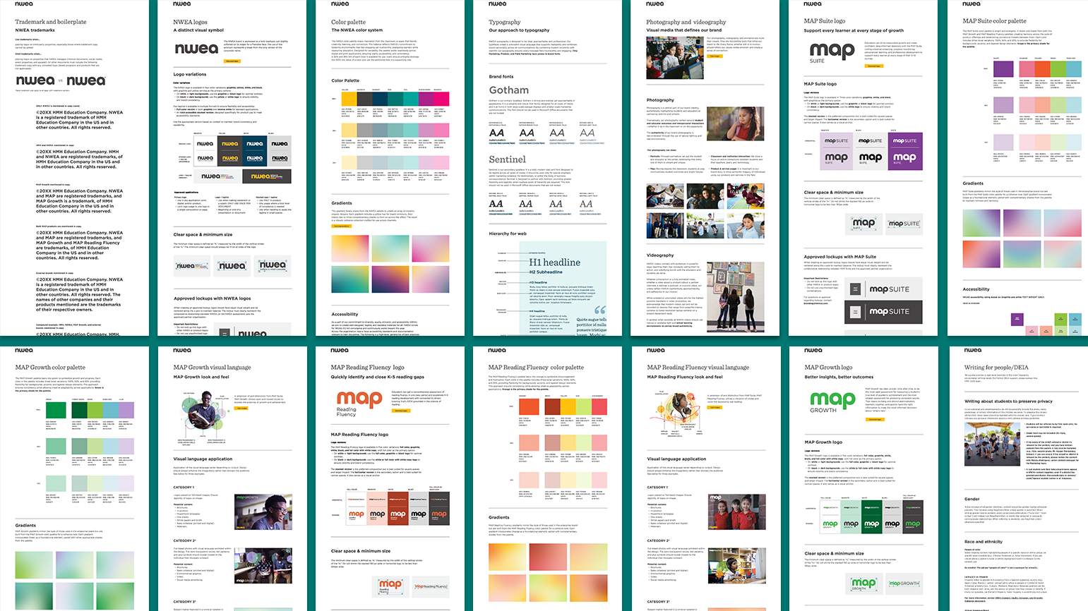
Brand guidelines
In 2026, I led the team through a rebuild of the NWEA brand guidelines within the Zeroheight platform. It allows for a more accessible, living source of truth for both the enterprise and product brands. Moving beyond a static PDF, the site lets teams explore principles, components, and examples in context, helping them quickly understand not just what to use, but how and why to use it.
The guideline houses visual standards, accessibility guidance, UI components, downloadable assets, and real-world applications in one searchable environment. By connecting design, marketing, and product, it supports consistent execution while remaining flexible enough to evolve alongside the brand.
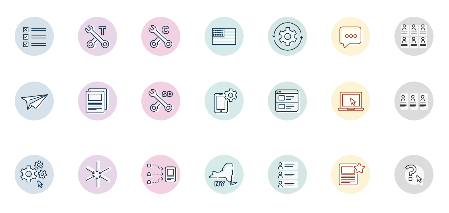
Iconography
NWEA’s iconography uses consistent, expressive line work paired with subtle shading from the enterprise palette and intentional white cutouts. The linework itself communicates the meaning of each icon, keeping them clear and accessible. The system covers a broad range of subjects and continues to grow as new needs emerge.
Kyle Walters-Sheaffer
Sr. Director of Brand Strategy
NWEA/HMH
“I’m always amazed with how Yoshini can translate a creative concept into something that is truly effective and beautiful. We set out to visually represent a key aspect of our brand story- NWEA provides critical insights to help teachers teach and students grow academically. The learning auras visual language is a great example of her talent. Yoshini was able to balance the new brand assets and our authentic photography into a unique system that communicates who NWEA is and how they want to be seen by educators.
The end result is a powerful brand statement where the end result is truly greater than the sum of its parts.”
TEAM: ART DIRECTOR: Yoshini White / SR. DIRECTOR OF BRAND STRATEGY: Kyle Walters-Sheaffer / ANIMATOR & SR. GRAPHIC DESIGNER: Amy Meyer / VIDEO: Joe Gallagher, Aaron Corpus & Matt Howell / WEBSITE OPERATIONS: Tiffani LeClair & Taylor Riordan / CONTENT: Derrick Vargason, Erin Ryan, & Monica Rodríguez / PROJECT MANAGEMENT: Meighan Holder & Kristi Swearingen / PHOTOGRAPHY: David Johnson & Matt Stanley