
NWEA Believe in What’s Possible Tagline
Impacted
Directed the visual expression of NWEA’s new tagline, bringing “Believe in what’s possible” to life through dynamic imagery and confident, mission-driven design.
Role & Responsibilities
Design Director: Marketing Art Direction, Design Systems, Brand Governance, Stakeholder Collaboration, Design Leadership
Brief
NWEA needed a new tagline that captured its future vision while aligning with the organization’s refreshed brand identity. The Creative and Content team was tasked with developing a line that was both forward-looking and consistent across applications.
Solution
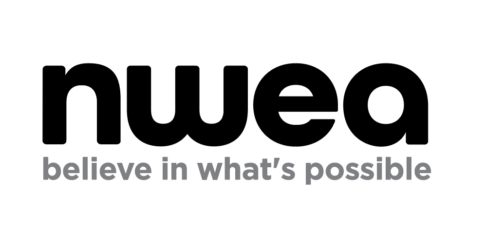
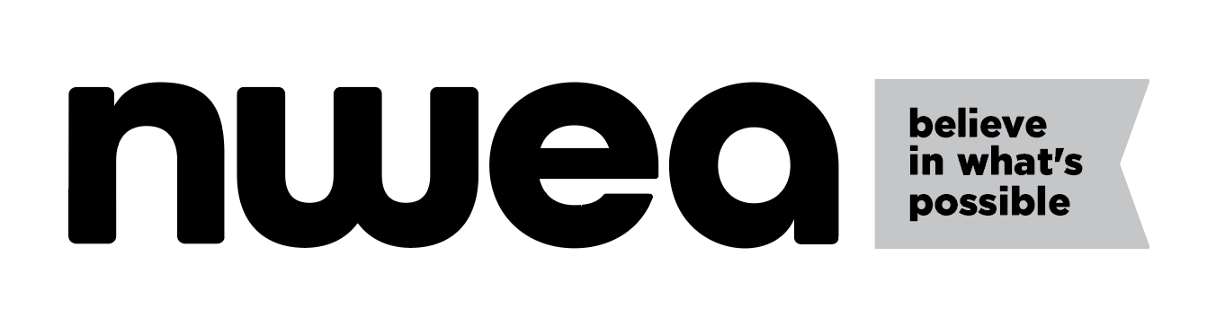
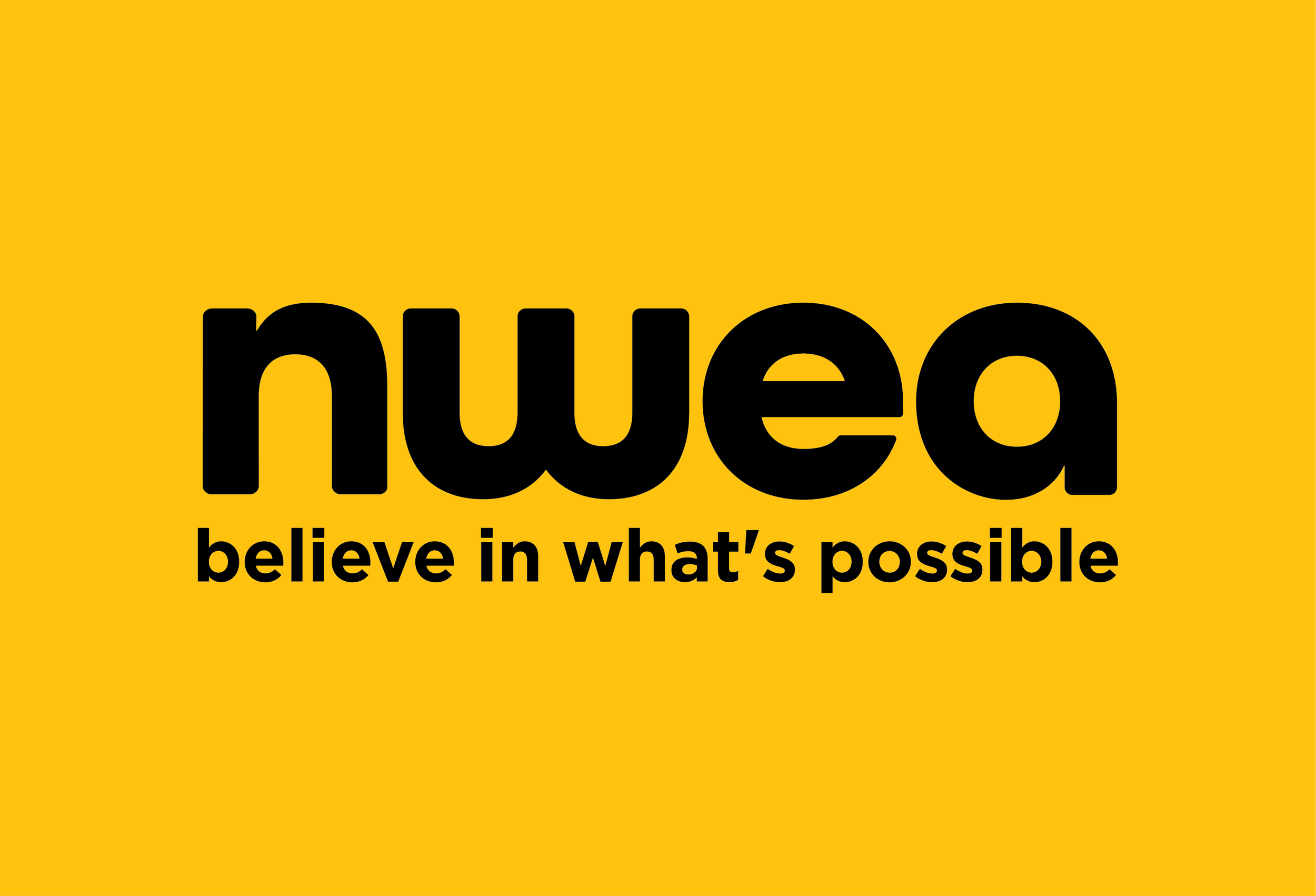
The new tagline, “Believe in what’s possible,” sharpens NWEA’s mission—empowering learners, driving innovation, and championing a growth mindset. Integrated with the logo, it creates a clear visual throughline across the organization’s programs and services.
Inspiration
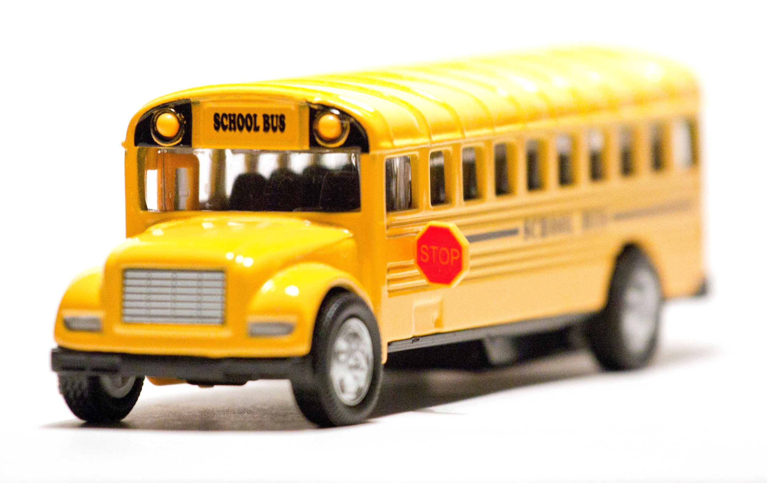
Inspired by growth and optimism, the colorful underline reflects the same spirit as the yellow school bus every NWEA employee receives on their first day. It is a symbol of progress, purpose, and belief in every learner’s potential.

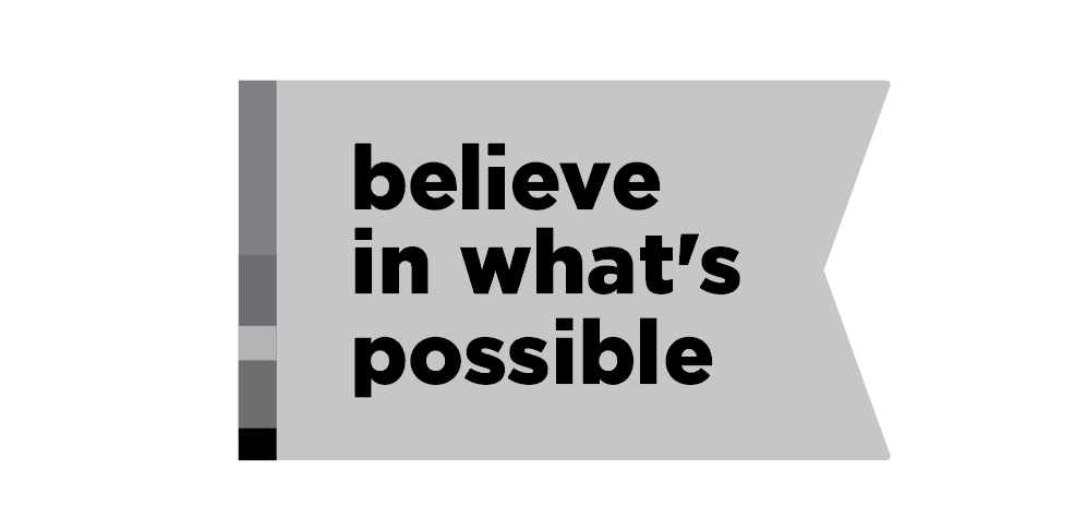
Initial concepts
Final brand
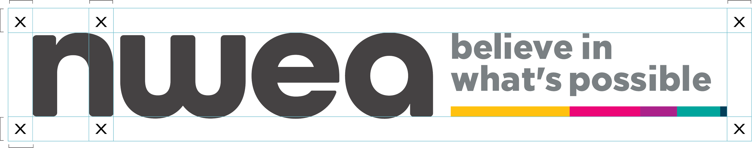
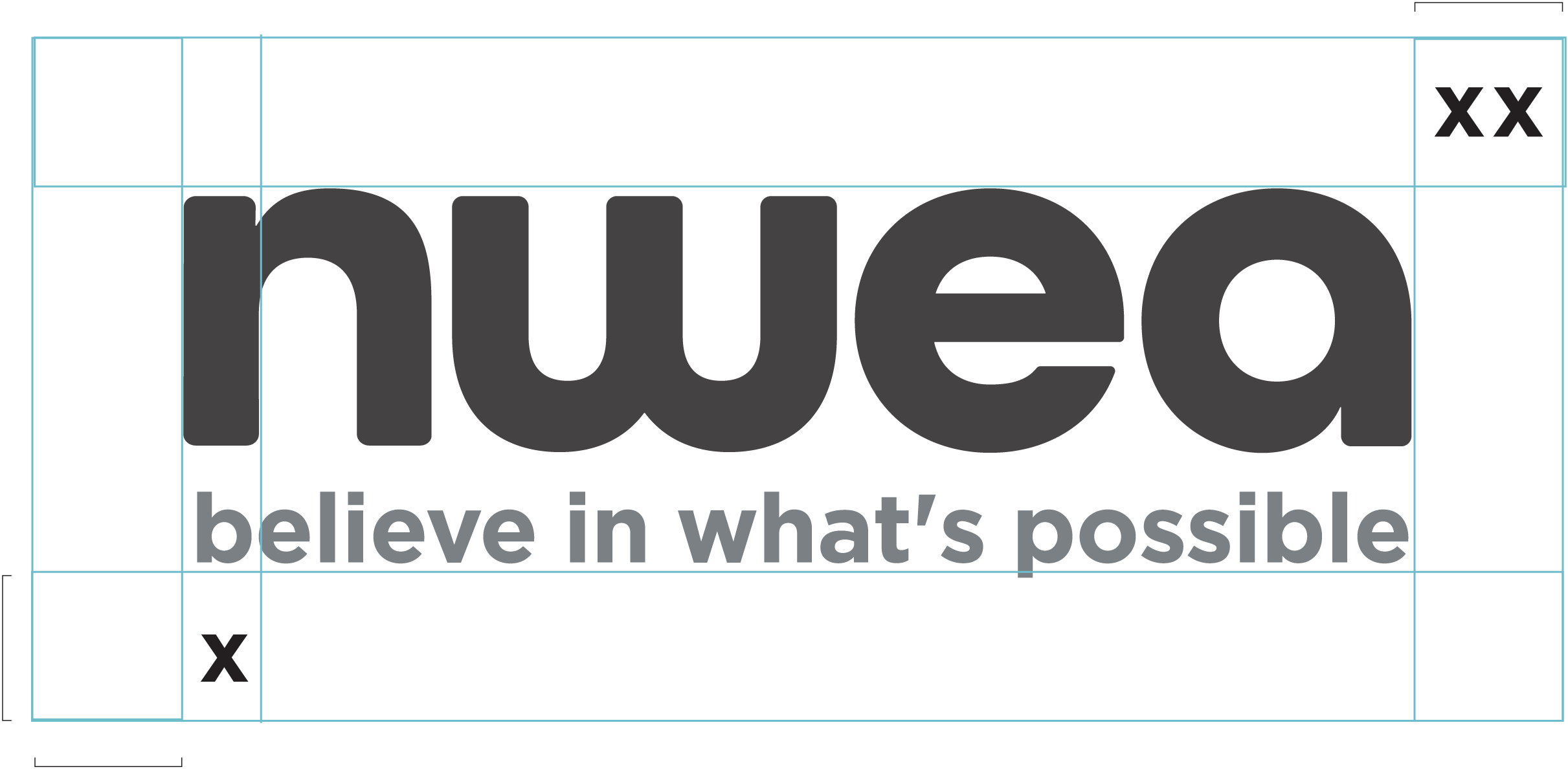
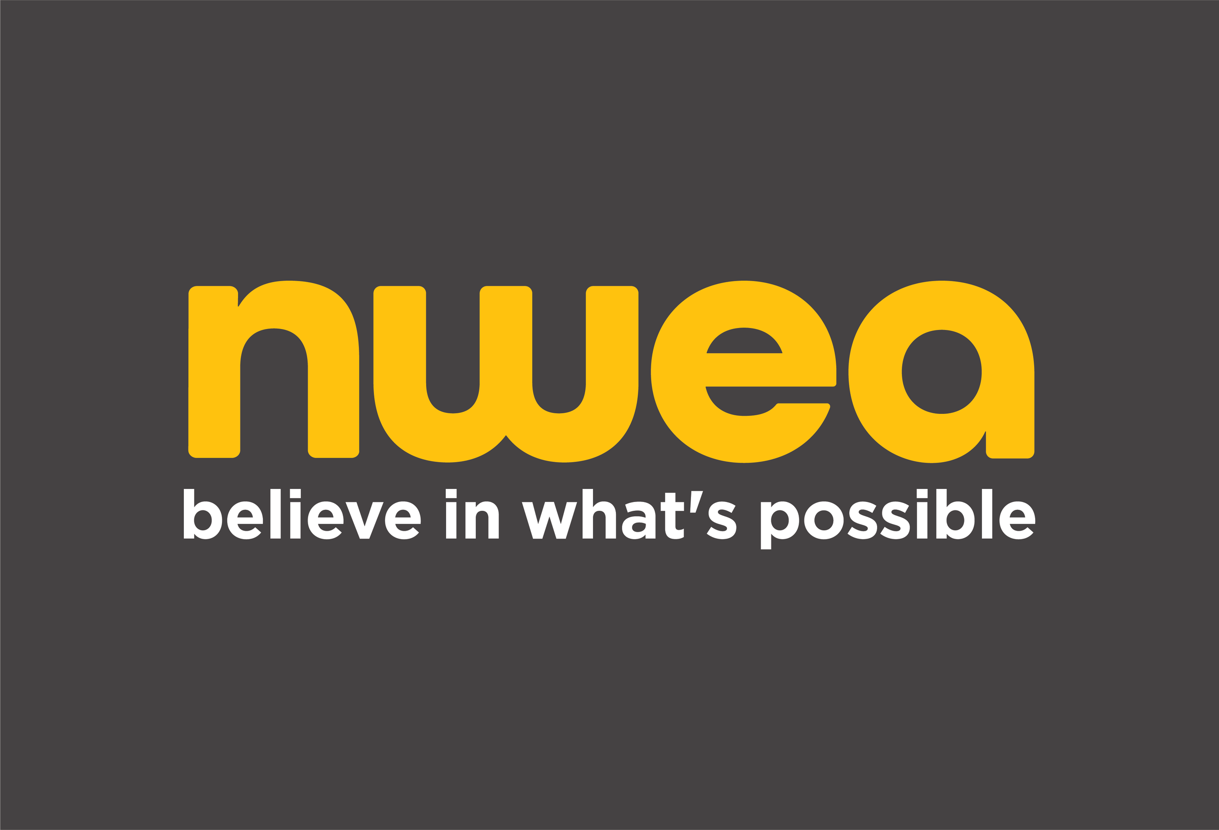
The final logo integrates the NWEA visual language while reinforcing the new tagline of Believe in what’s possible®. It carries forward the brand’s sense of optimism and progress, using familiar forms and color to feel unmistakably connected to NWEA while still standing confidently on its own. The “b” in believe remains lowercase within the logo to align with brand standards, and the mark is designed to scale across contexts — from full-color and reverse white executions to an accessible stacked version for product use and AAA contrast needs. Together, the system ensures the tagline is recognizable, flexible, and consistently tied back to the broader NWEA brand.
Minimum Size:
To maintain legibility and consistent brand representation, it is essential that the logo maintains a minimum width of 80px, while the stacked version should not be reduced below 50px.

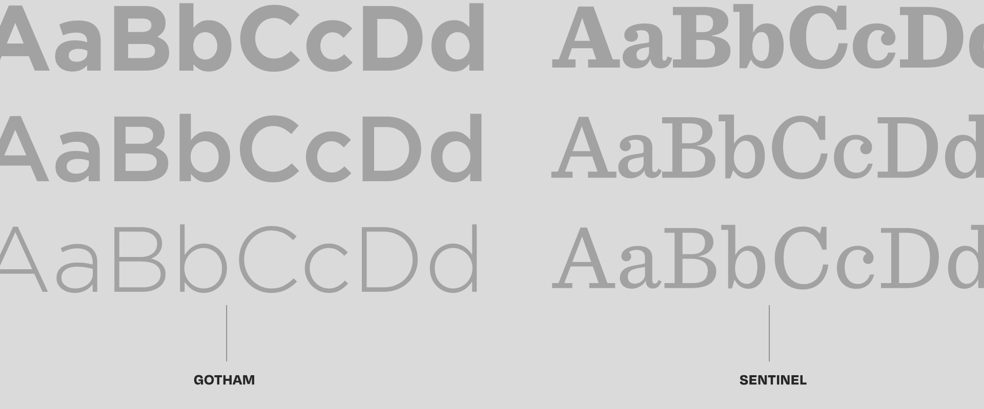
Color Palette & Typography
Yellow
Yellow 50%
Yellow 25%
Graphite
Graphite 50%
Graphite 25%
Midnight
Midnight 50%
Midnight 25%
Pine
Pine 50%
Pine 25%
Teal
Teal 50%
Teal 25%
Marionberry
Marionberry 50%
Marionberry 25%
Magenta
Magenta 50%
Magenta 25%
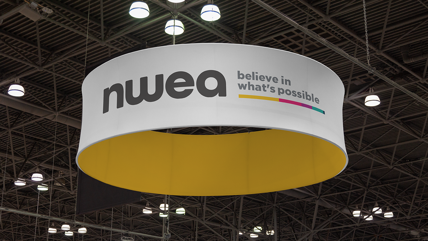
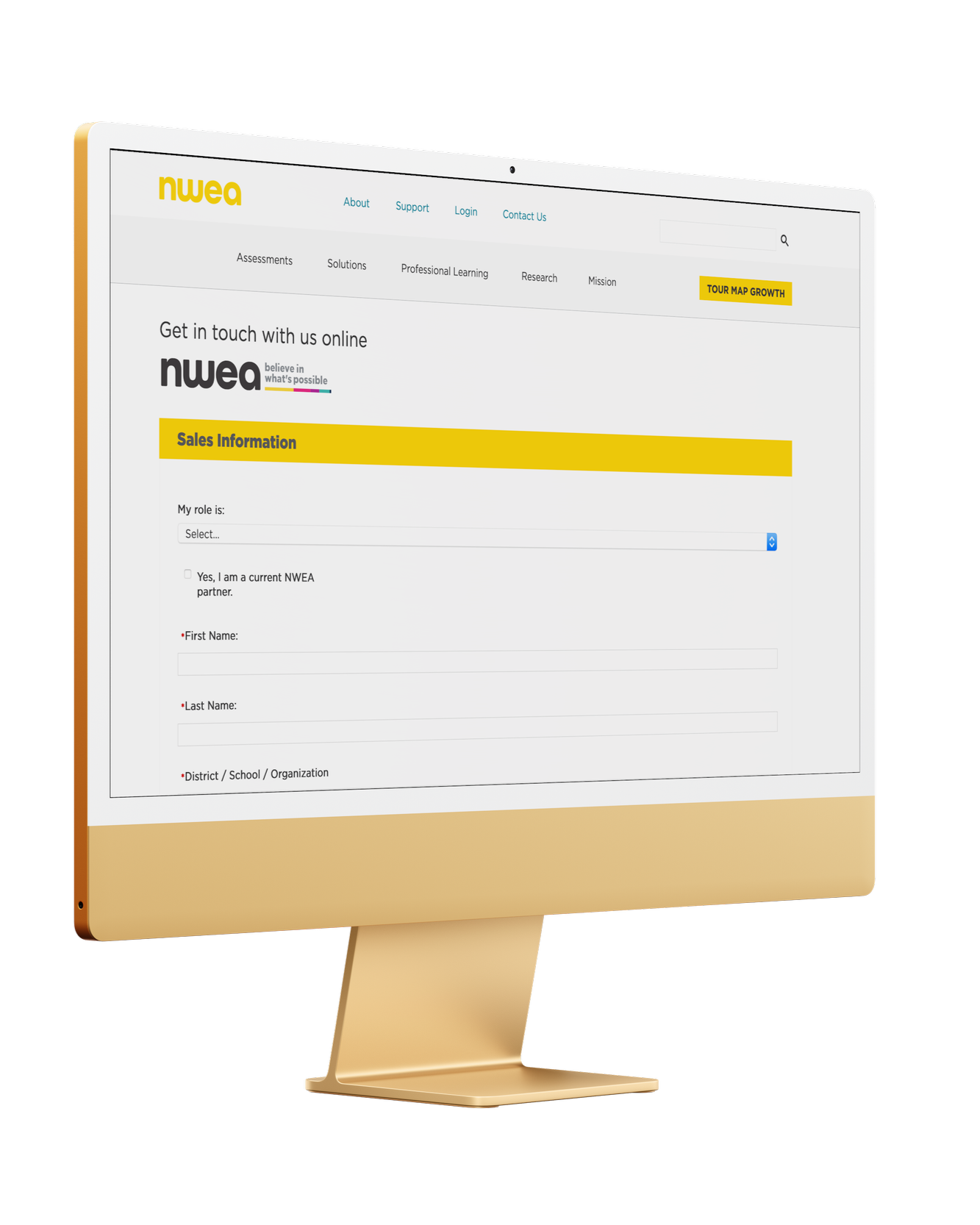
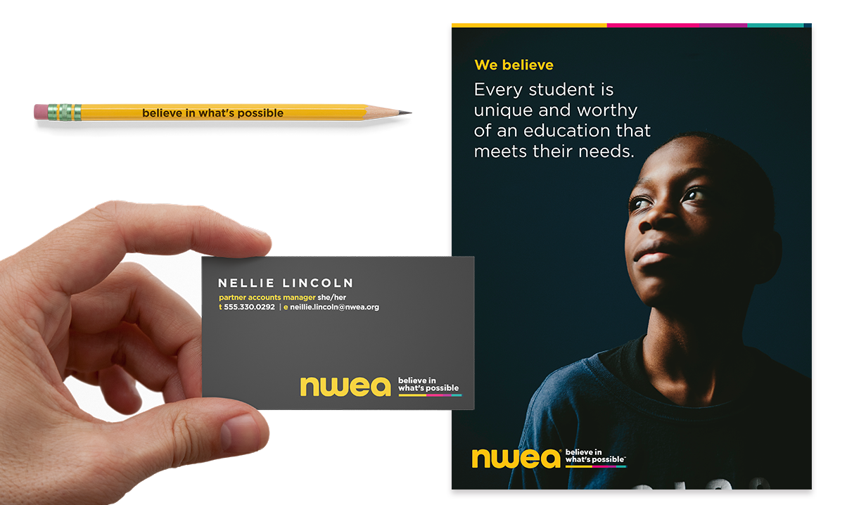
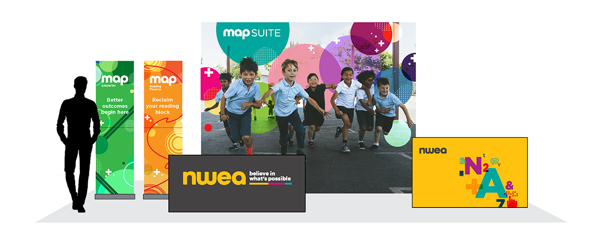
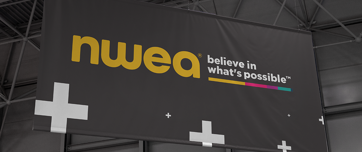
Application
As part of securing the new logo and tagline, we provided specimen examples to the trademark office. The following show applications of the mark across print, digital, and event environments.
TEAM: ART DIRECTOR: Yoshini White / SR. DIRECTOR OF BRAND STRATEGY: Kyle Walters Sheaffer / ANIMATOR & SR. GRAPHIC DESIGNER: Amy Meyer / CONTENT: Erin Ryan