
MAP Growth Art Direction
Impact
Delivered a high-impact redesign of the MAP Growth landing page, with 52% engagement and increasing performance by 4%.
Role & Responsibilities
Design Director: Marketing Art Direction, Design Systems, Brand Governance, Stakeholder Collaboration, Design Leadership

Brief
MAP Growth had an established logo but lacked a defined visual language to express its story and value. The challenge was to create a cohesive system that could bring student data to life while aligning seamlessly with NWEA’s broader enterprise brand.
Solution
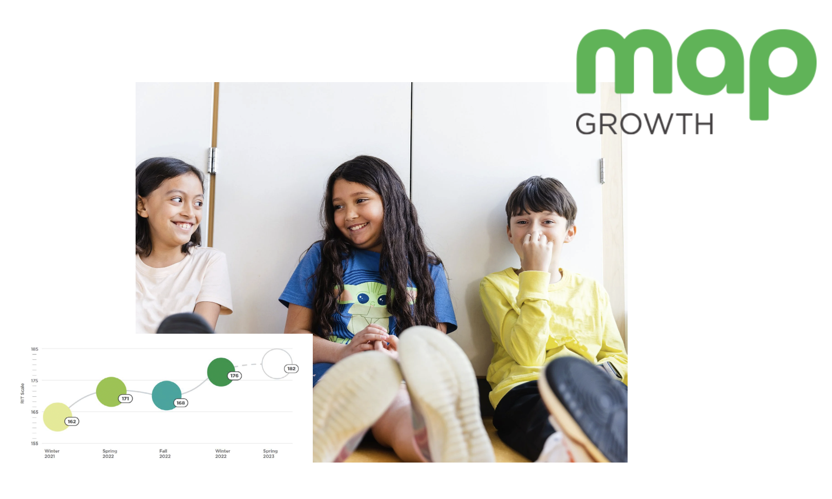
We defined a scalable visual language that positioned MAP Growth as a distinct product brand within the NWEA ecosystem. A unique color palette with connective threads to the enterprise system, paired with data-inspired graphic forms and human-centered photography, helped translate student growth into a clearer, more relatable story across touchpoints.
Inspiration
Inspired by student data and the educators and administrators who bring it to life, the visuals work together in balance to reinforce the broader learning story.
Visual Language
The visual language blends a MAP Growth–specific palette tied to NWEA, achievement-driven circle forms, data patterns, and student–educator photography to express both insight and humanity.
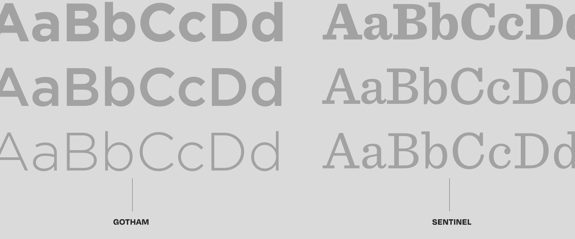
Color Palette & Typography
Green
Green 50%
Green 25%
Forest Green
Forest Green 50%
Forest Green 25%
Grass
Grass 50%
Grass 25%
Robin’s Egg
Robin’s Egg 50%
Robin’s Egg 25%
Lilac
Lilac 50%
Lilac 25%
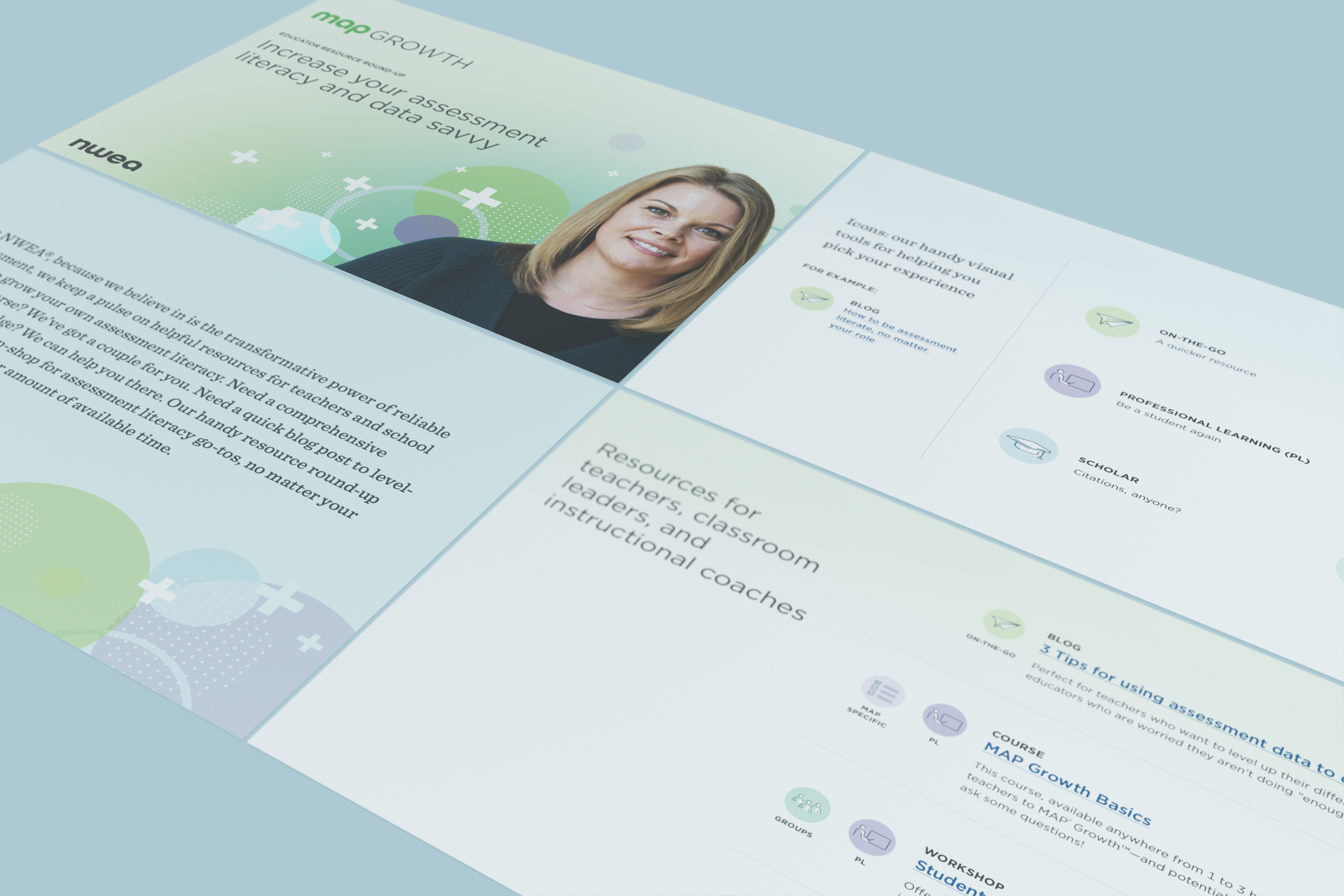
Application
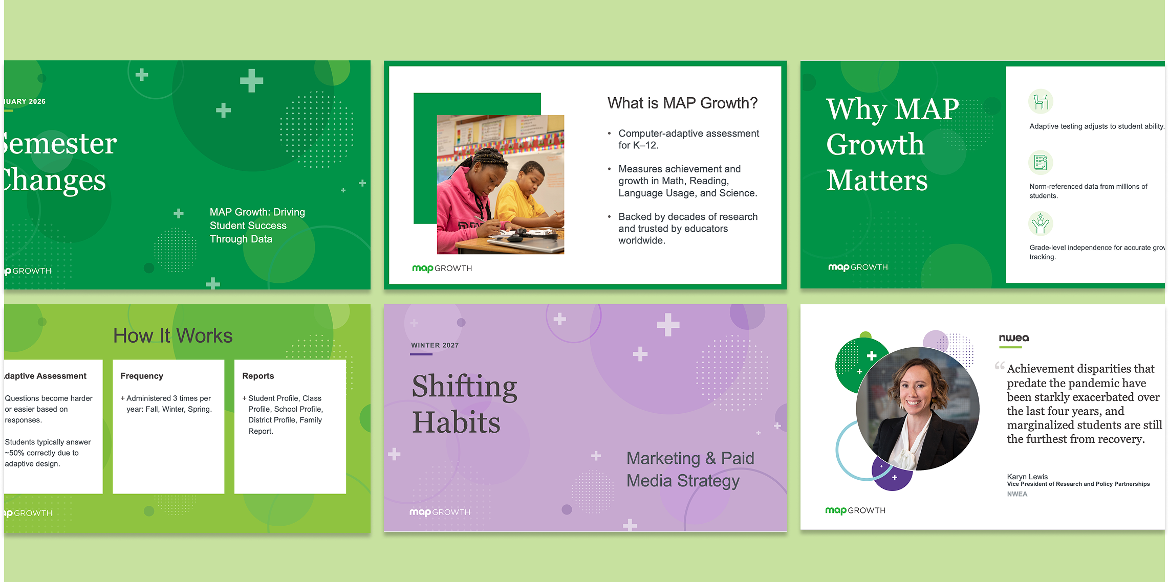
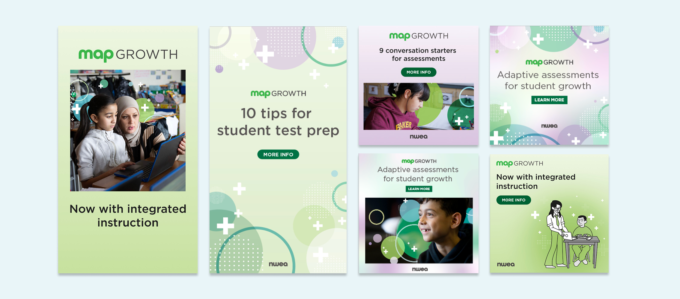
I established three tiers of visual expression to ensure the MAP Growth brand could flex appropriately across contexts. Some moments called for subtle integration, while others required a more prominent brand presence. The following guidelines provide guardrails for brand, product, and sales teams to apply the brand consistently in their own environments.
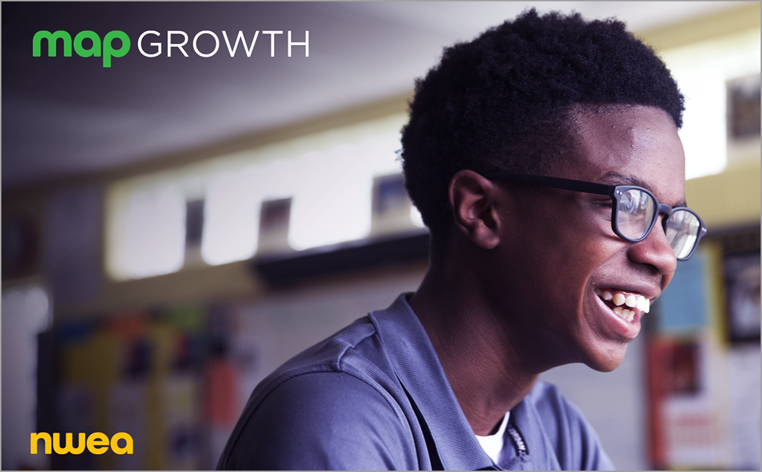
Logos placed on full-bleed images. Ensure legibility of logos on the image. Potential content:
Brochures
In-product
PowerPoint templates
One sheets
White papers and briefs
Sales collateral (printed and digital)
Webinars
Category 1
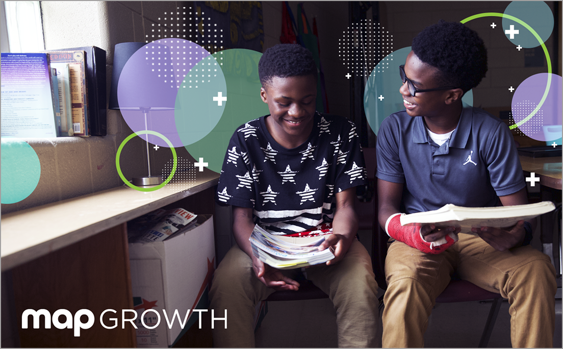
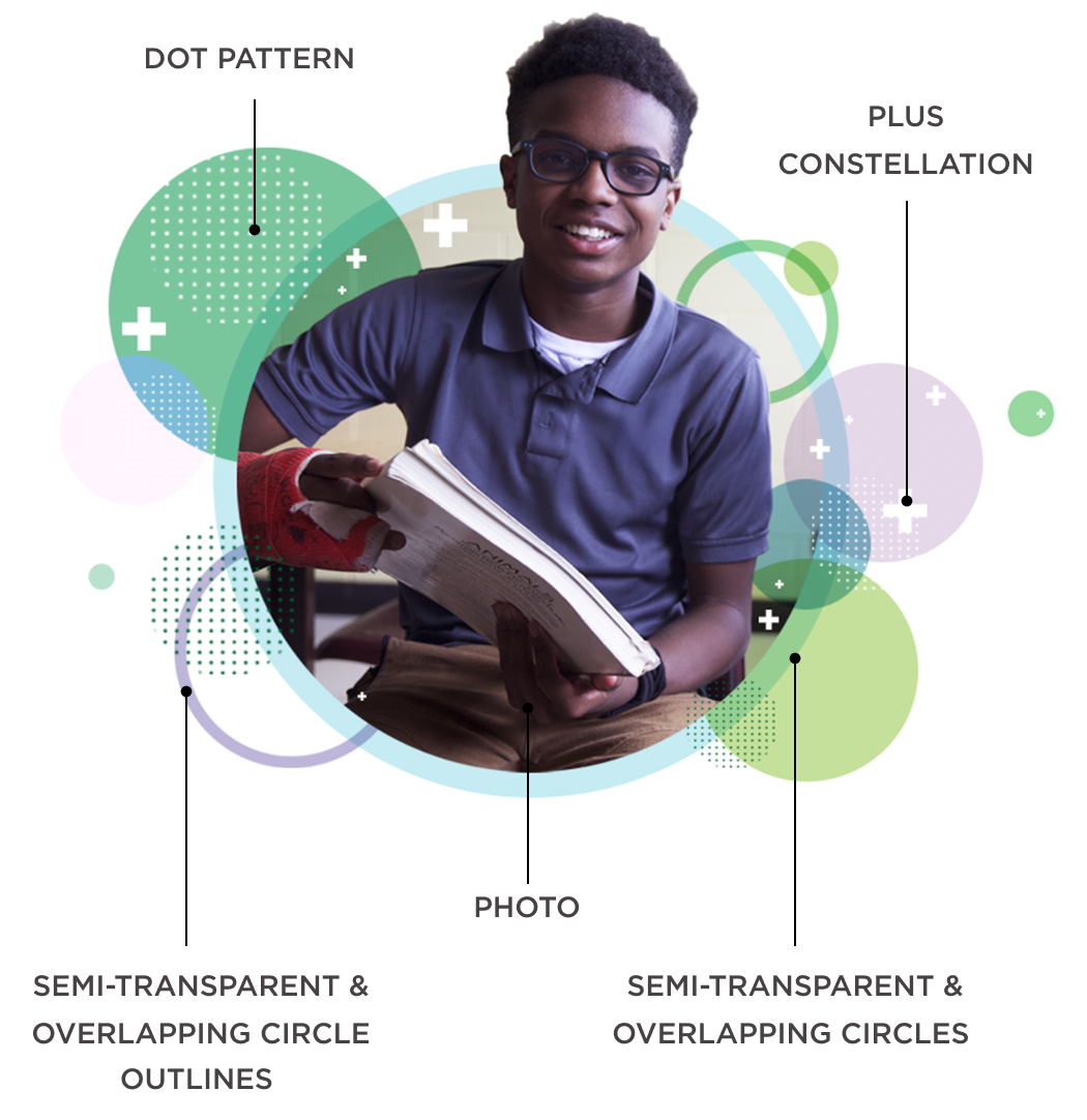
Full-bleed photos with visual language sprinkled within the design. The semi-transparent circles, dot patterns, and plus symbols should cluster closest to the individual, then dissipate outward. Potential content:
Brochures
Sales collateral (printed and digital)
Environmental graphics
Video
Social media advertising
Category 2

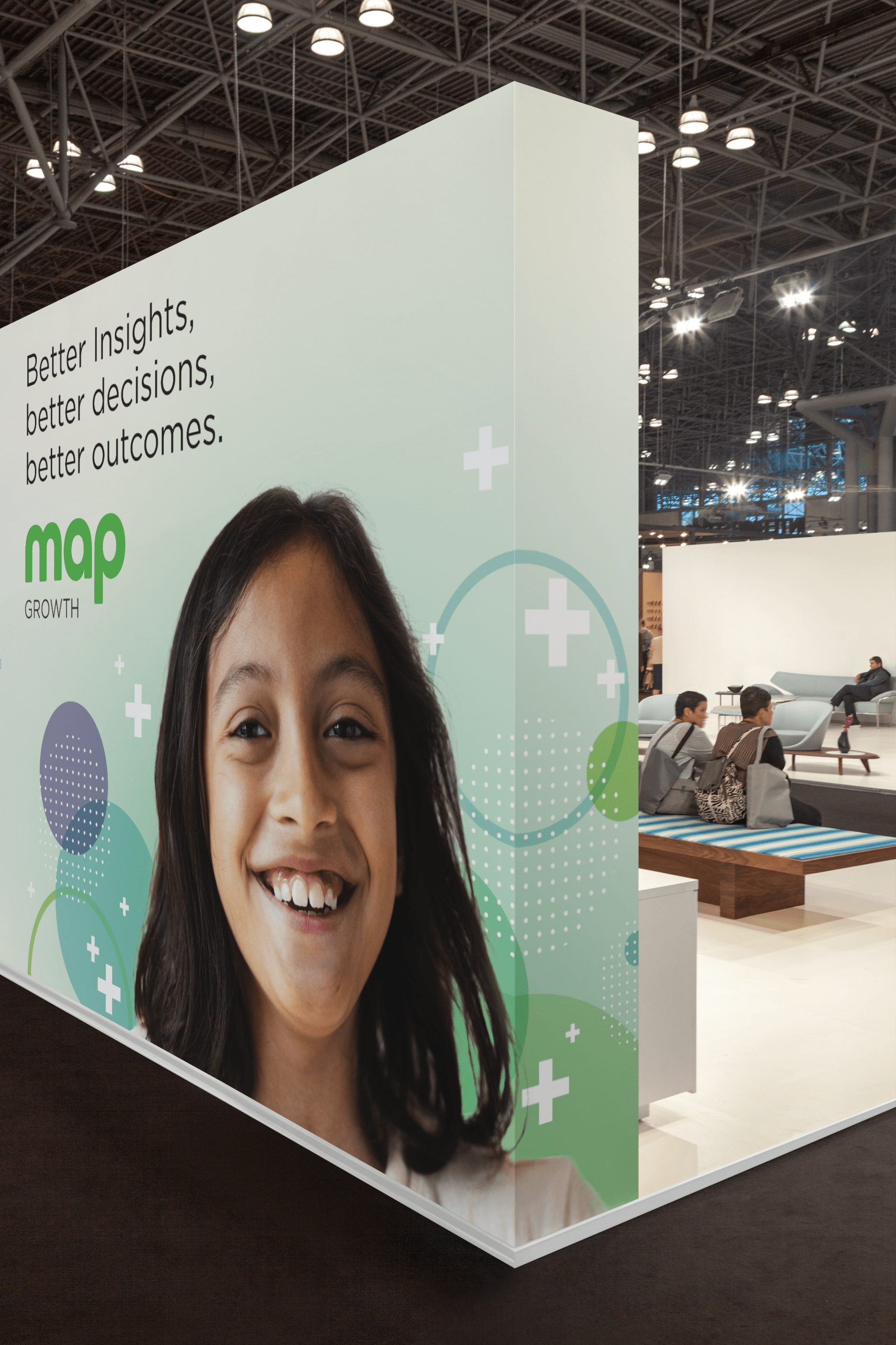
Category 3
Subject matter featured in a circle or isolated in the foreground, surrounded by product-specific design elements. The semi-transparent circles, dot patterns, and symbols should cluster closest to the photo circle, then dissipate outward. Potential content:
Social media advertising
NWEA/MAP Growth website
Environmental graphics
Video
In this role, I helped define and govern the MAP Growth visual language by establishing guidelines, mentoring designers, and providing final art direction. The work shown was created by the design team, demonstrating how the system scaled across digital, templates, experiential, and sales touchpoints while maintaining a consistent brand thread.
TEAM: ART DIRECTOR: Yoshini White / SR. DIRECTOR OF BRAND: Kyle Sheaffer / ANIMATOR & SR. GRAPHIC DESIGNER: Amy Meyer / VIDEO: Joe Gallagher, Aaron Corpus & Matt Howell / GROWTH MARKETING: Megan Akers / WEBSITE OPERATIONS: Tiffani LeClair & Taylor Riordan / CONTENT: Derrick Vargason, Erin Ryan, Chris Orcutt, & Monica Rodríguez / PROJECT MANAGEMENT: Meighan Holder & Erin Mills / PR: Simona Beattie / PHOTOGRAPHY: David Johnson & Matt Stanley