
Laurel Tree
Impact
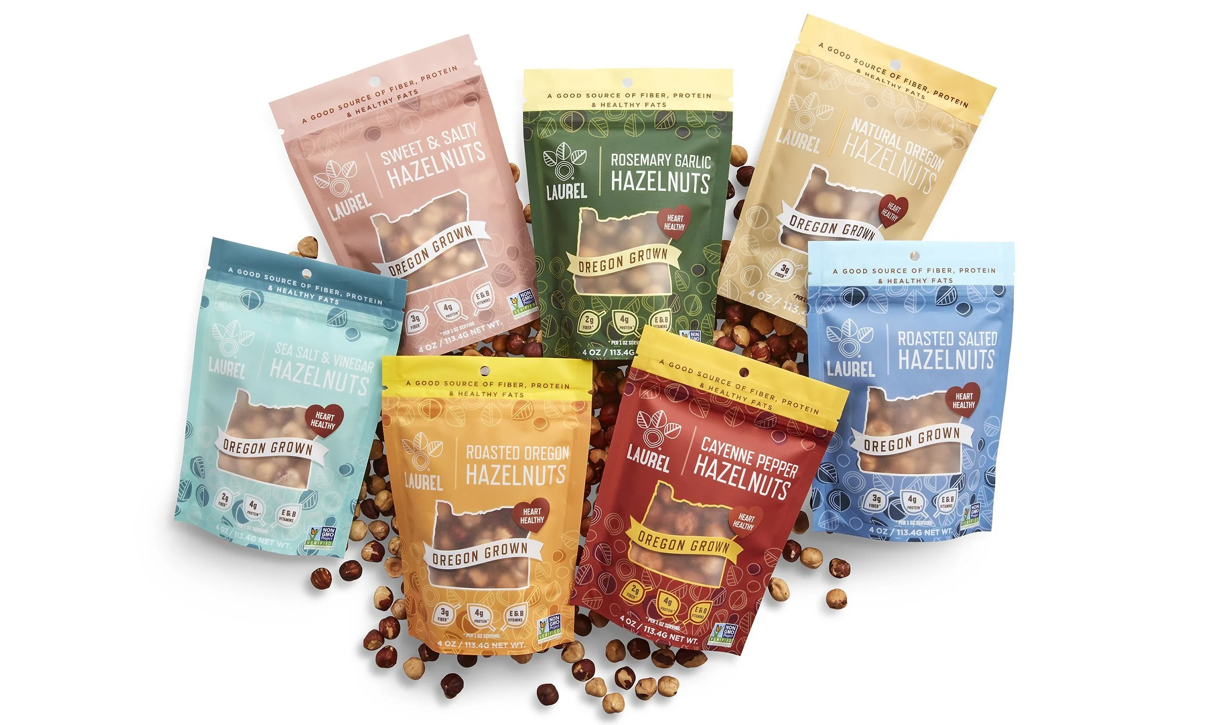
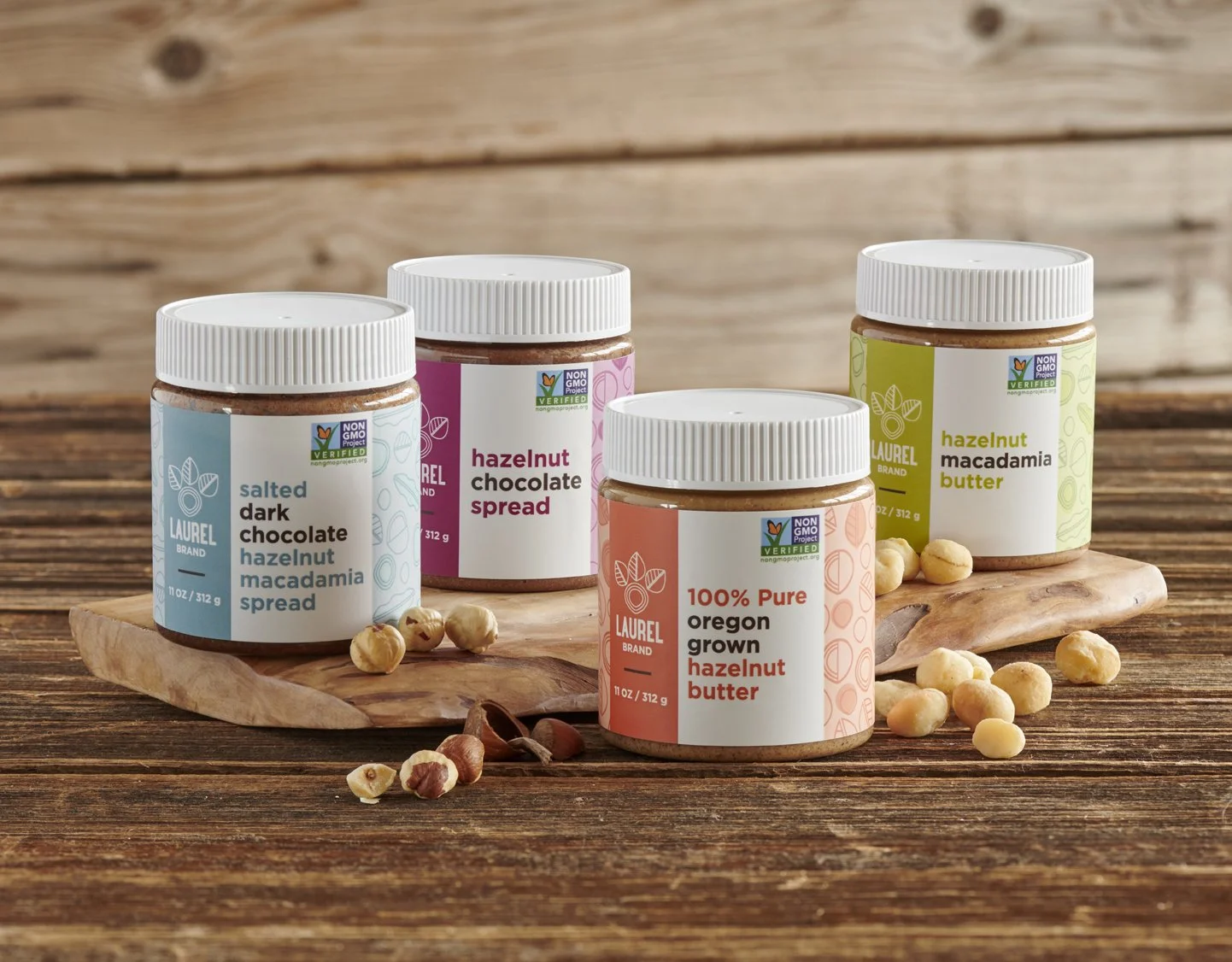
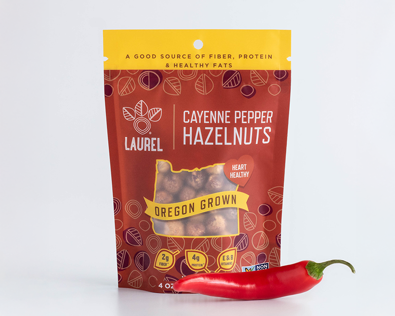
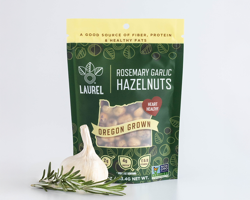
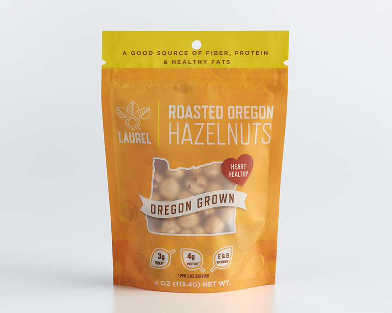
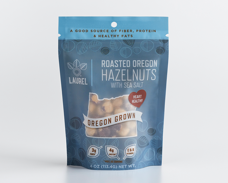
Created a scalable brand identity and packaging system for 18+ SKUs that expanded Laurel Tree into retail displays, grab-and-go pouches, hazelnut oil, spreads, and gift packs
Role & Responsibilities
Art Director: Creative Direction, Brand Identity, Packaging Design, Visual Systems, Brand Development
Brief
Laurel Tree, a company specializing in value-added food processing with a focus on hazelnut products, faced a branding and packaging challenge. While they were known for their hazelnut-based offerings, they were in the process of expanding their product range to include cashews, macadamia nuts, and pecans.
Solution
The refreshed identity and packaging positioned Laurel Foods to move confidently into retail, increase consumer recognition, and expand their product range. This project reflects my ability to direct complex brand systems from strategy to execution—leading teams, aligning stakeholders, and delivering creative that drives business growth.
Inspiration
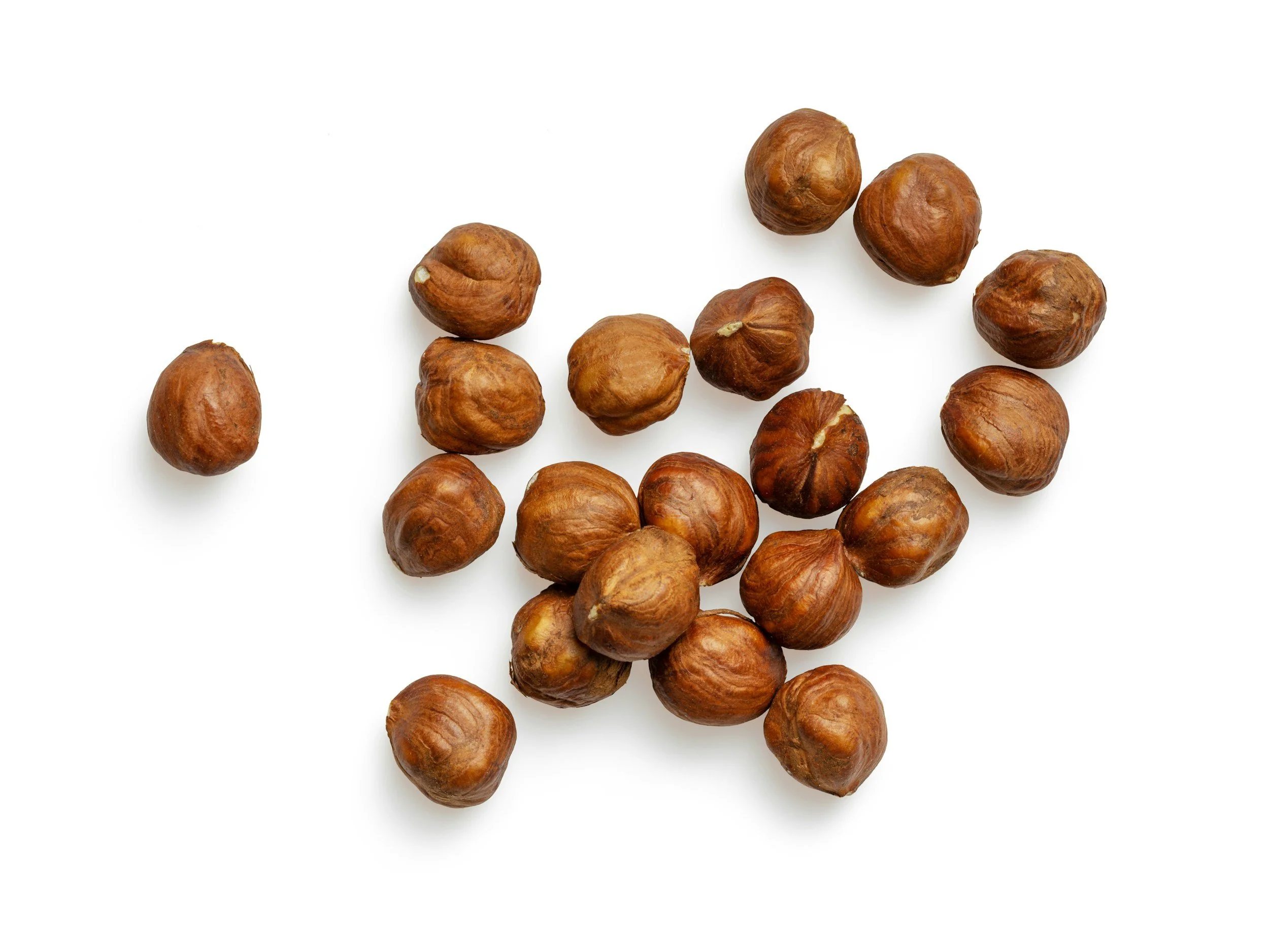
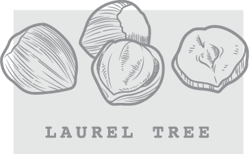
The design draws inspiration from the Pacific Northwest’s rich landscapes, the organic patterns and natural geometry found in nature, and of course, the distinct form of the hazelnut itself.

Initial concepts

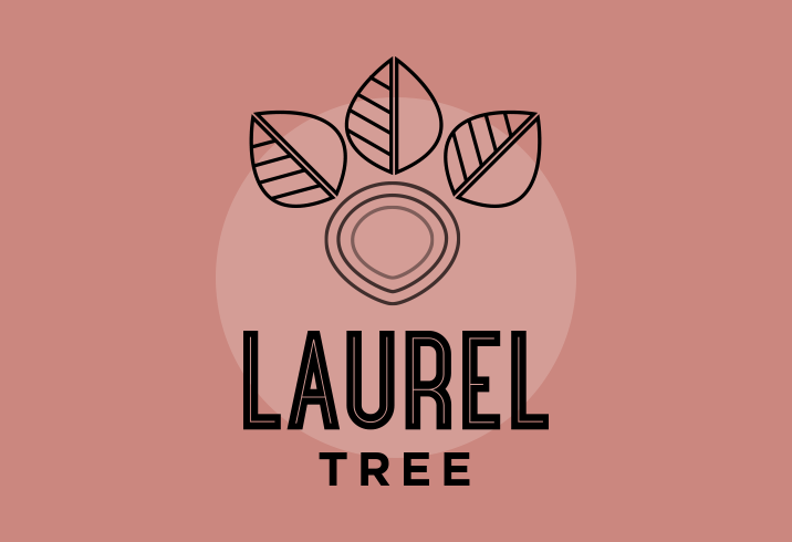
Final brand
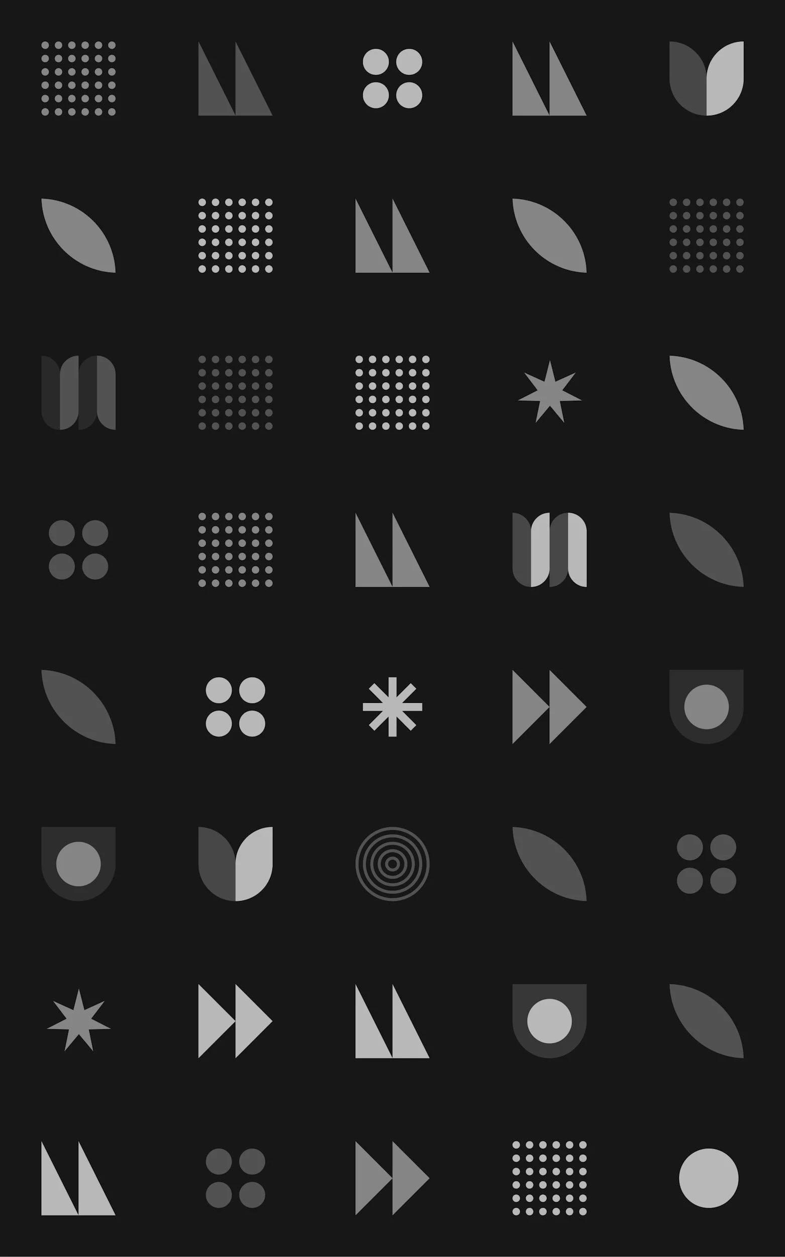
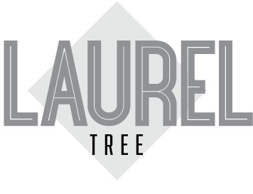
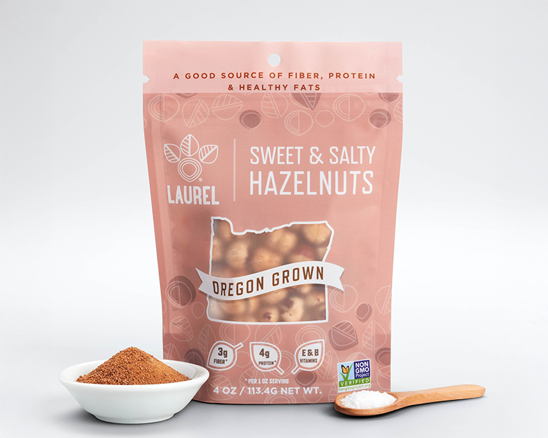
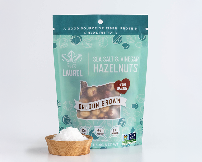
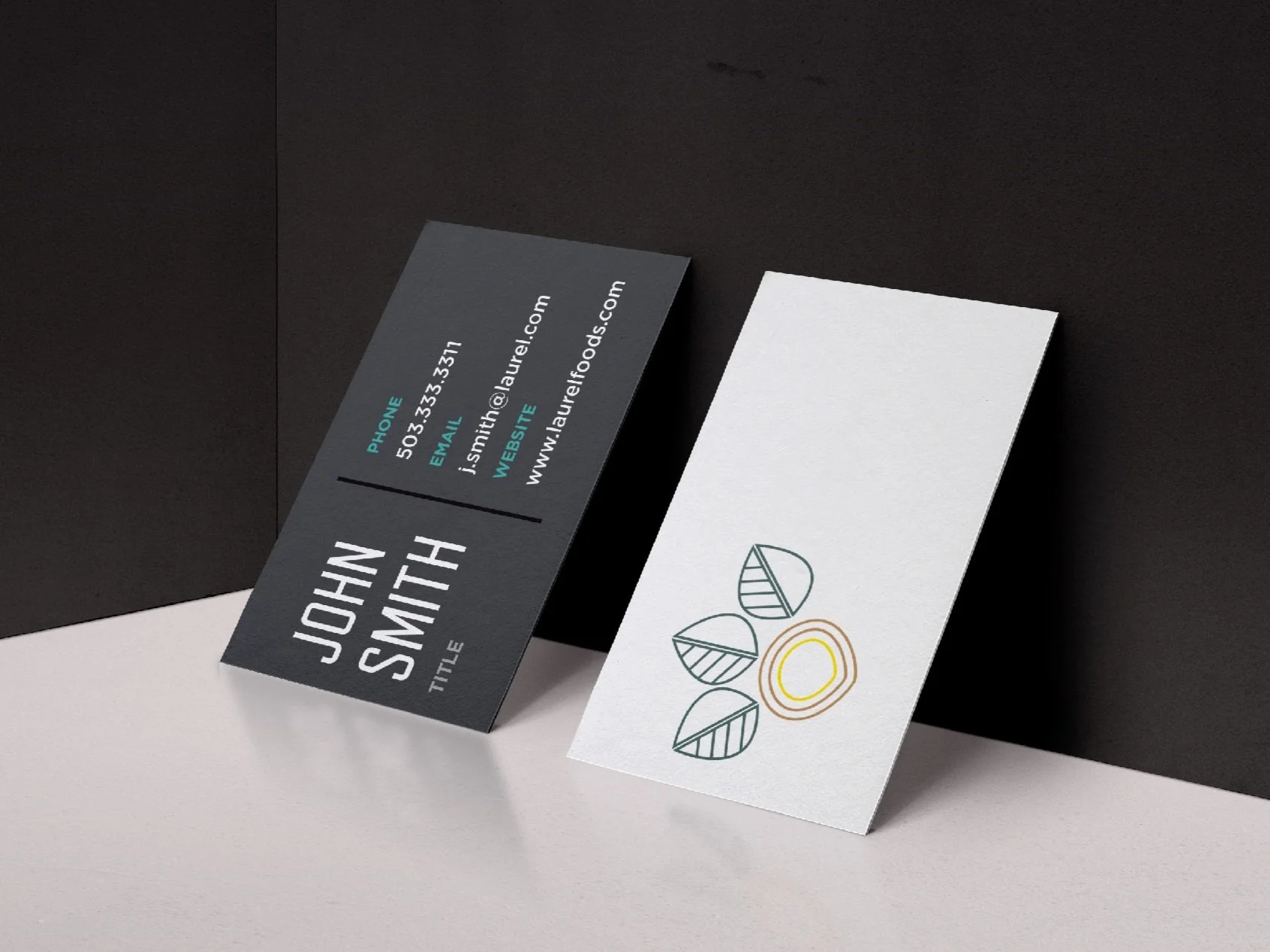
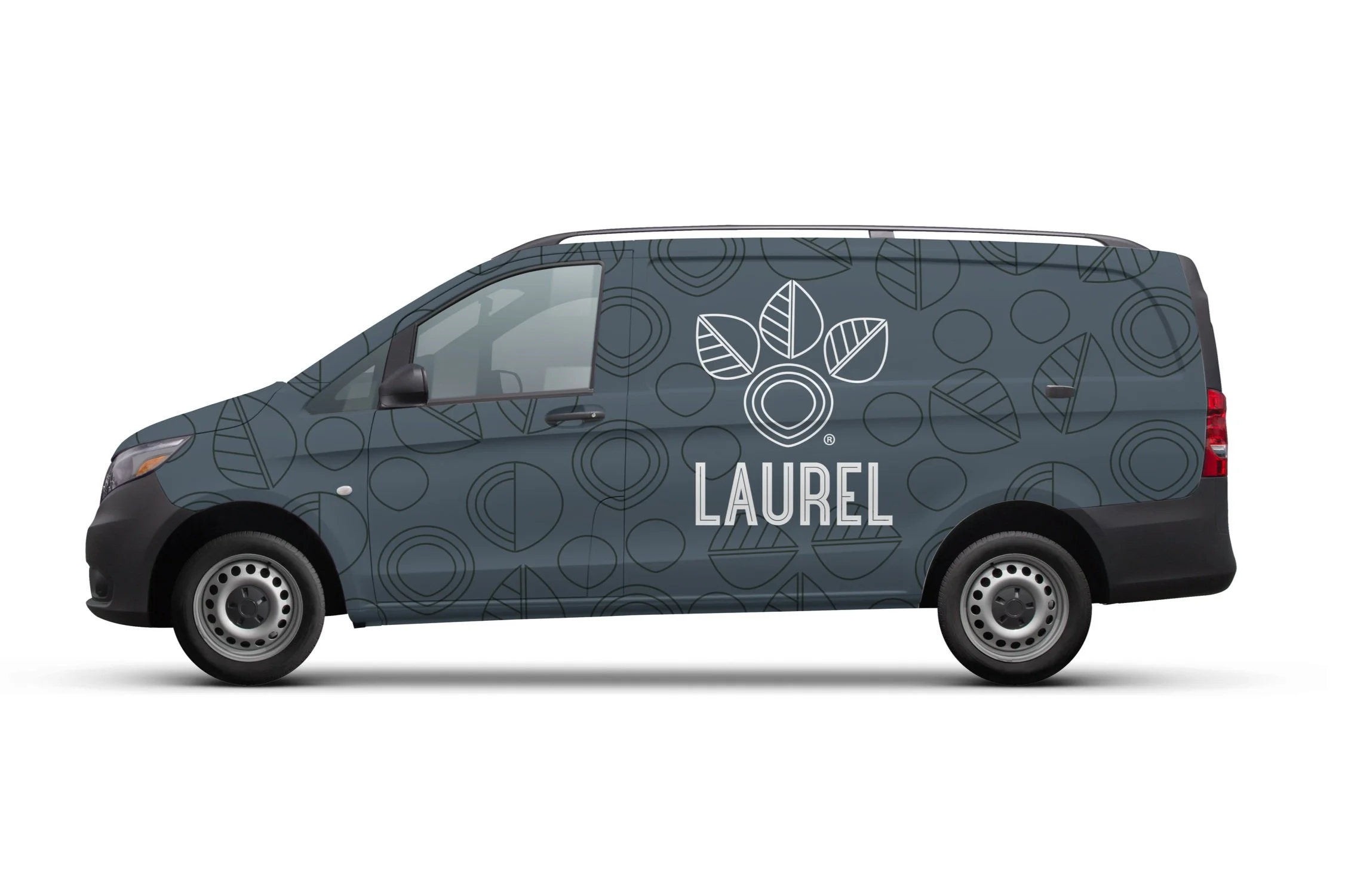
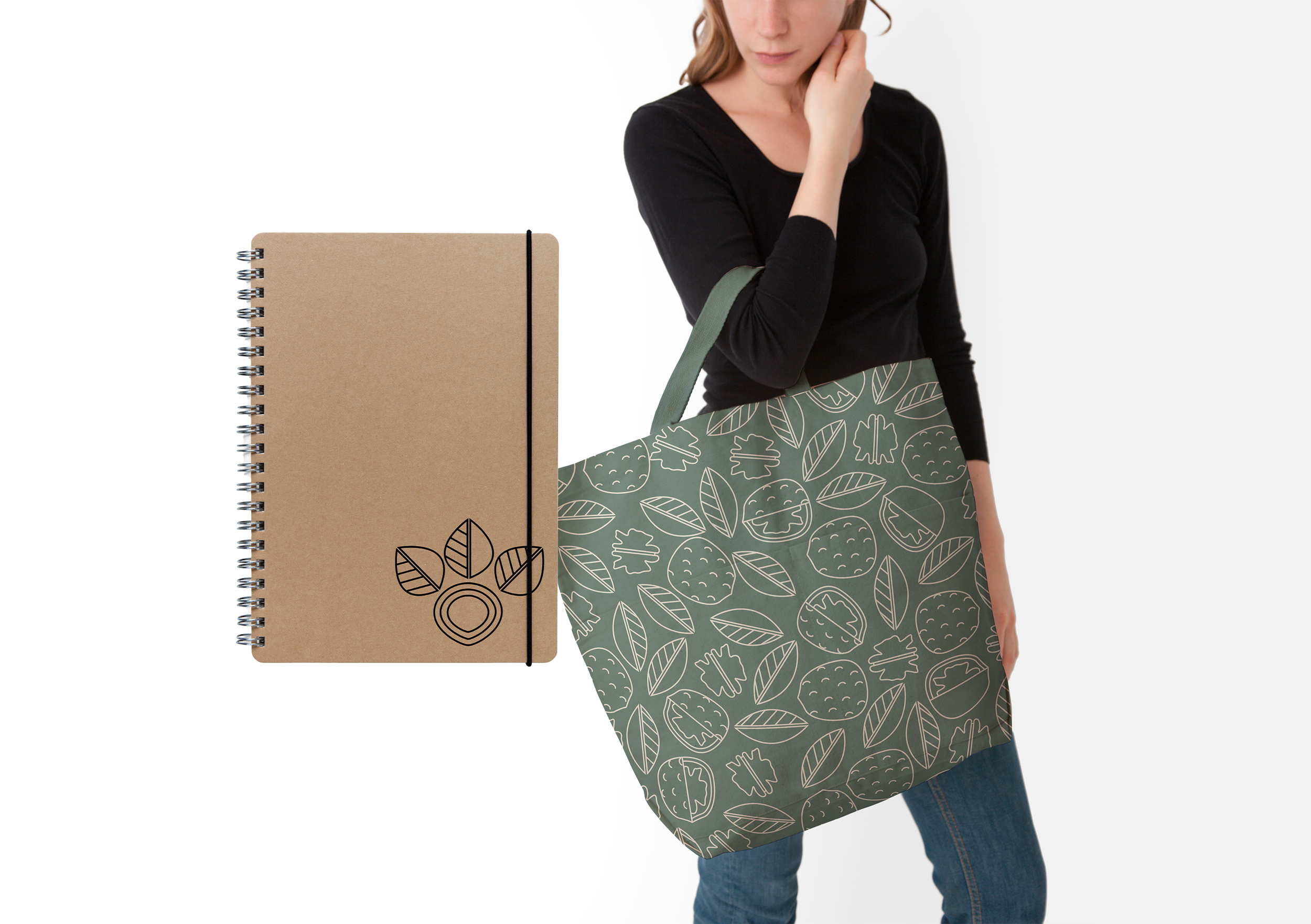
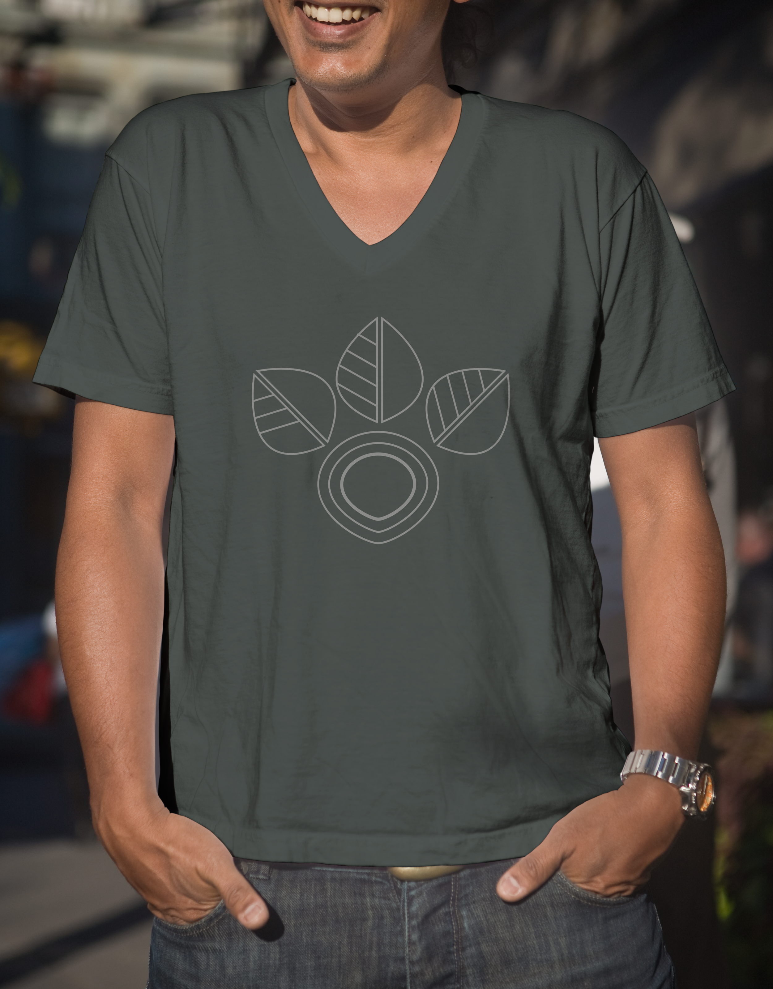
The Laurel Tree logo was designed to feel both modern and organic, blending clean lines with natural forms. The layered leaf icon creates a sense of growth and harmony, while the bold, geometric type adds a grounded, confident presence. Every element was intentionally crafted to work in harmony, creating a look that feels both fresh and rooted.
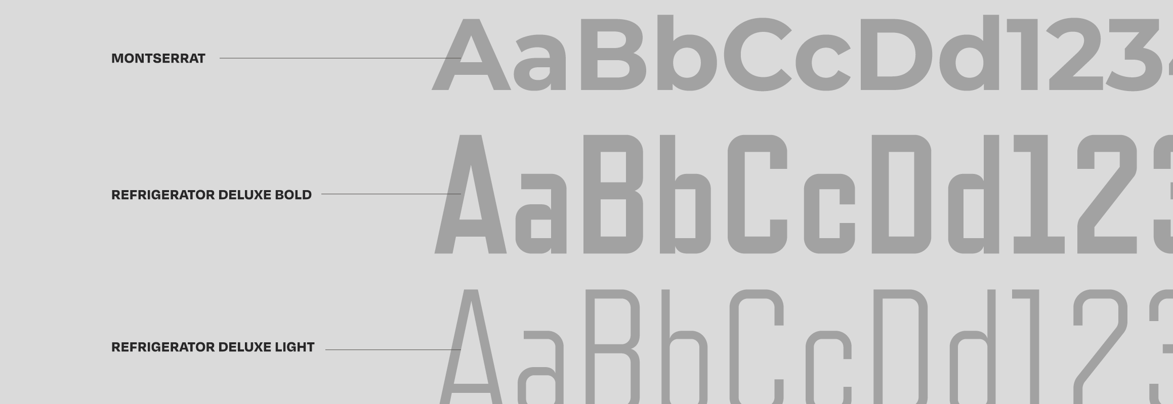
Color Palette & Typography
Dusty rose
Pine
Lemon Yellow
Chartreuse
Slate
Graphite
Patterns
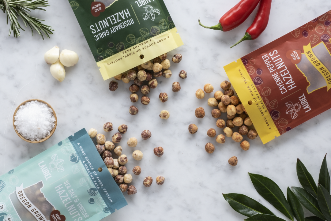
As the brand grows, I developed the nut patterns with flexibility in mind—ensuring they not only beautifully represent hazelnuts but can also evolve to include a variety of other nuts as the brand expands. This approach allows for a consistent, yet dynamic, visual identity.


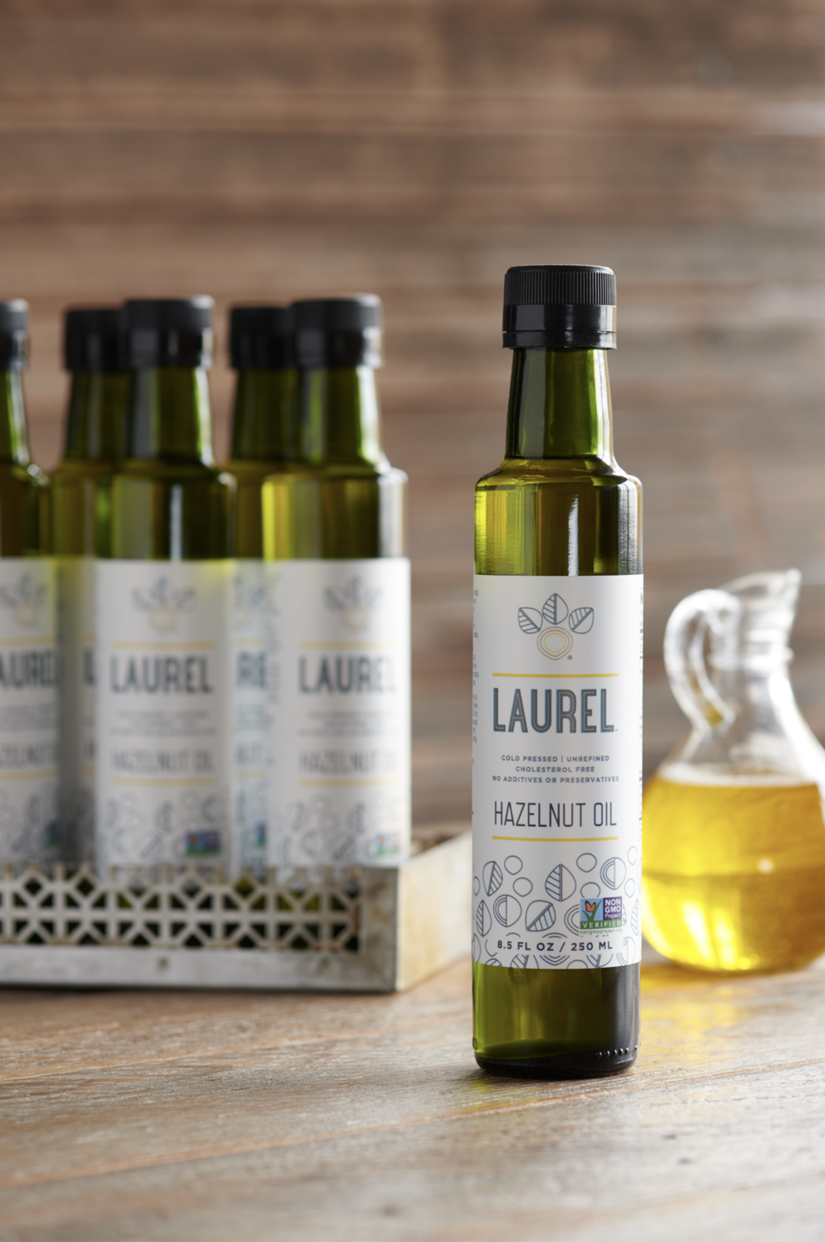
Application
While pressure testing the brand, we kept the Laurel food application top of mind, seamlessly weaving it into the hazelnut packaging, nut butters, and nut oils to create a cohesive and inviting look that truly reflects their quality and care.
Michael Johnson
Manager of Operations
Laurel Tree, LLC