Geranium Lake Flowers Rebrand
Impact
Refreshed the Geranium Lake Flowers brand with a timeless, vintage-inspired identity, balancing classic floral detail with modern restraint to reflect quality, care, and legacy.
Role & Responsibilities
Art Director: Creative Direction, Brand Strategy, Identity Design, Visual Systems, Stakeholder Collaboration
Brief
After 20 years in business, Geranium Lake Flowers needed a brand refresh that better reflected its vintage sensibility and evolving customer expectations, while maintaining the quality and professionalism the shop was known for.
Solution
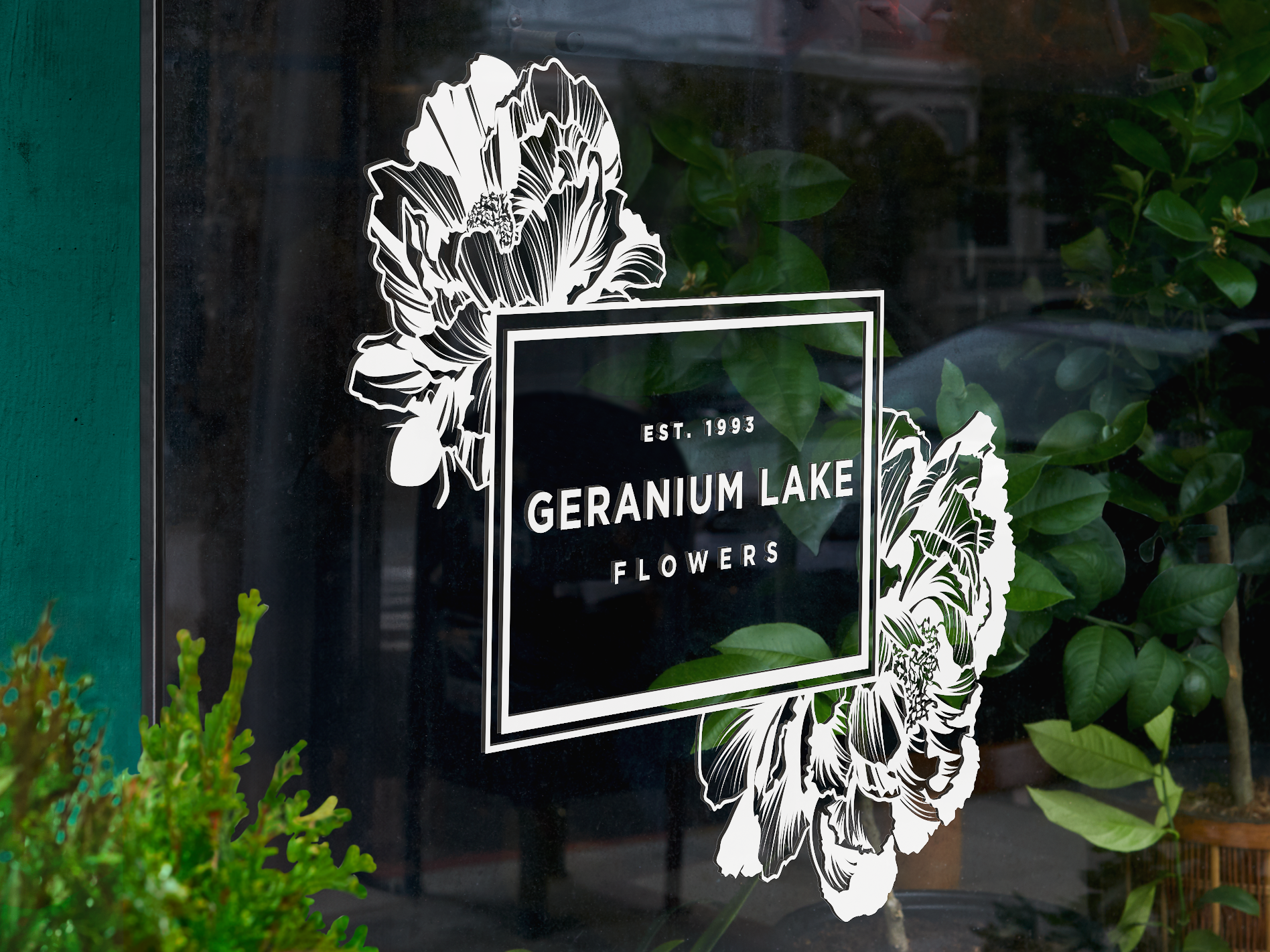
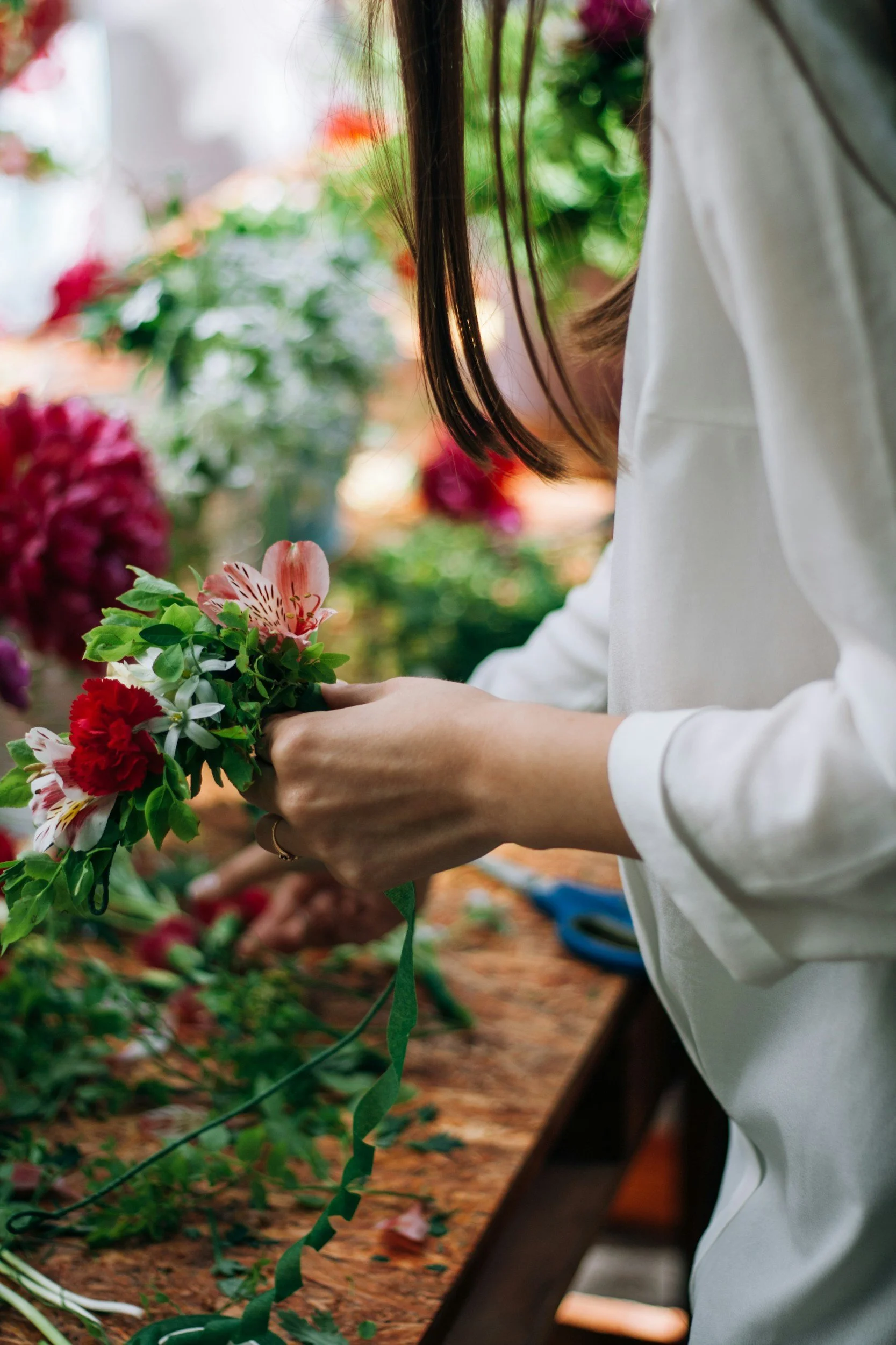
The refreshed identity balances detailed, timeless floral illustration with clean, modern structure to create a flexible logo system that works across storefront signage, packaging, and marketing materials. The result is a cohesive brand expression that enhances the retail experience, evokes botanical and industrial, and reinforces Geranium Lake Flowers as a destination for thoughtful, high-quality floral design.
Inspiration
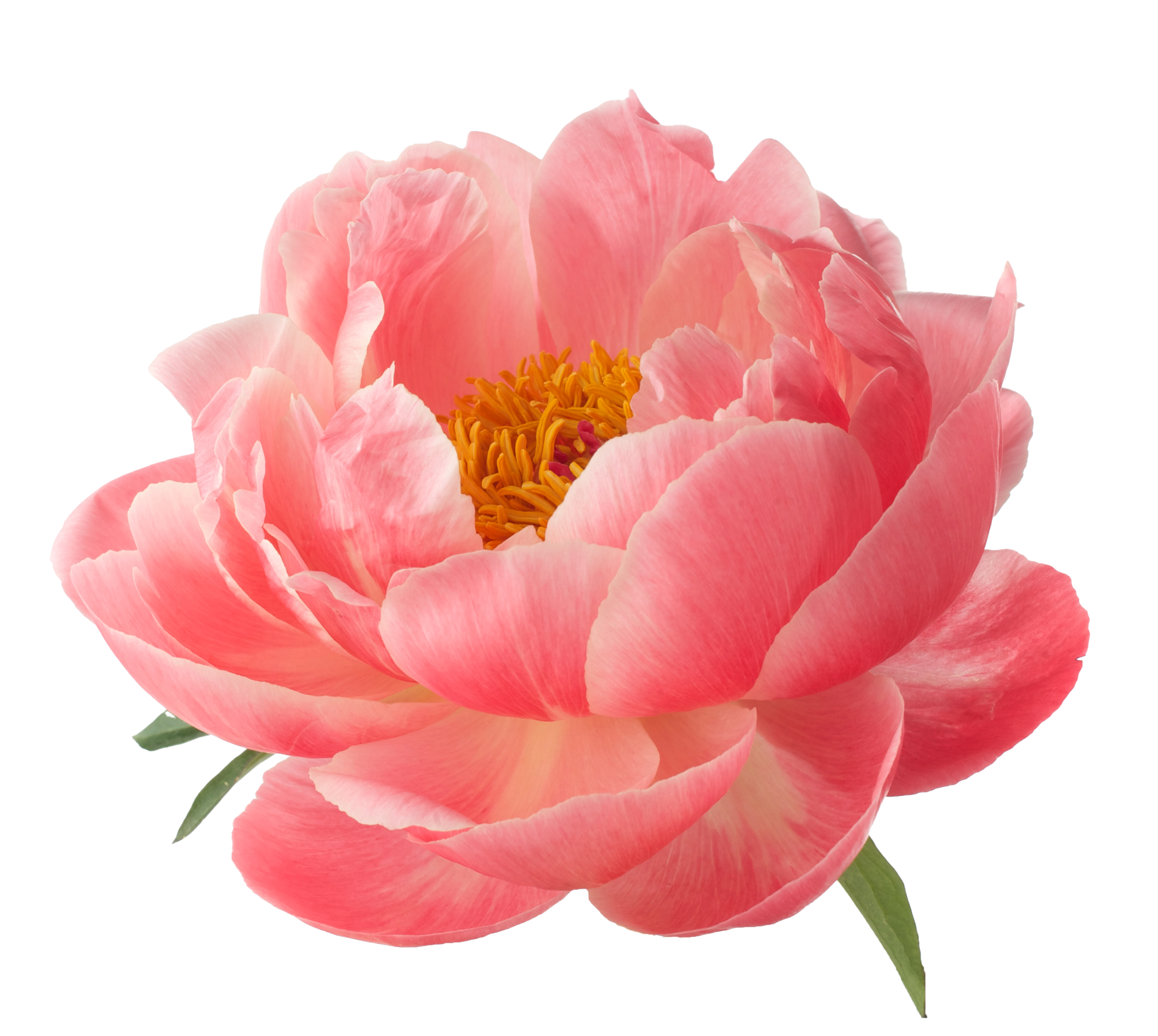
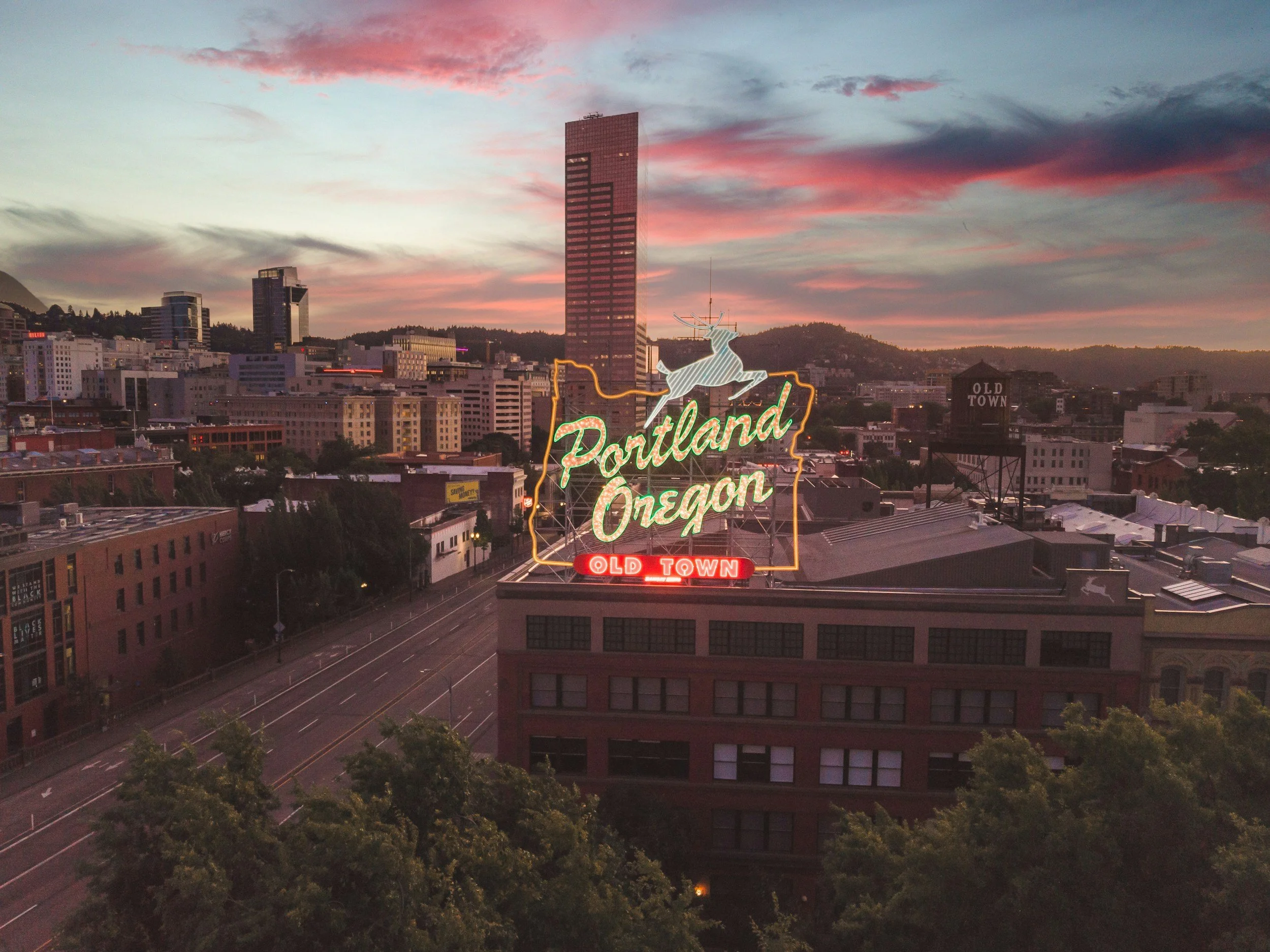
The brand draws inspiration from the owner’s love of peonies and the shop’s rich heritage inside Portland’s iconic “Big Pink” building, blending floral elegance with a strong sense of place.
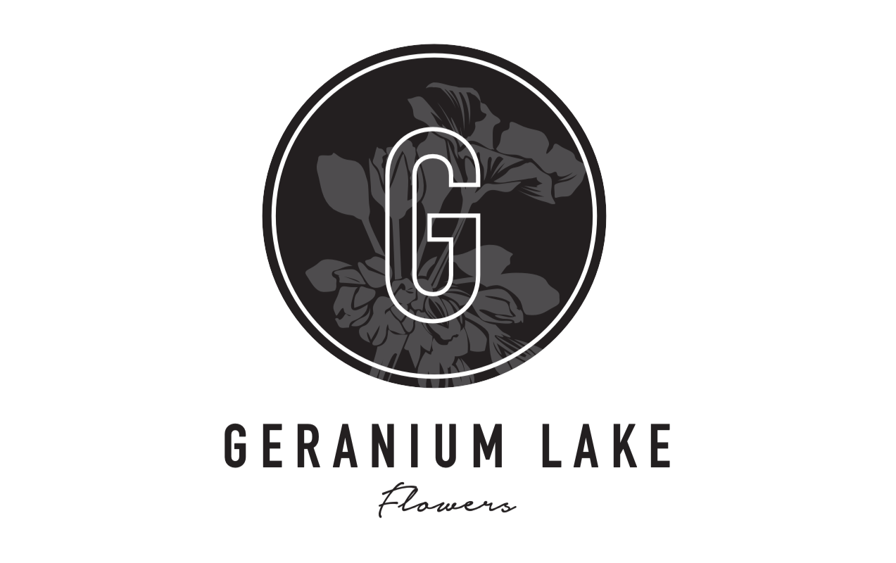
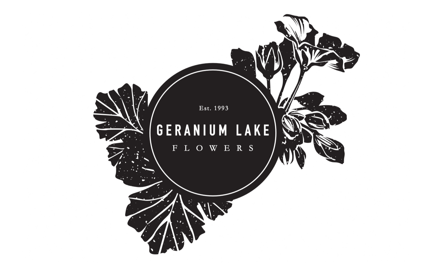
Initial concepts
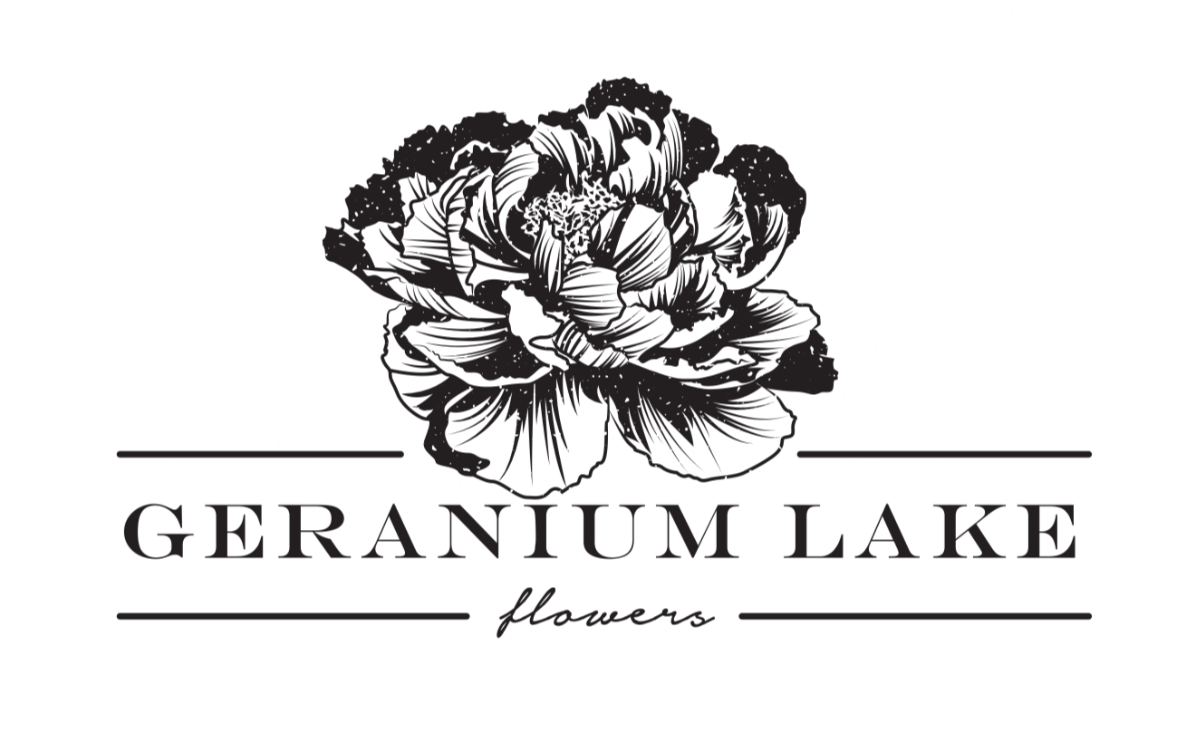
Final brand
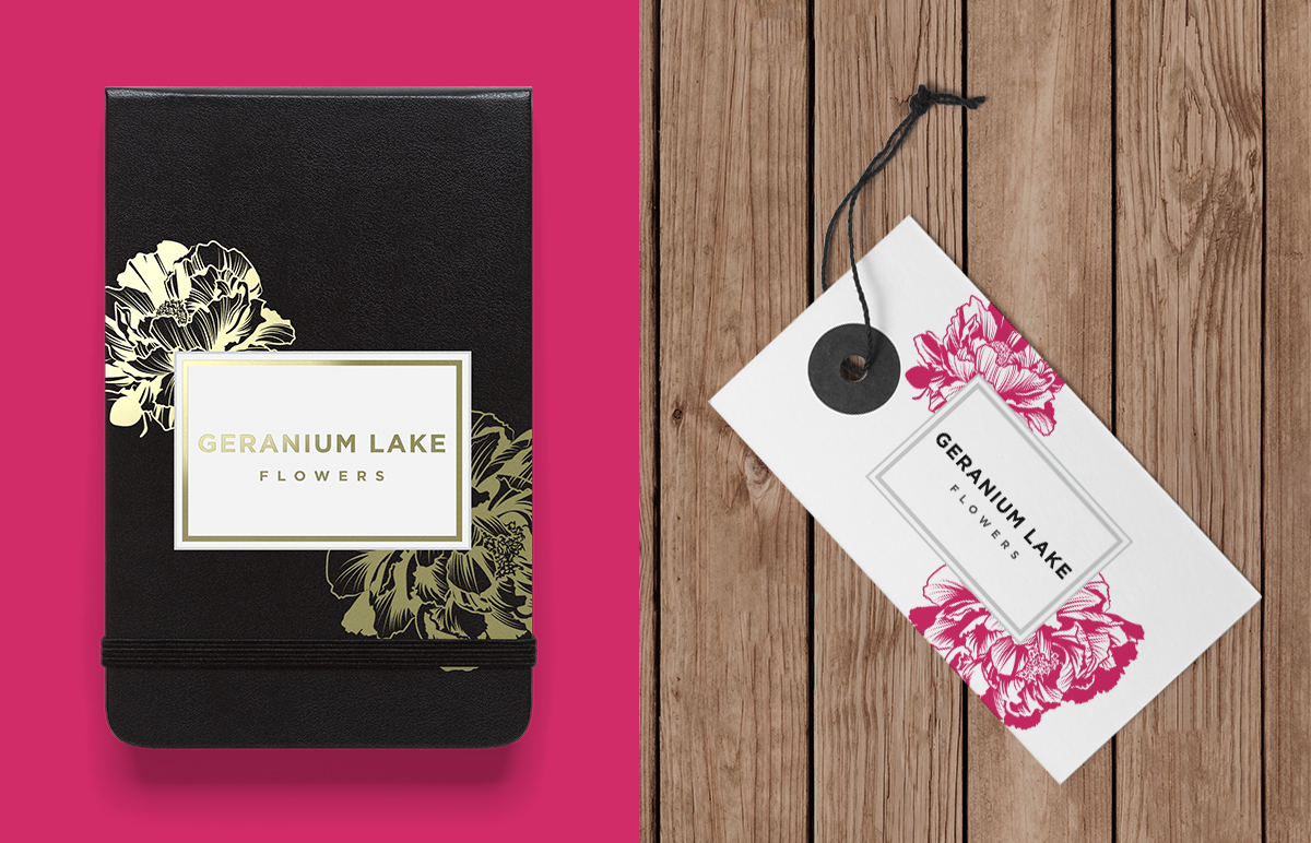
The final Geranium Lake Flowers logo balances personality with versatility. The owner wanted to retain the established name for its brand recognition while incorporating her love of peonies, so an illustrated floral mark was developed to immediately signal the nature of the business and evoke a handcrafted aesthetic. The detailed peony lockup serves as the expressive primary logo, while a simplified typographic version without the illustration provides flexibility for smaller or more restrained applications. The system also includes black and reversed-white variations to ensure the brand remains clear and elegant across different backgrounds and uses.
Minimum Size:
To maintain legibility and consistent brand representation, it is essential that the logo maintains a minimum height of 200px, while the wordmark should not be reduced to a height below 100px.
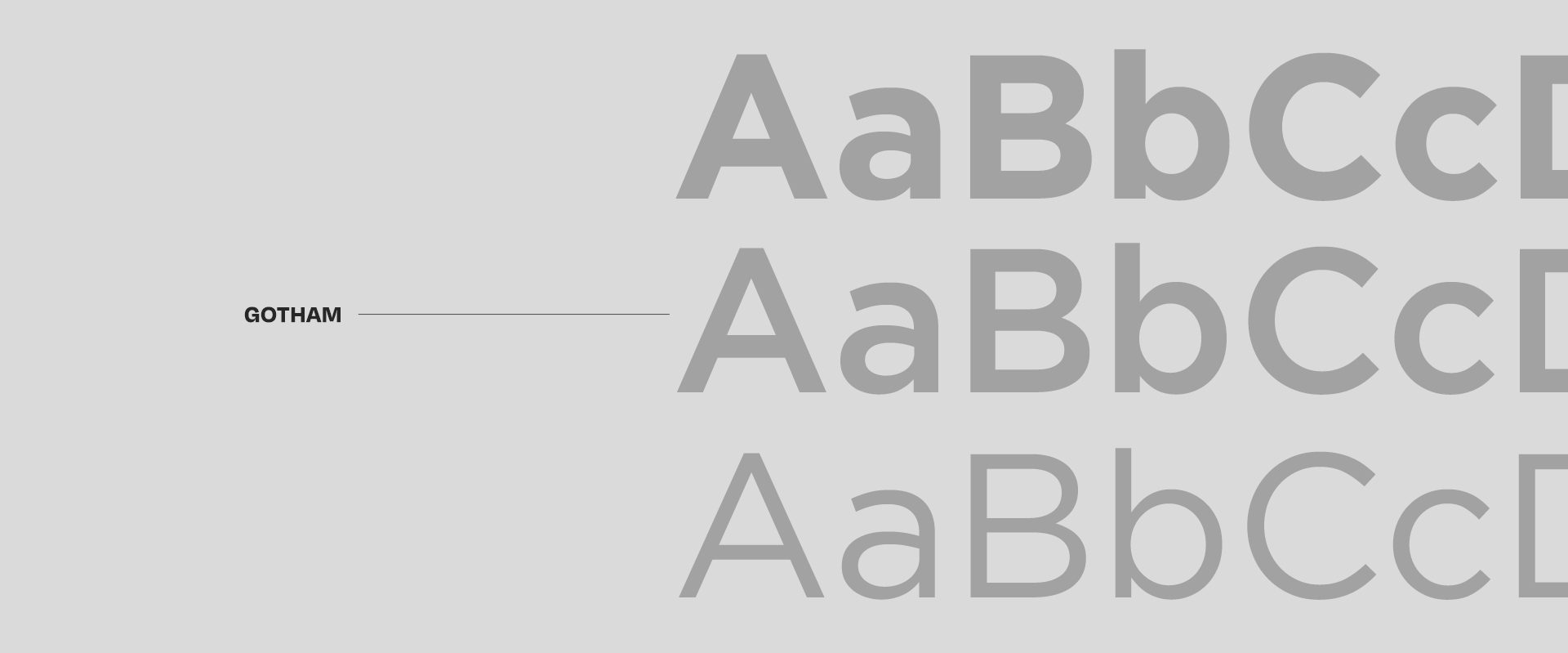
Color Palette & Typography
Warm Gray
Magenta
Black
White
Application
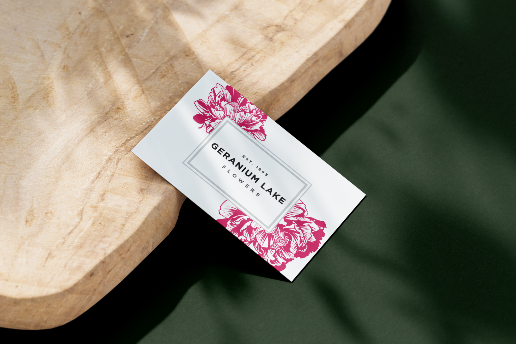
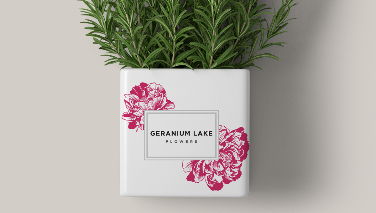
The brand comes to life across signage, packaging, and retail tags, where the peony illustration adds a handcrafted, welcoming feel at larger scales and the simpler mark keeps smaller pieces clear and readable.