
Cascade AIDS Project: PreP Branding
Impact
Made CAP’s PrEP initiative more accessible by developing a welcoming bilingual visual identity that translated a clinical advancement into a community resource.
Role & Responsibilities
Art Director: Creative Direction, Brand Strategy, Identity Design, Visual Systems, Stakeholder Collaboration
Brief
As Cascade AIDS Project engaged Roger That Agency to introduce PrEP to the community, the challenge was to reframe a highly effective but clinically perceived HIV-prevention treatment into something approachable, inclusive, and easy to understand for a diverse audience.
Solution
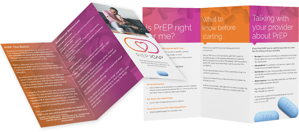
I established a visual identity that built on CAP’s existing brand while giving PrEP a distinct, human-centered presence. Furthermore, bilingual educational materials in English and Spanish were developed through this visual lens to clearly explain PrEP and reduce stigma, helping make the program more accessible and empowering individuals to make informed healthcare decisions.
Inspiration
The brand draws inspiration from the warm colors of the CAP palette, the simple geometry of the pill form, and the heart—bringing a sense of care, optimism, and positivity to a sensitive healthcare topic.


Initial concepts
Final Brand
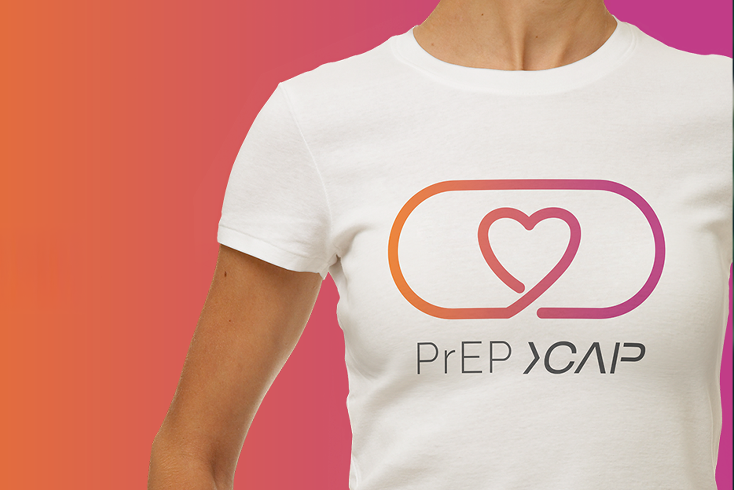
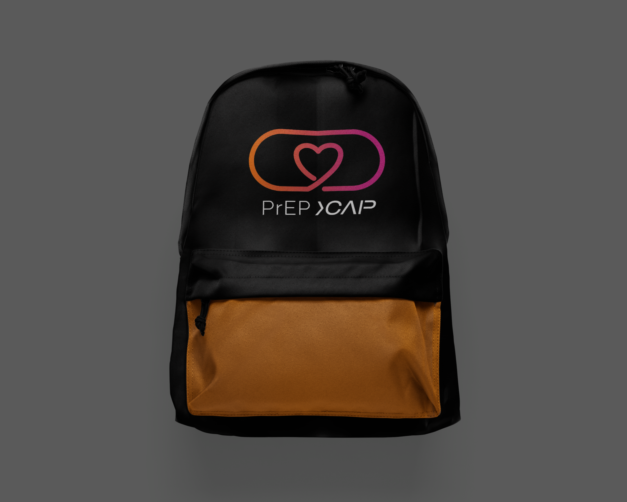
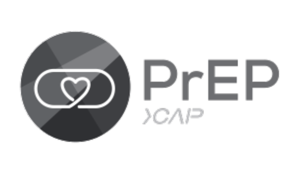
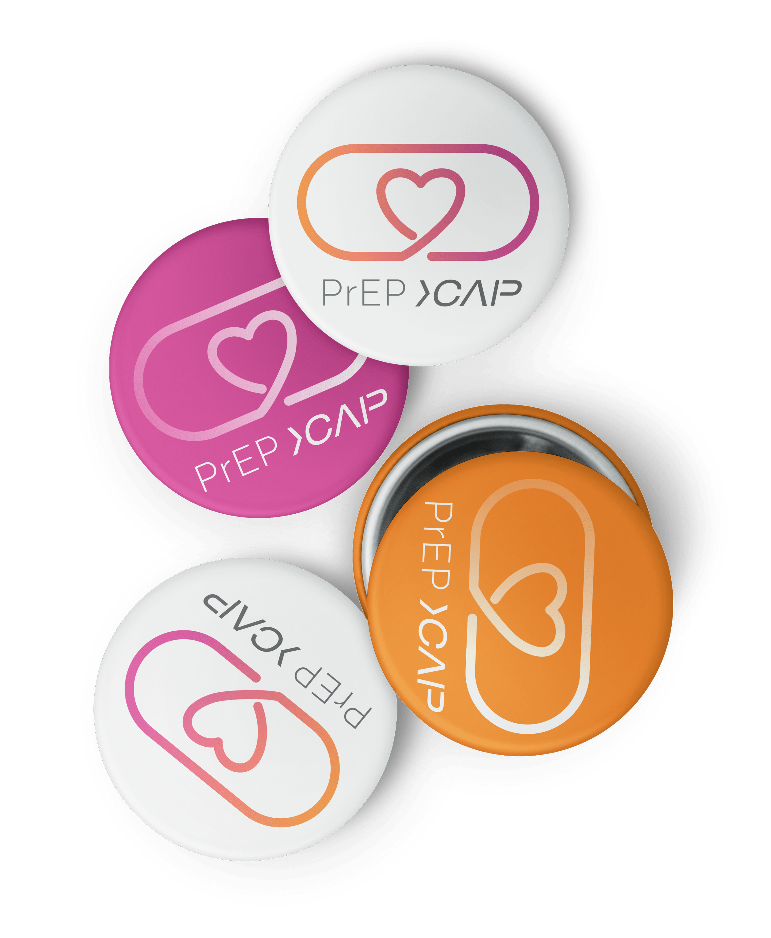
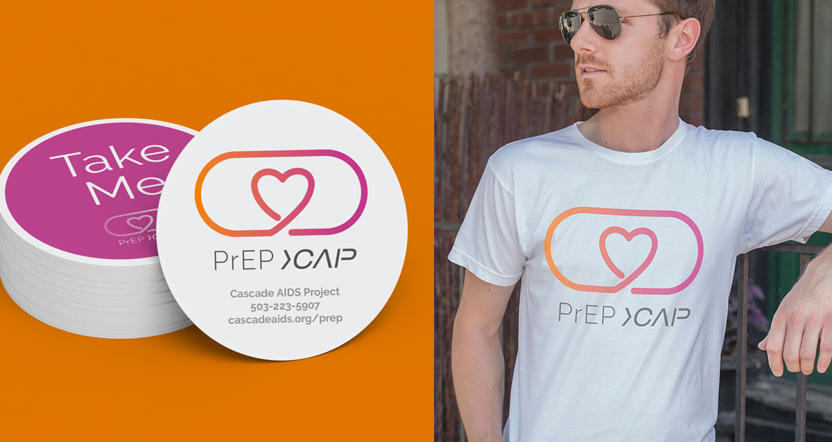
The final PrEP logo centers on a pill-shaped form that directly references the medication itself. A continuous line drawn from the outline creates a heart at the center, subtly evoking the shape of an AIDS ribbon. Warm gradient colors add a friendly, welcoming feel, helping the mark feel supportive and human while staying simple and easy to recognize across outreach materials.
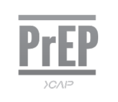
Minimum Size:
Minimum width of 150px for digital application and .75 inches for print.
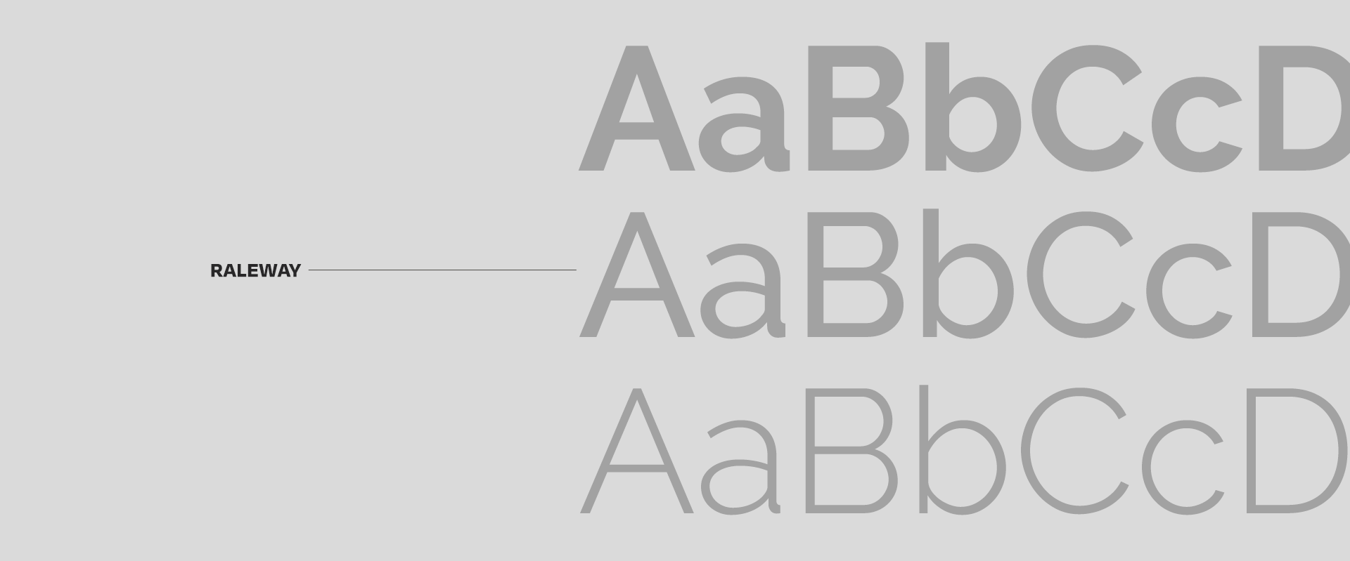
Color Palette & Typography
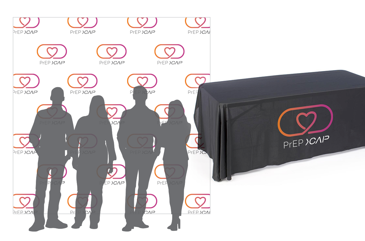
Application
event and promotional materials. Its use on brochures, swag, and awareness campaigns helped create a recognizable presence that encouraged people to learn about and consider the medication. Consistent application across touchpoints reinforced trust and made the message approachable and accessible.
This was a Roger That Agency project.